
IYKYK
Sculpture
2025
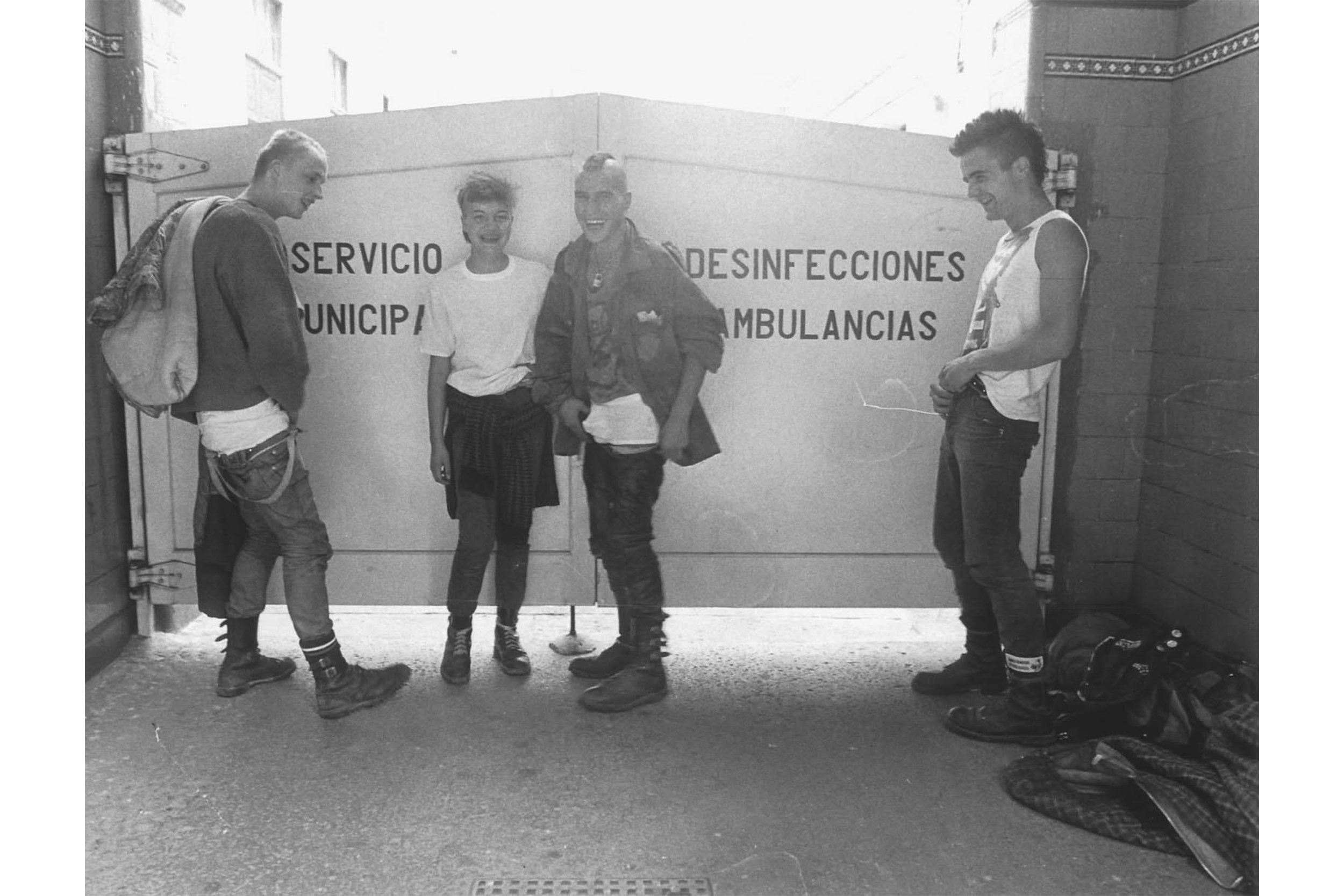
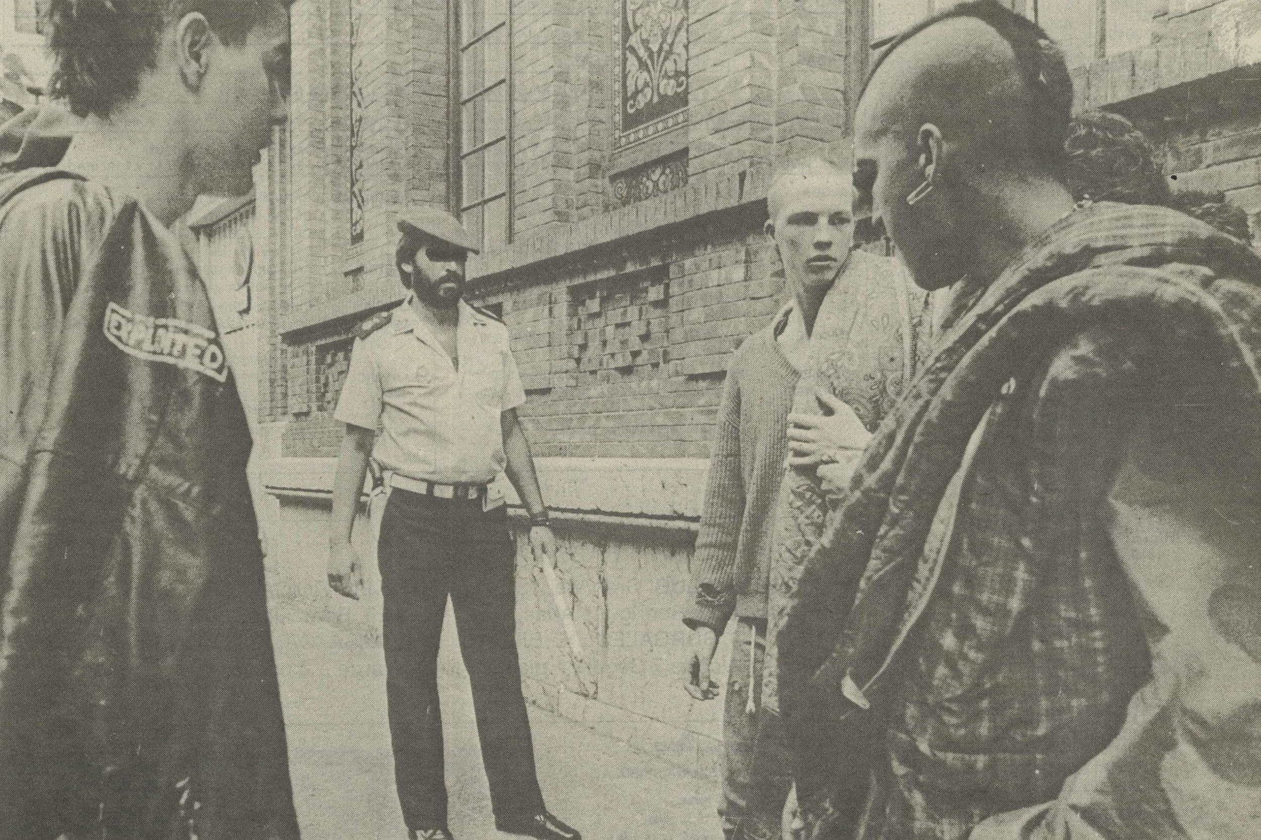
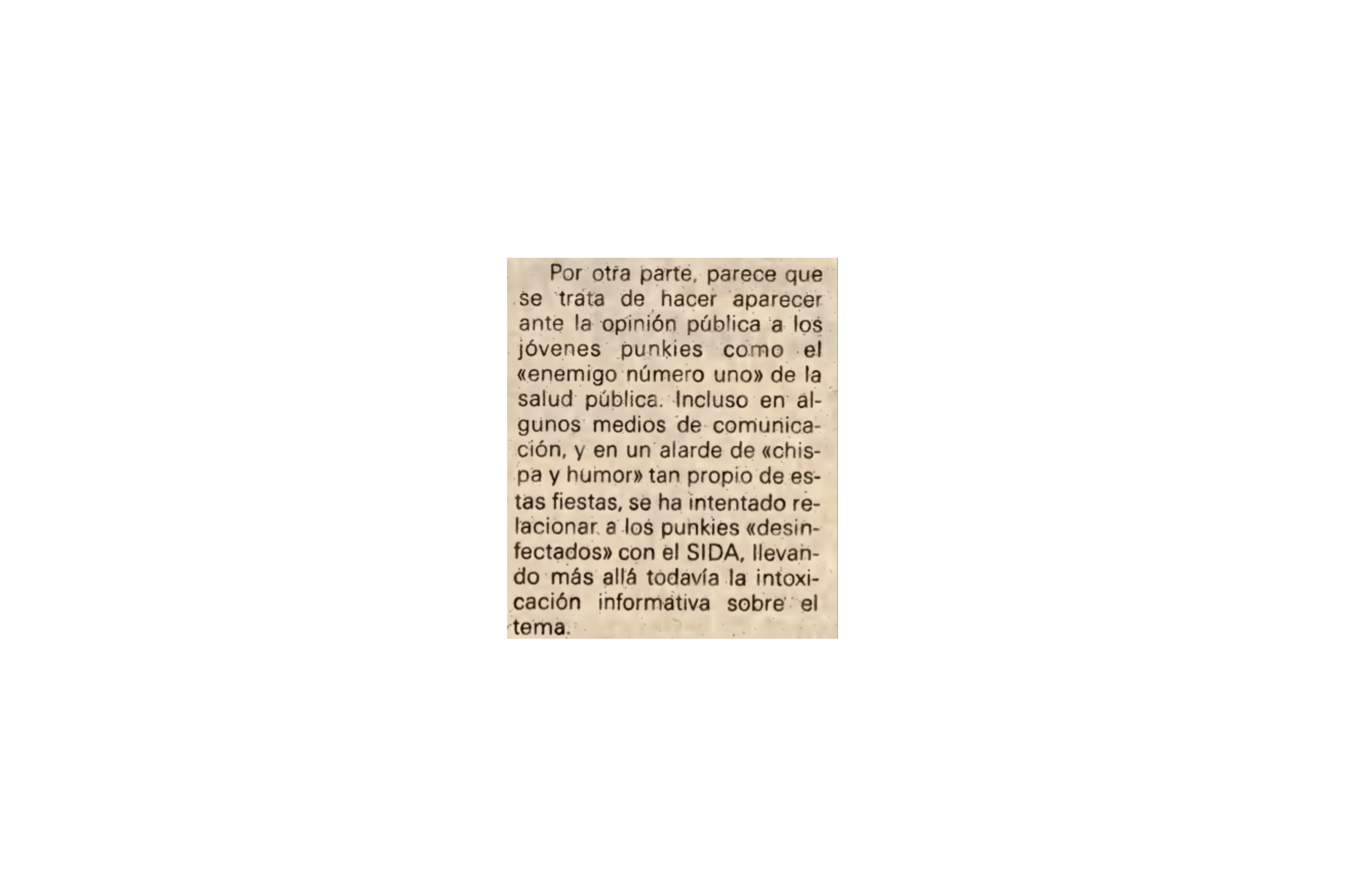
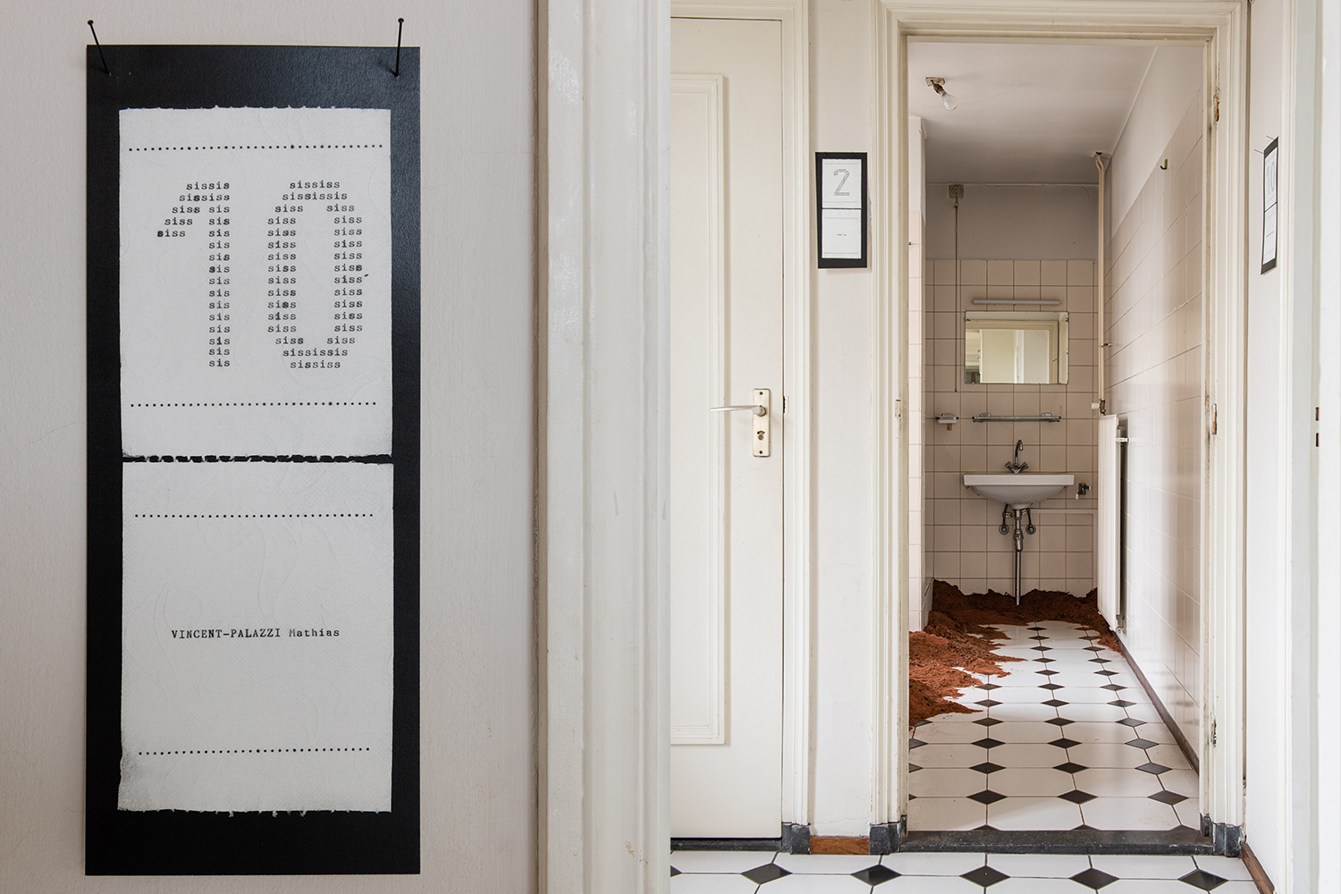
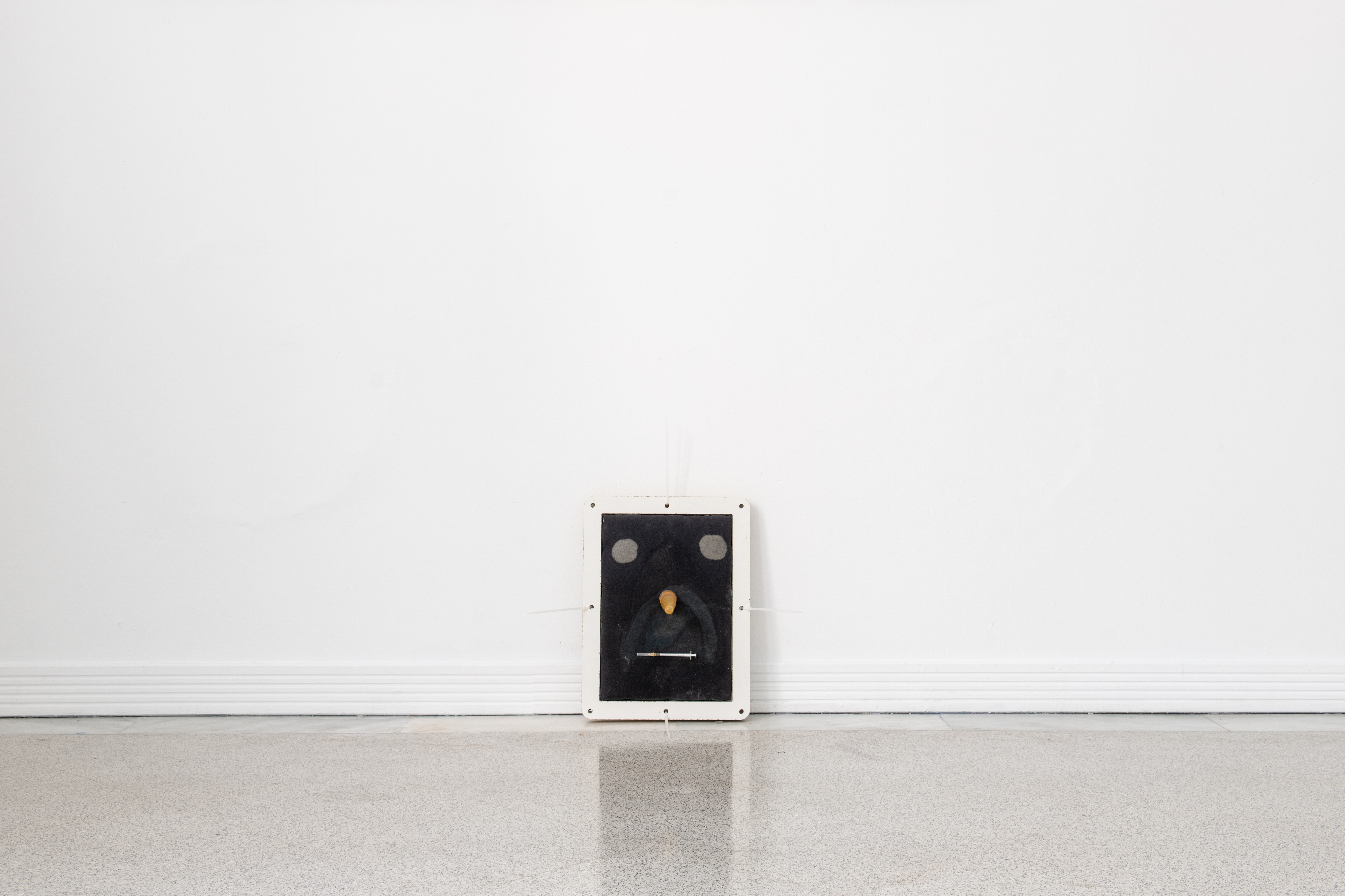
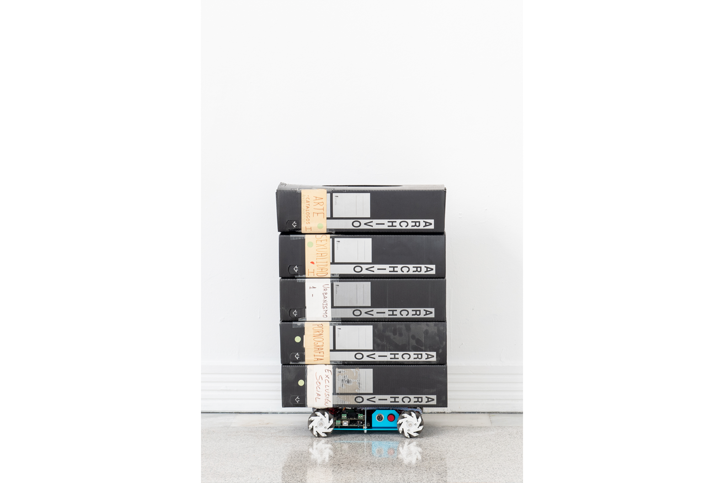
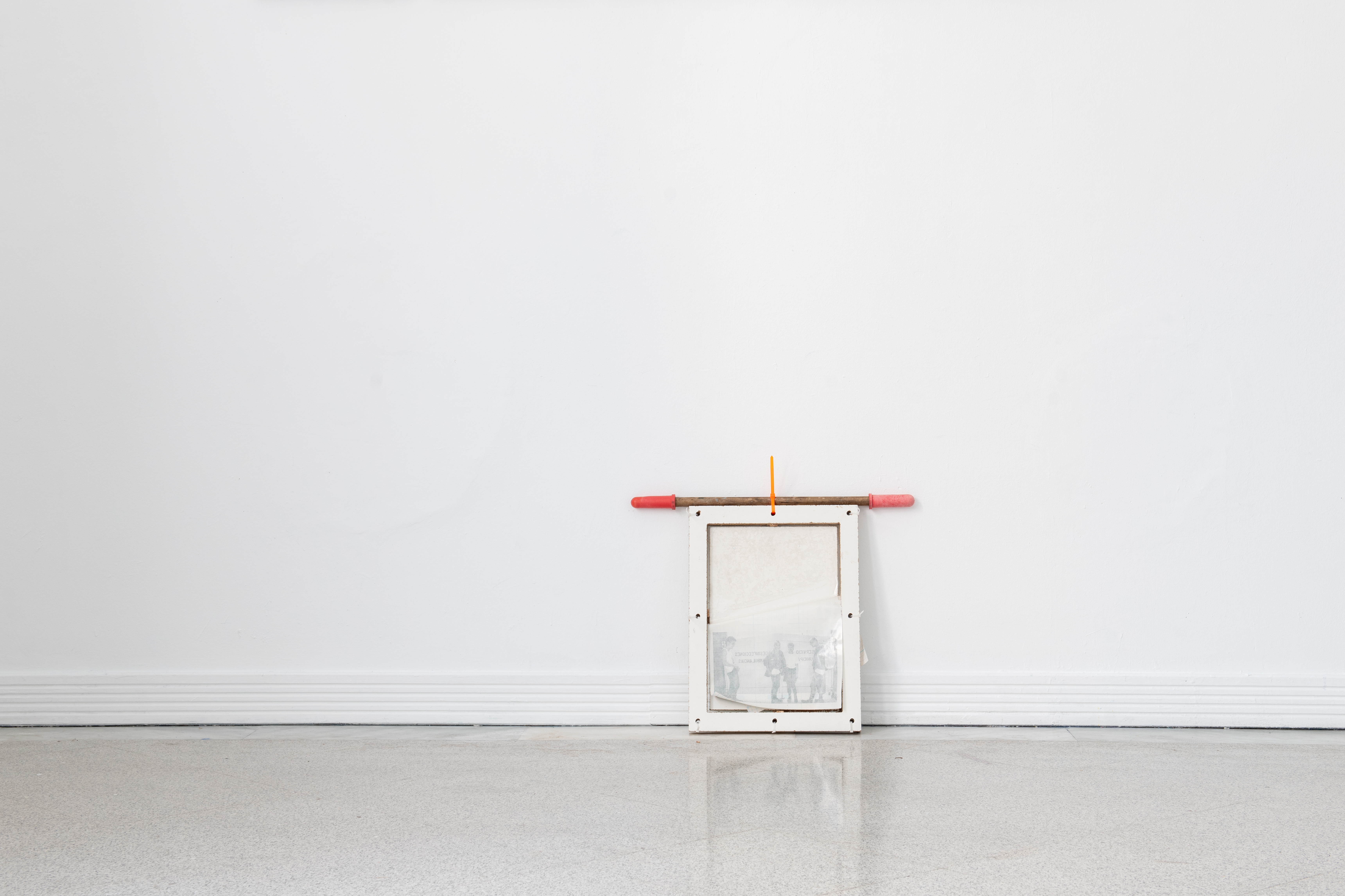
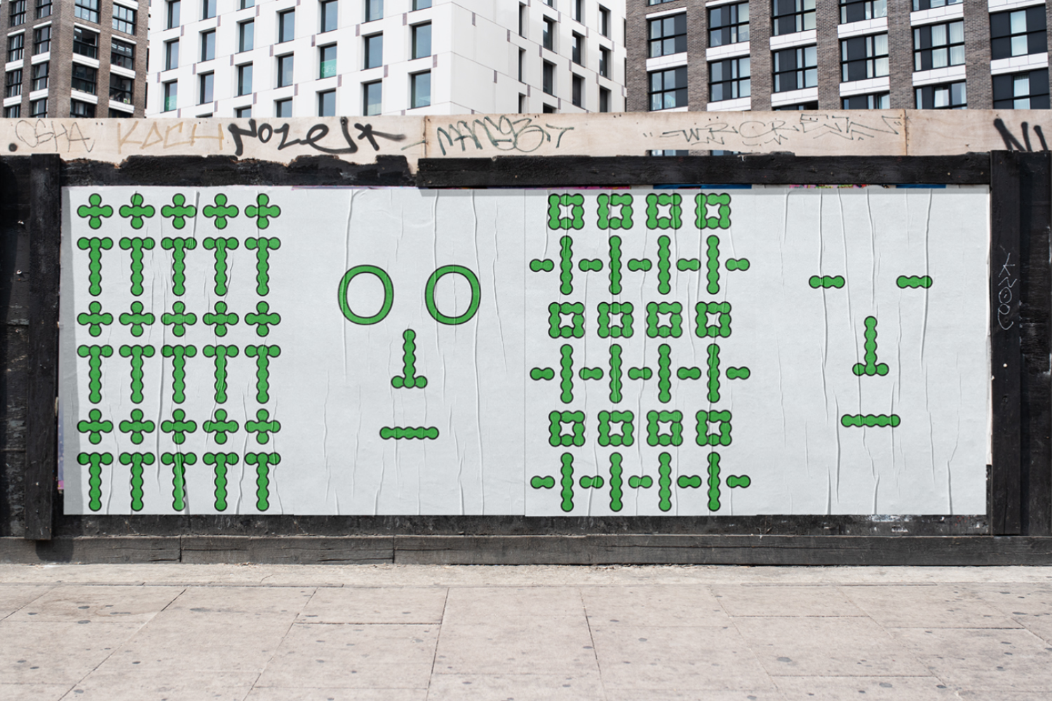
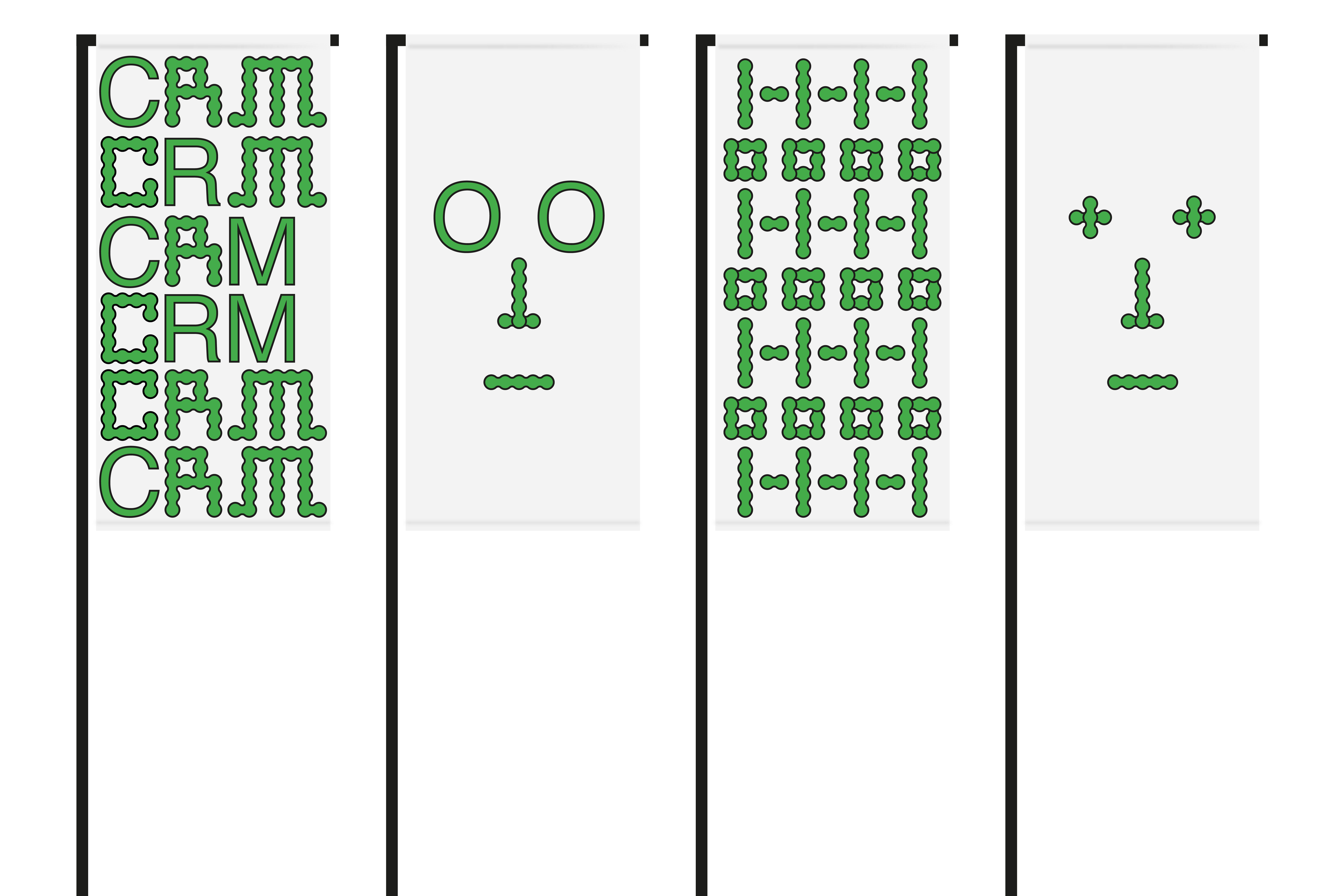
In IYKYK (“If you know, you know”), Matauko enacts deliberate acts of forgetting through sculptural gestures—such as depositing unclaimed Amazon surprise parcels in a museum cloakroom—to reflect on the Basque Country’s Lost Generation. The work centers on The Night of the Cut Mohawks in 1985, when 104 punks were arrested during Bilbao’s Aste Nagusia festival for allegedly violating public decorum through supposed signs of poor hygiene. In this context, the conscious act of forgetting becomes a subversive strategy—an alternative mode of resistance that exposes the violent entanglement of governmental hygienist policies and dissident lived experience.
Purity is a vision of things put in places different from those they would occupy if not prompted to move elsewhere, pushed, pulled or goaded; and it is a vision of order, that is of a situation in which each thing is in its rightful place and nowhere else.
—Zygmunt Bauman, Dream of Purity—
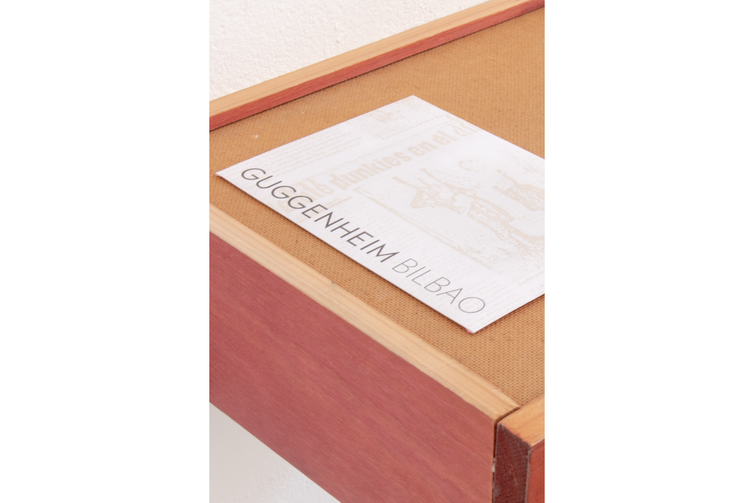
Collection BilbaoArte Bilduma
No. Registro: 2025.631.4
Artists in Residence 2024/25: New Acquisitions at
URIBITARTE 40
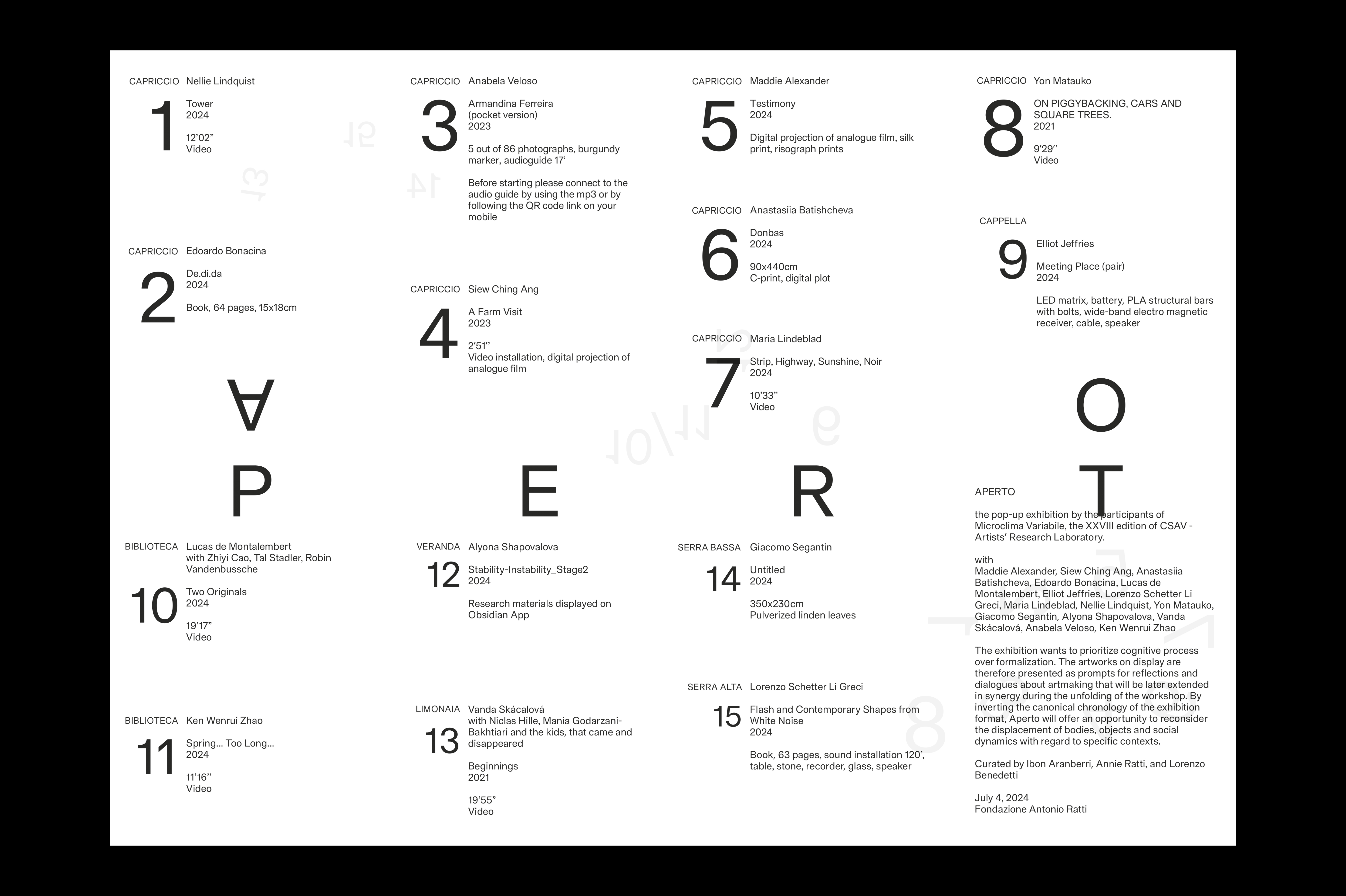
APERTO
Visual identity, Editorial
2024
Pop-up exhibition by the participants of Microclima Variabile, the XXVIII edition of CSAV - Artists’ Research Laboratory at Fondazione Antonio Ratti with Maddie Alexander, Siew Ching Ang, Anastasiia Batishcheva, Edoardo Bonacina, Lucas de Montalembert, Elliot Jeffries, Lorenzo Schetter Li Greci, Maria Lindeblad, Nellie Lindquist, Giacomo Segantin, Alyona Shapovalova, Vanda Skácalová, Anabela Veloso, Ken Wenrui Zhao
The exhibition wants to prioritize cognitive process over formalization. The artworks on display are therefore presented as prompts for reflections and dialogues about artmaking that will be later extended in synergy during the unfolding of the workshop. By inverting the canonical chronology of the exhibition format, Aperto will offer an opportunity to reconsider the displacement of bodies, objects and social dynamics with regard to specific contexts.
Curated by Ibon Aranberri, Annie Ratti, and Lorenzo Benedetti
With © Ken Wenrui Zhao

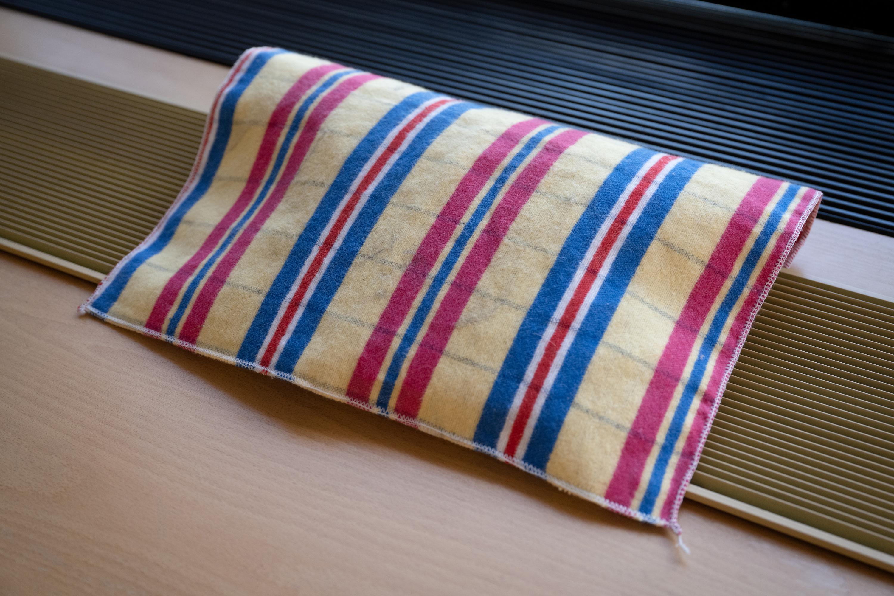
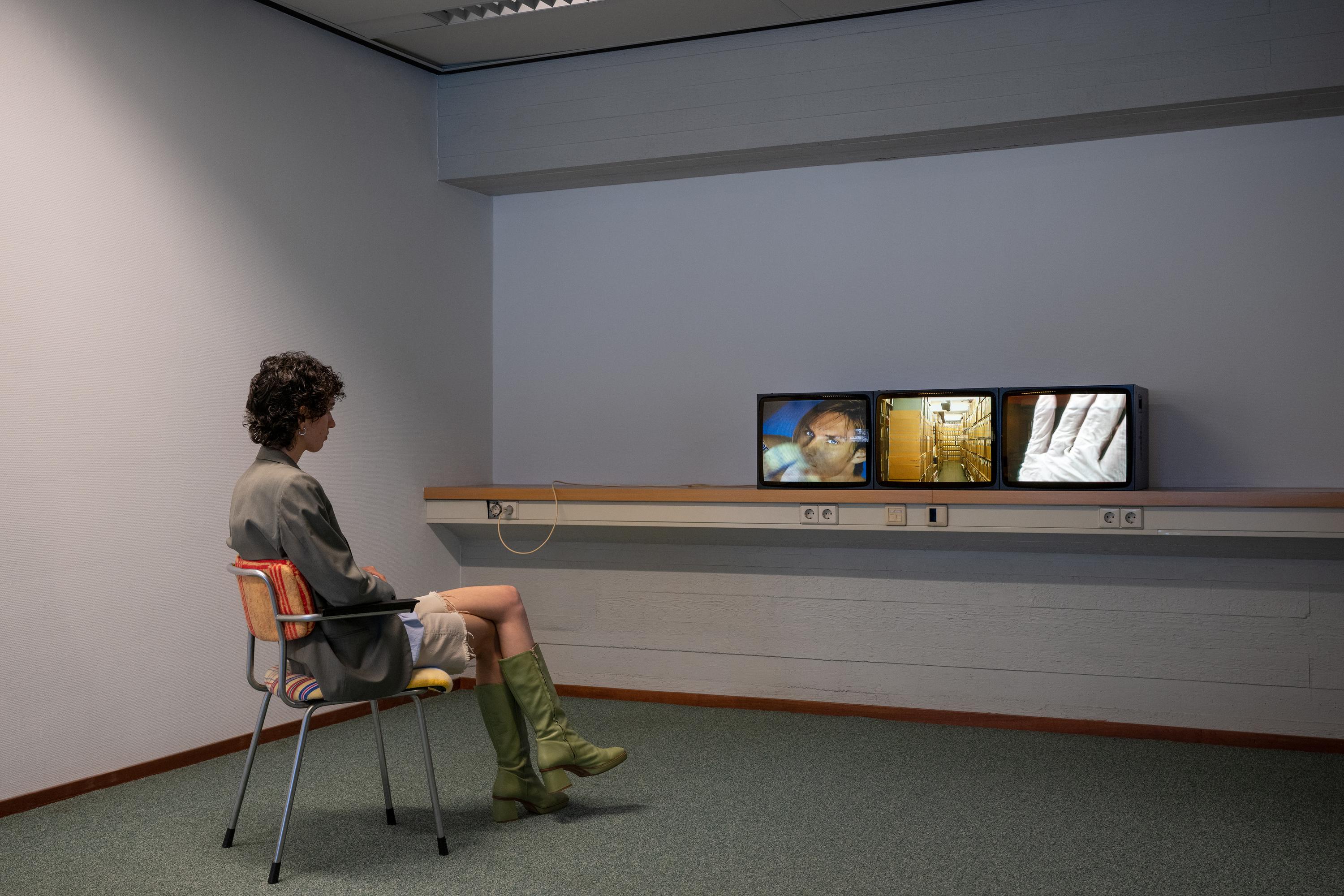
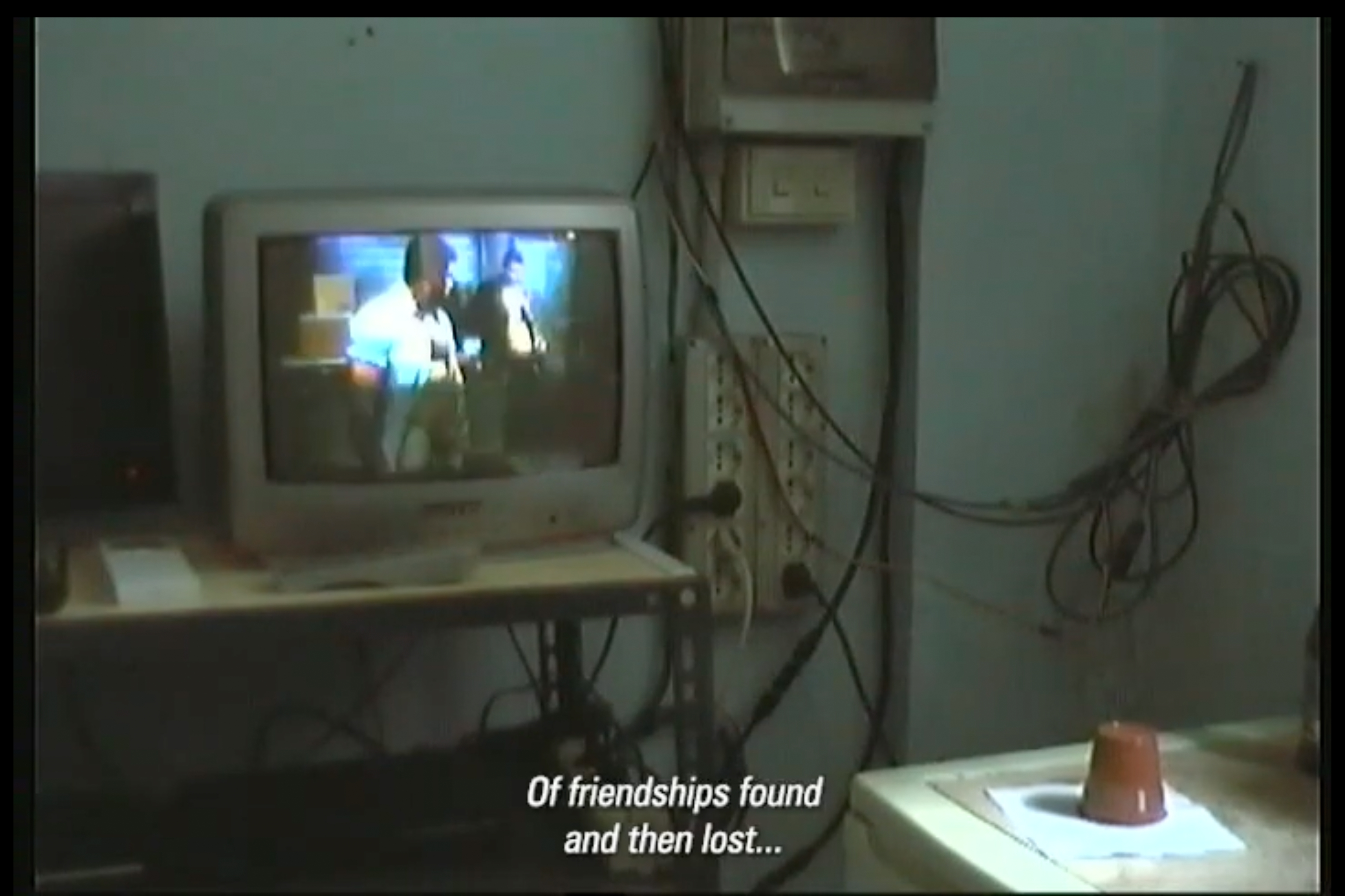
THE CHRONIC WANDERING
OF DUST
Site-Specific Video Installation
2022
‘The Chronic Wandering of Dust’ was my contribution to Holding Pattern; Sandberg Instituut’s Studio for Immediate Spaces 2022 graduation show at De Oude Rechtbank, the former courthouse in Amsterdam. This project delved into the moral narratives of dust and the mechanisms for its control. By physically interacting with cloths laden with dust extracted from the shelves of the IHLIA Heritage —the largest LGBTQIA+ archive in Europe— visitors were invited to partake in the everlasting circularity of dust. The piece was a nostalgic activation of dust, an undesirable agent that manifests itself as an uncanny physical index of history when displaced from one place to another, while having the ability of unsettling regimes of order, permanence, and control. The compulsive task of dusting served as a metaphor for the dynamics between repression and desire. Dust, like desire, cannot be swept under the rug. It is simply moved, not removed.
Featured in The Salmon of Knowledge,
Our Polite Society.
A LITTLE LADYBIRD TOLD ME
project type - Queer Theory based research
year - 2024
year - 2024

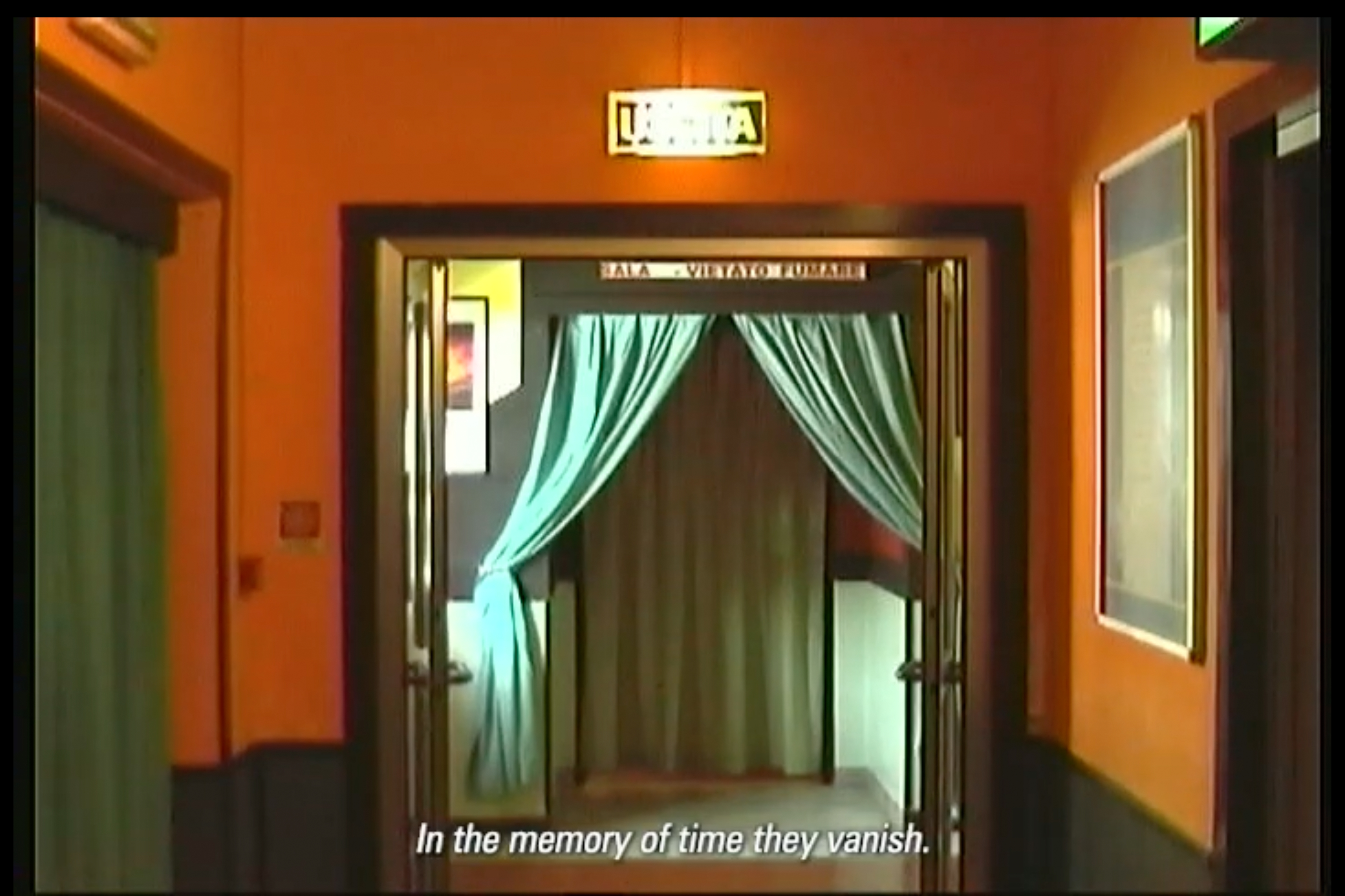
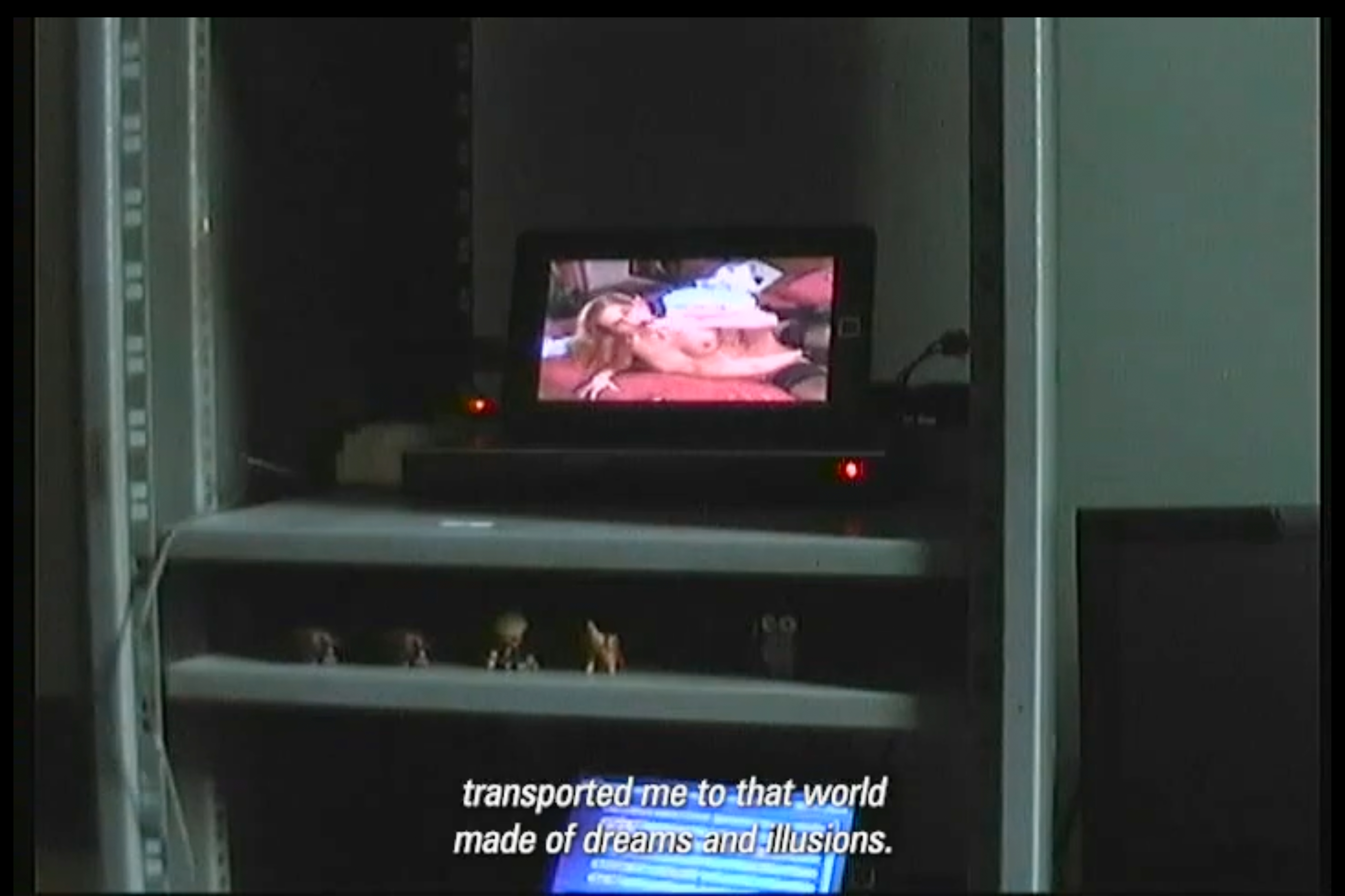
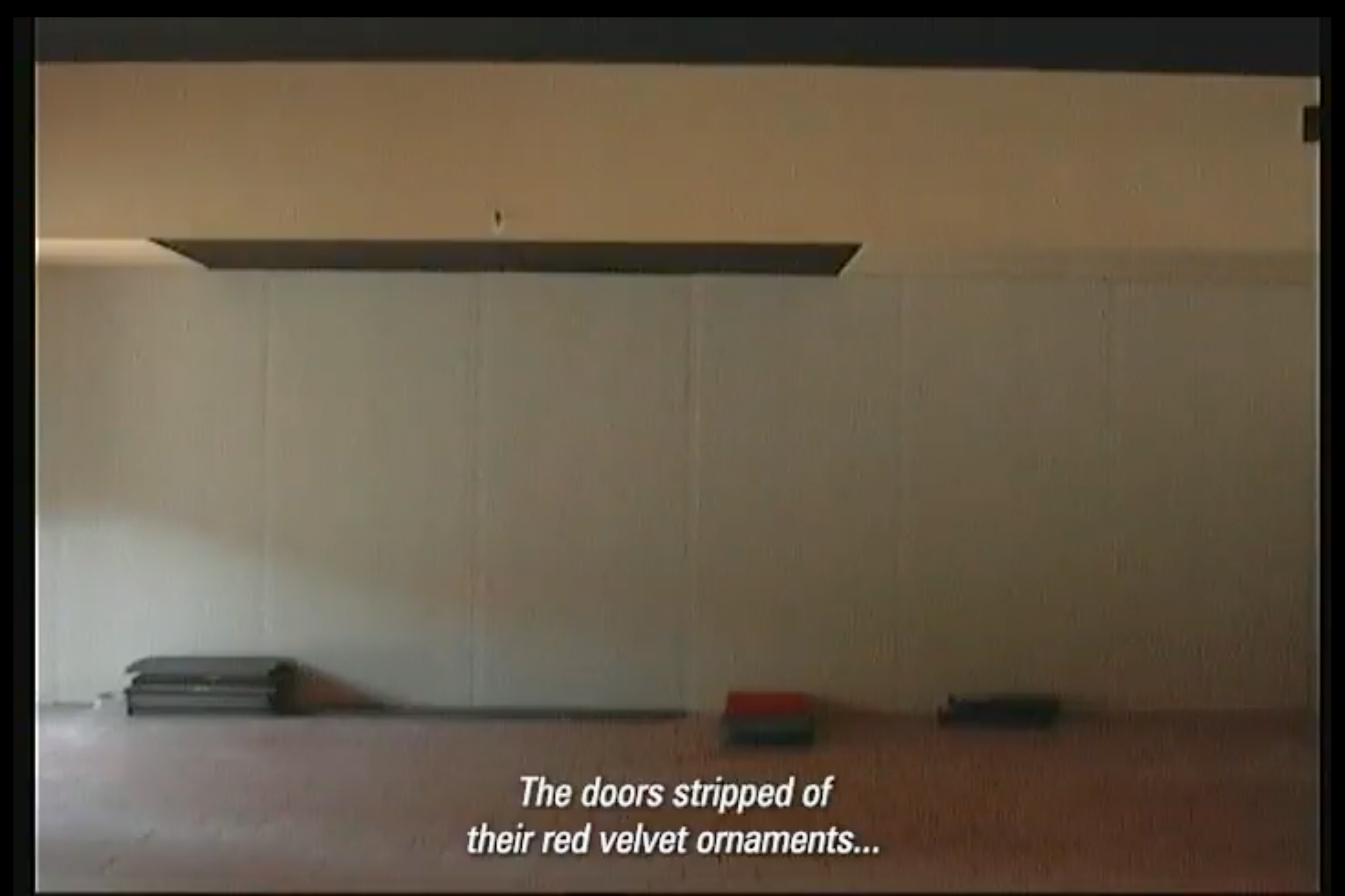
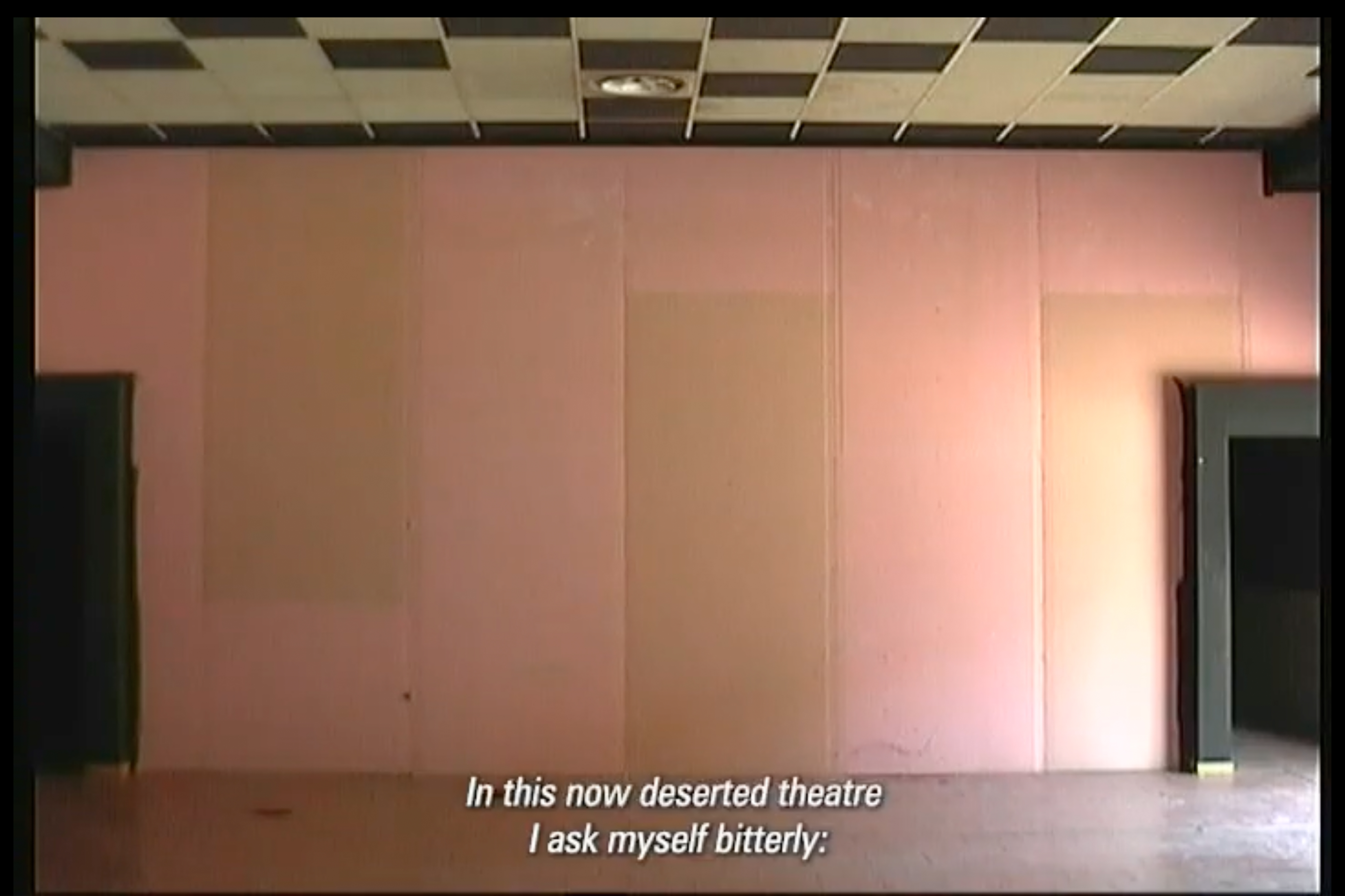
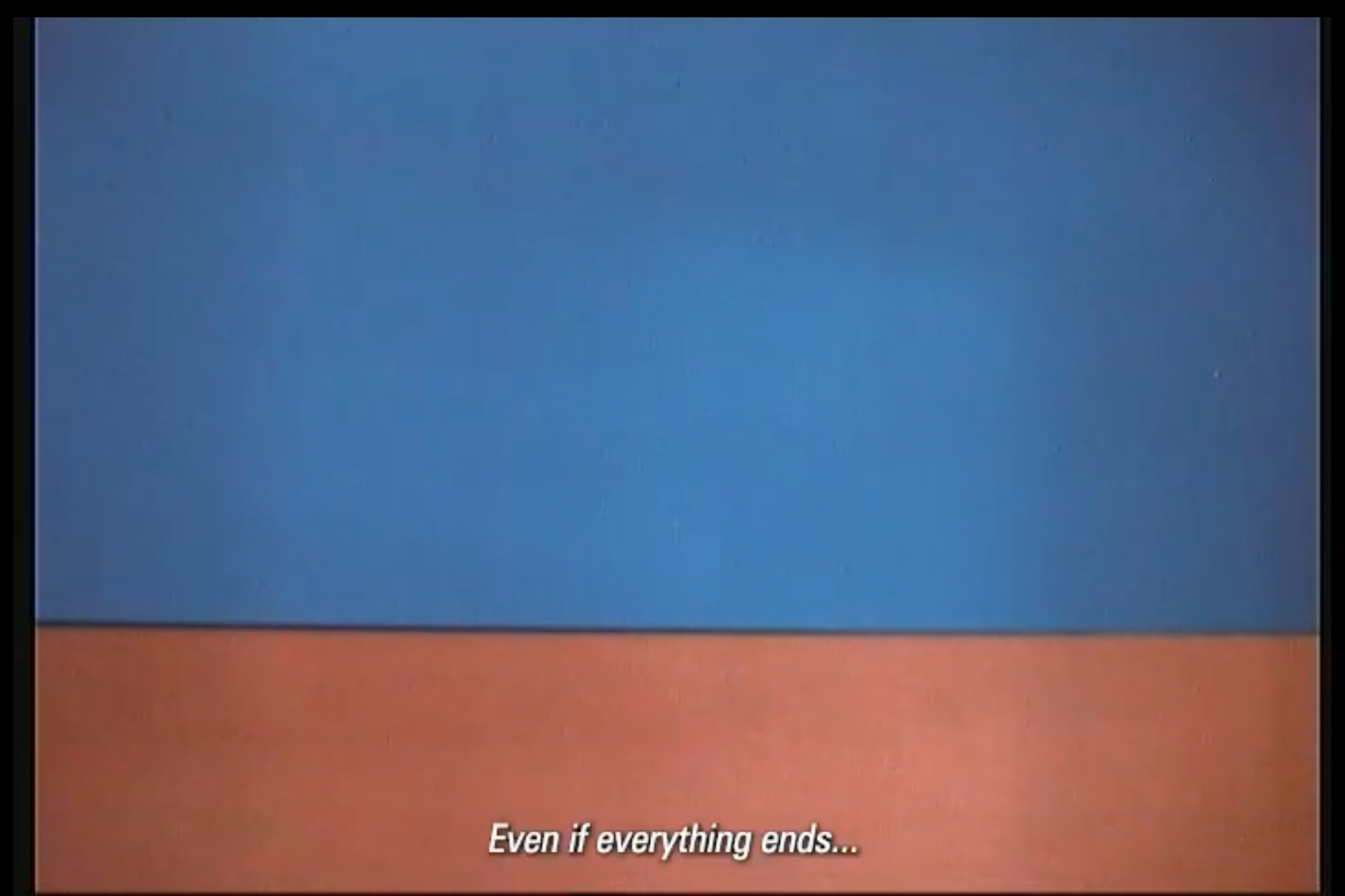
ORA NON C'È PIÙ
Video
2024
2024
A psychogeographic video requiem examining one of the last red-light theatres in Europe, nestled on the border between Switzerland and Italy. Through the intimate reflections of its owner Flavio, we get a first hand account of a place pressed by ever-relentless progress, jeopardizing its continued existence. And yet it exists. A time capsule. A mirage, almost - of hidden desires, nostalgia for days gone by, and resilience, as the ultimate act of transgression. The bittersweet beauty of desperately holding on to something, knowing that your days are numbered. Knowing that, very soon, these things - like so many others - will have become a thing of the past.
Presented at CHIUSO,
part of Microclima Variable closing exhibition,
the XXVIII edition of CSAV - Artists Research Laboratory -
at the Fondazione Antonio Ratti.
Camera © Edoardo Bonacina
Single channel video on MiniDVtape,
loop ca. 3 min
Presented at CHIUSO,
part of Microclima Variable closing exhibition,
the XXVIII edition of CSAV - Artists Research Laboratory -
at the Fondazione Antonio Ratti.
Camera © Edoardo Bonacina
Single channel video on MiniDVtape,
loop ca. 3 min
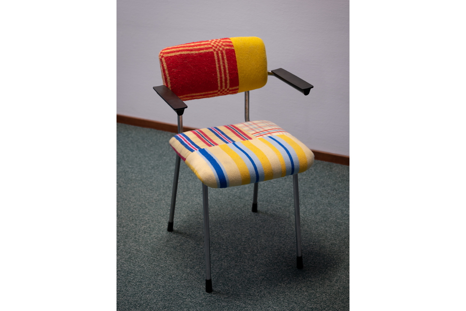
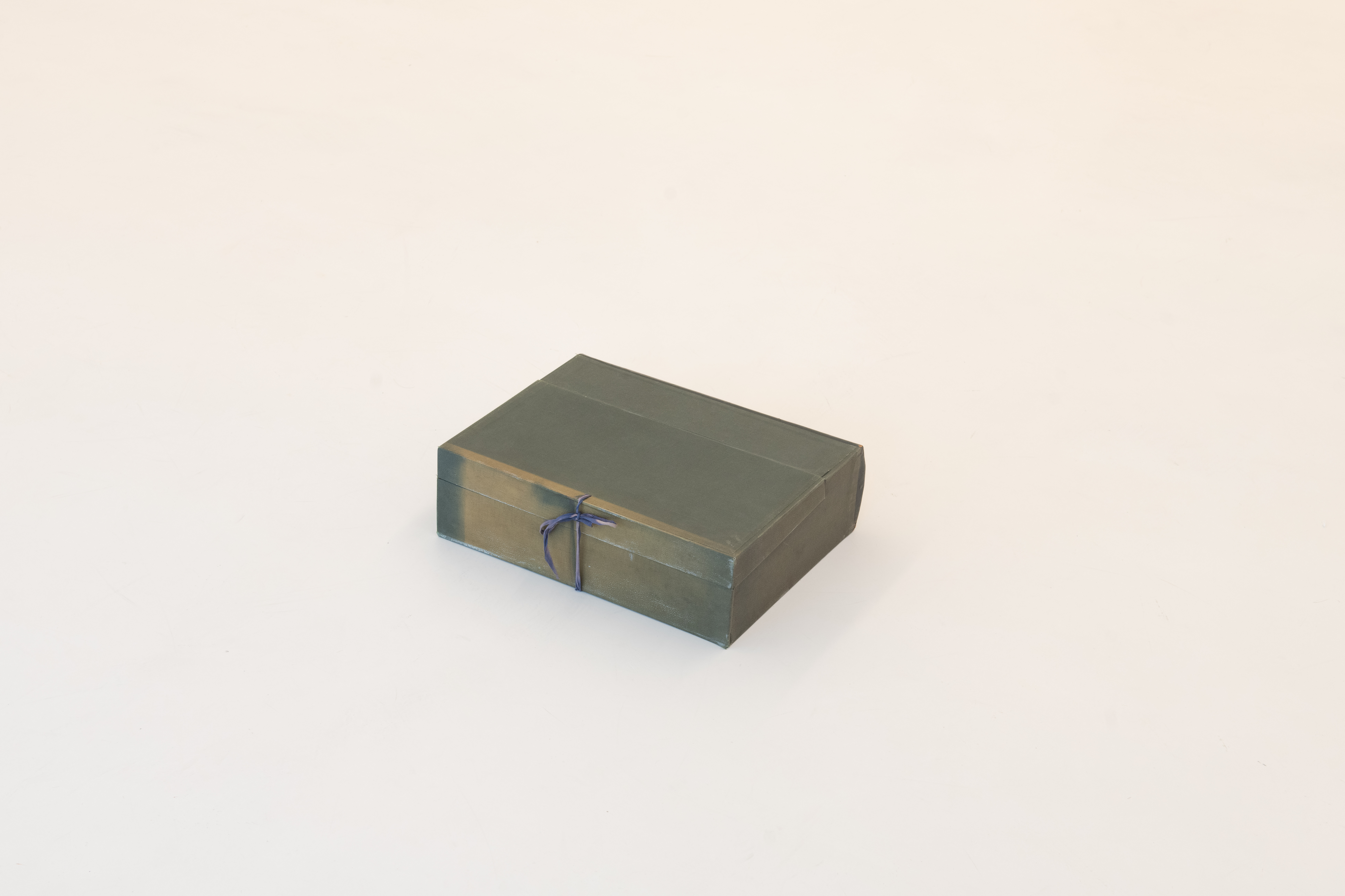
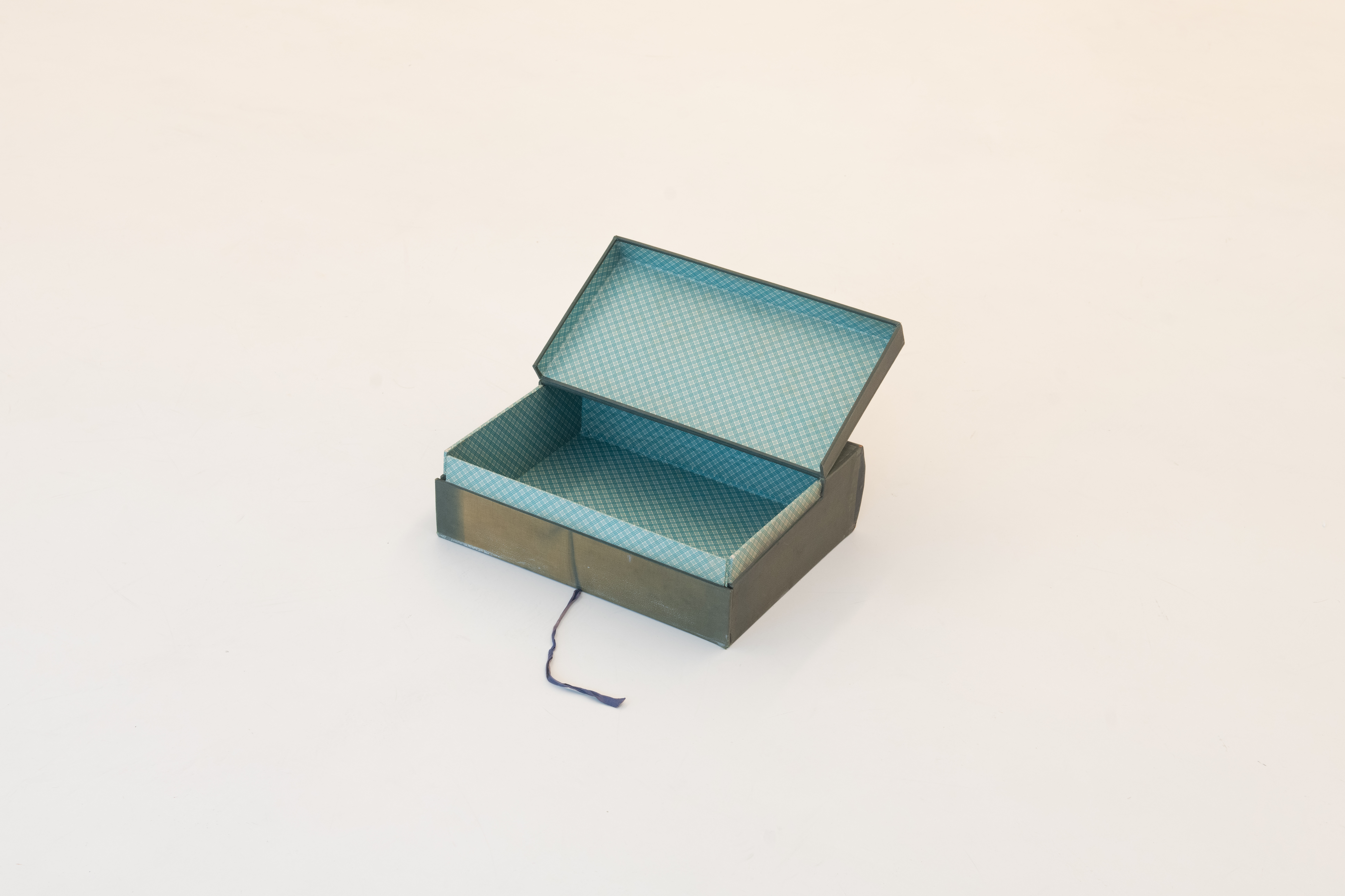
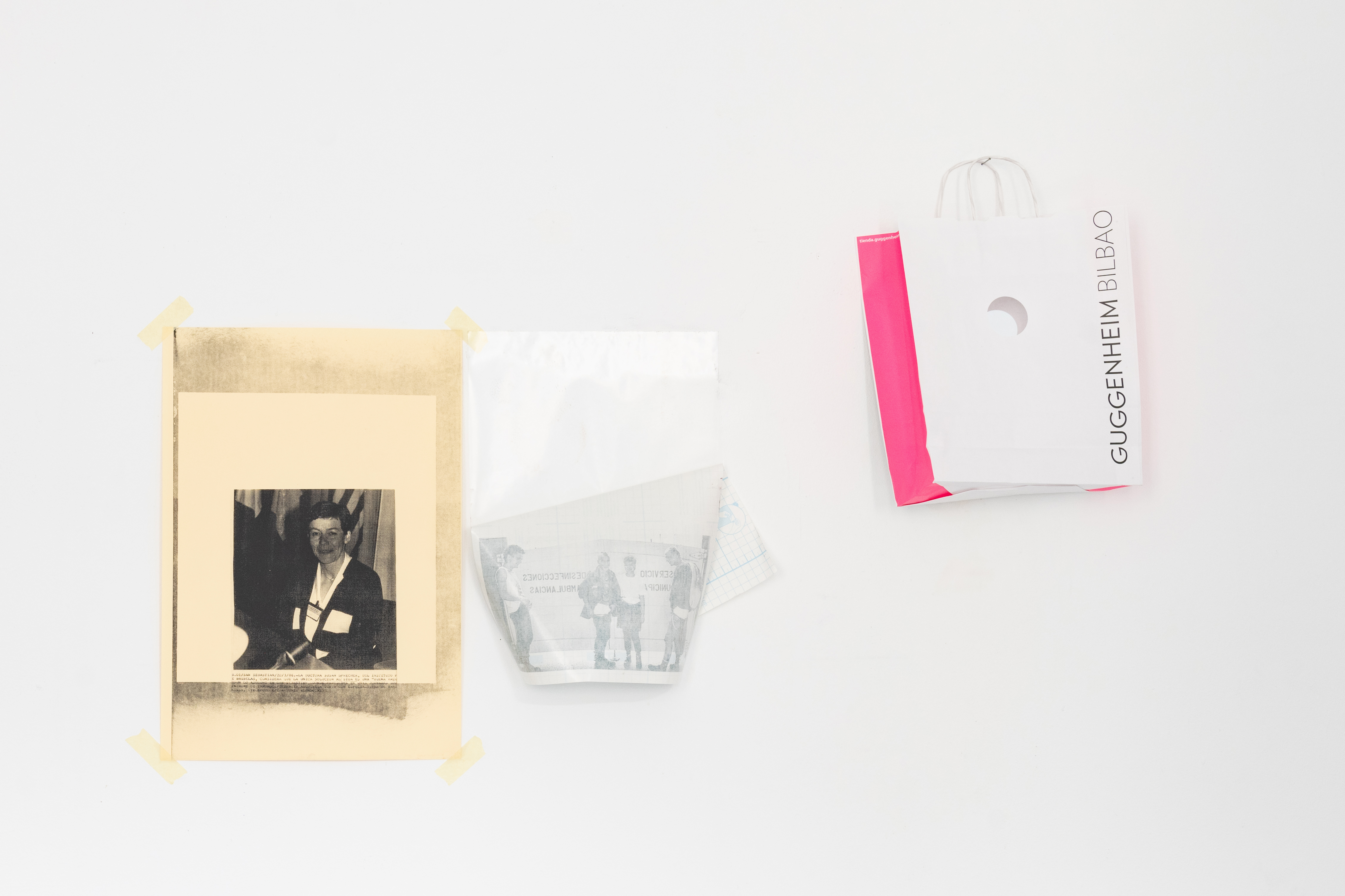
HOMMAGE À KAIXA
(HOMAGE TO KAIXA)
Artist´s Book
2025
2025
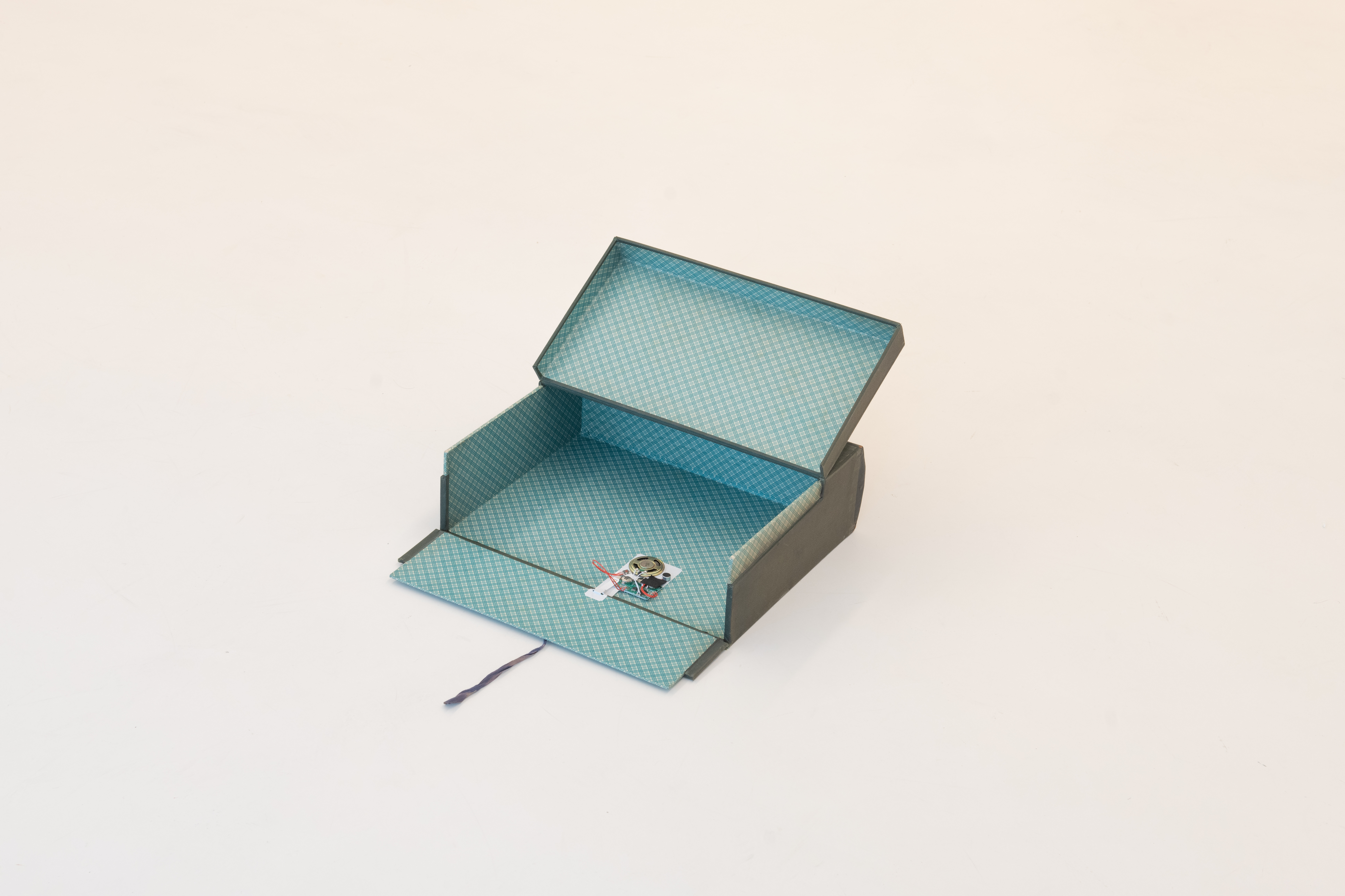
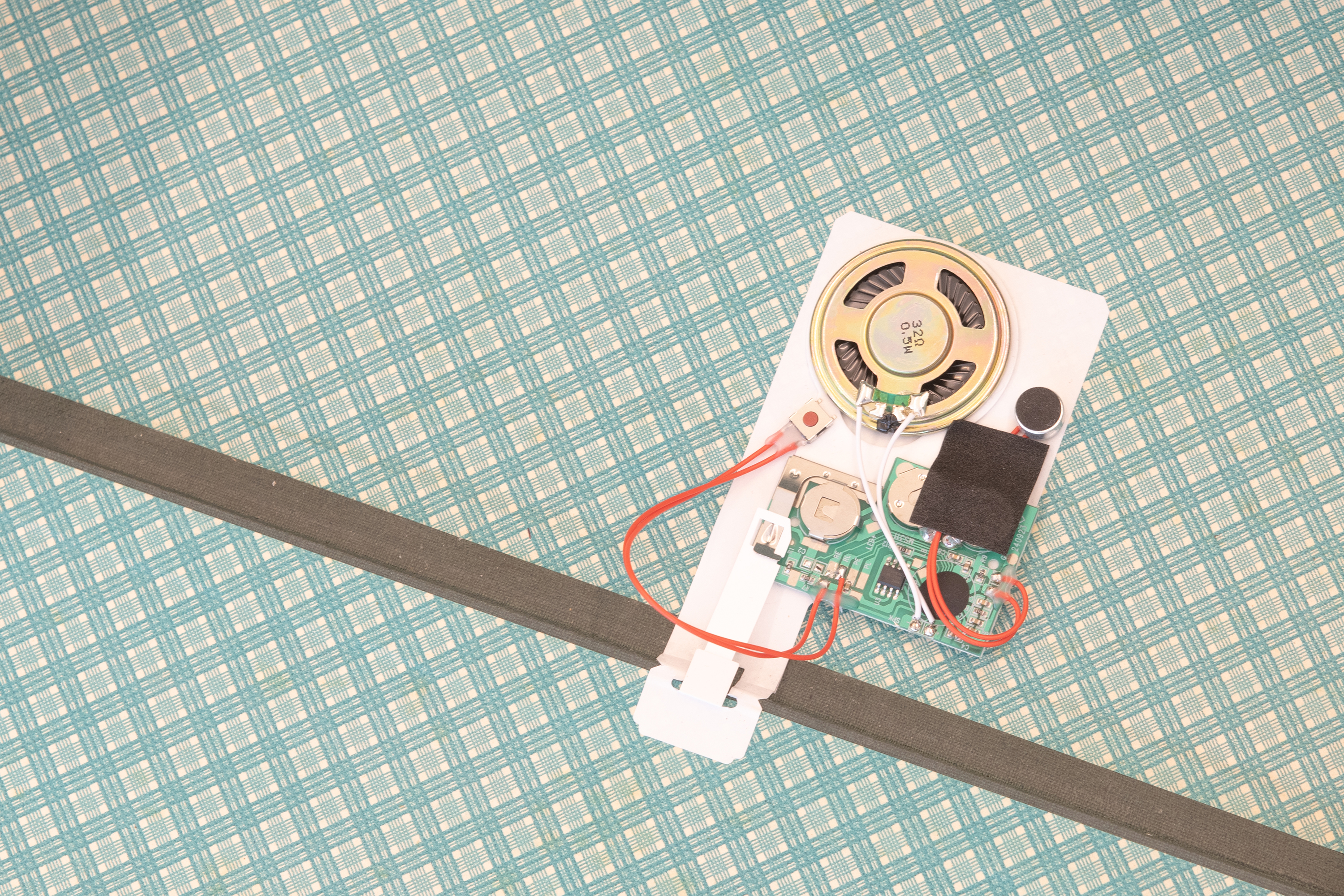
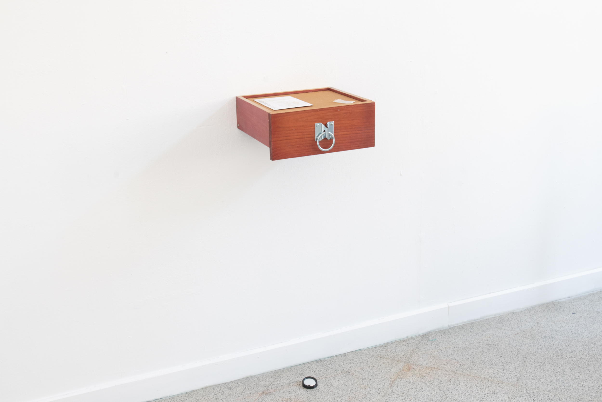
Hommage à Kaixa takes the form of a book housed within an archival box from the Biscay Provincial Council. Inside, a sound chip loops the phrase 概念艺术确实很危险, spoken in Mandarin by a woman living in Bilbao who sells Amazon “surprise packages,” figures Matauko mobilizes as objects of oblivion in IYKYK. Displaced within the bureaucratic logic of the archive, the voice unsettles the order that seeks to contain it, acting as a mischievous trigger that slips beyond assimilation.
38 × 31 × 11.5 cm
13 sec looped recording
We only become what we are by the radical and deep-seated refusal of that which others have made of us…. I think we understood this thruth at one time, but we have forgotten it - that no gentleness can efface the marks of violence; only violence itself can destroy them.
—Jean-Paul Sartre, preface to Frantz Fanon, Wretched of the Earth—
Collection BilbaoArte Bilduma
No. Registro: 2025.632.1
Artists in Residence 2024/25: New Acquisitions at
URIBITARTE 40
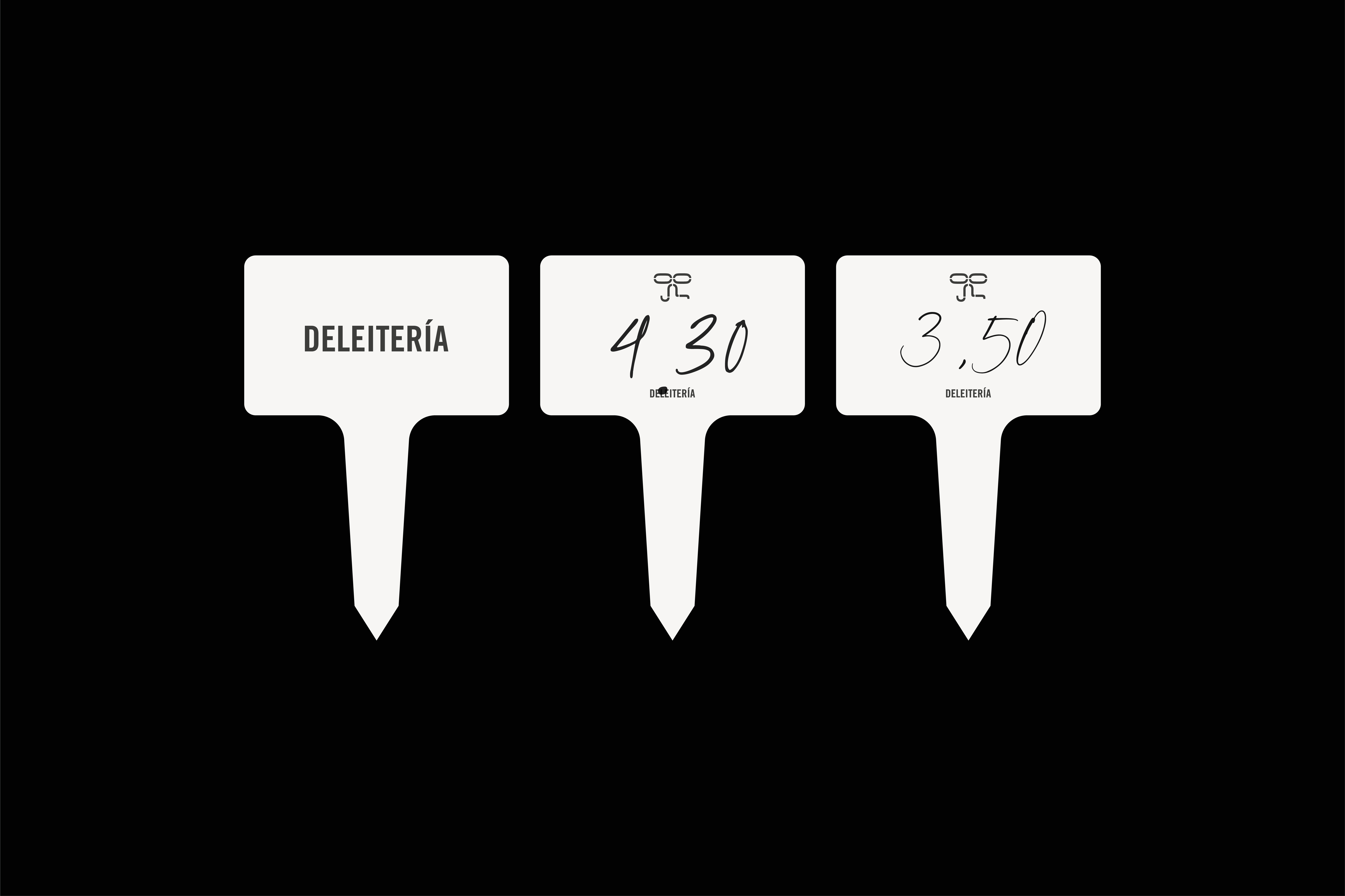
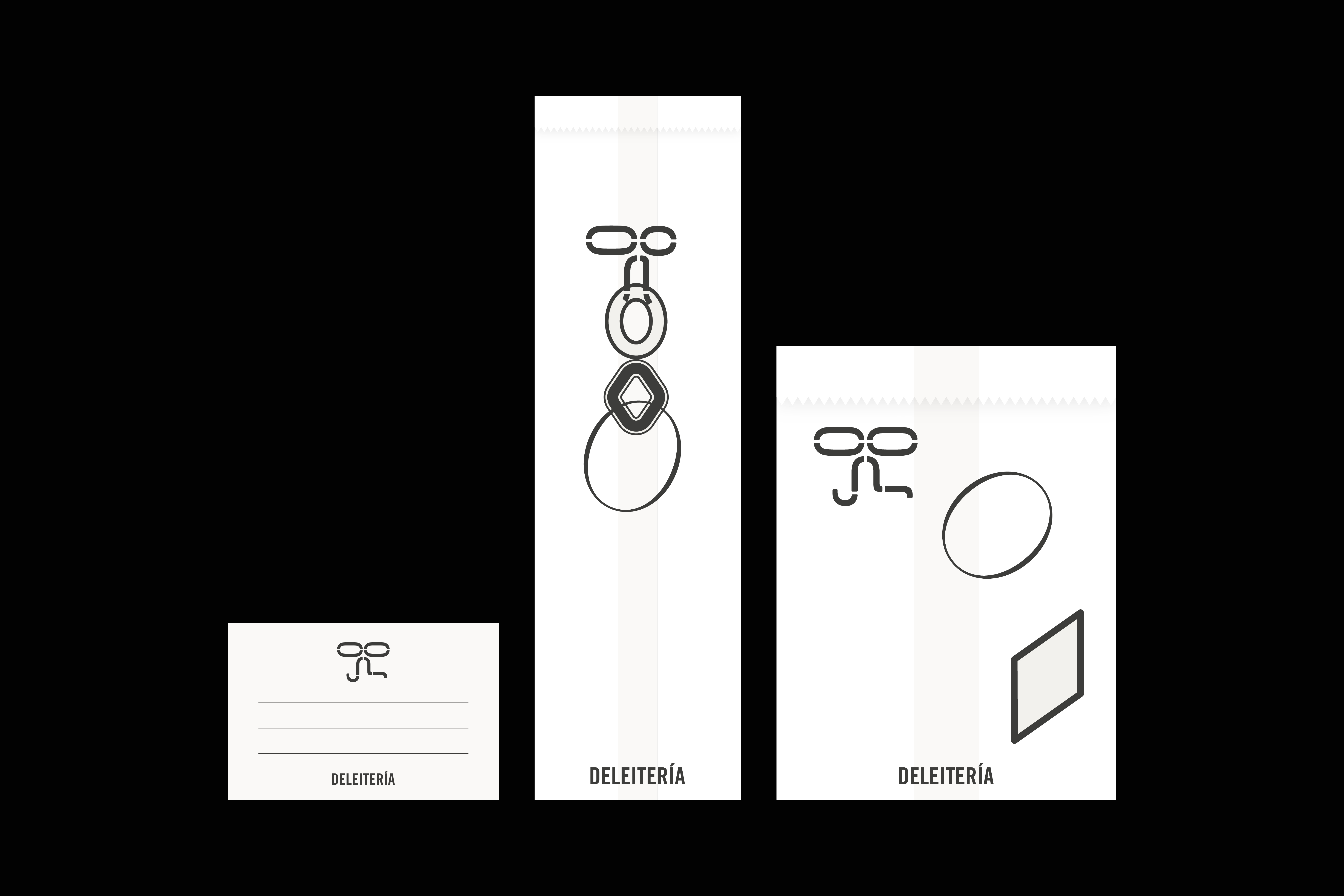
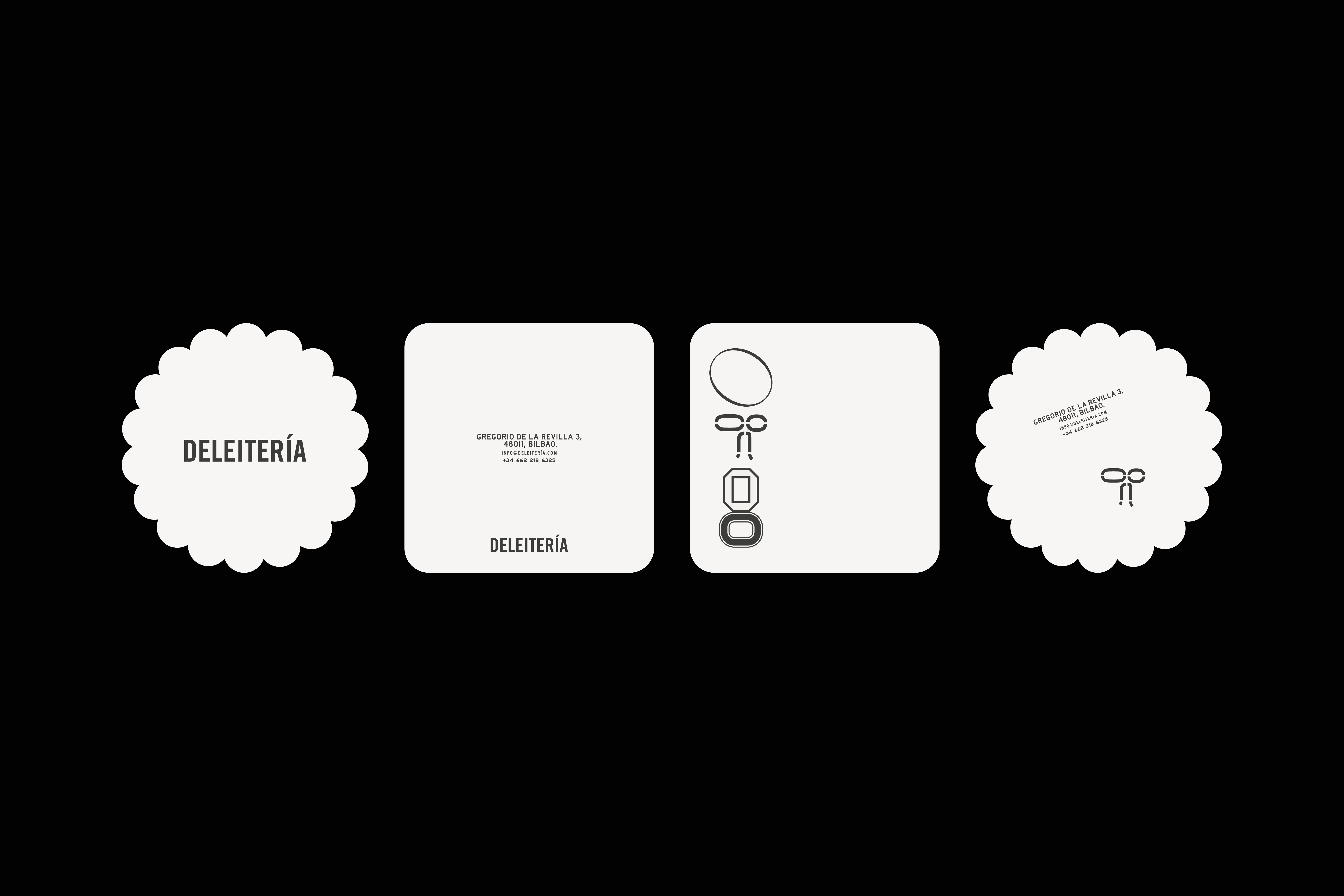
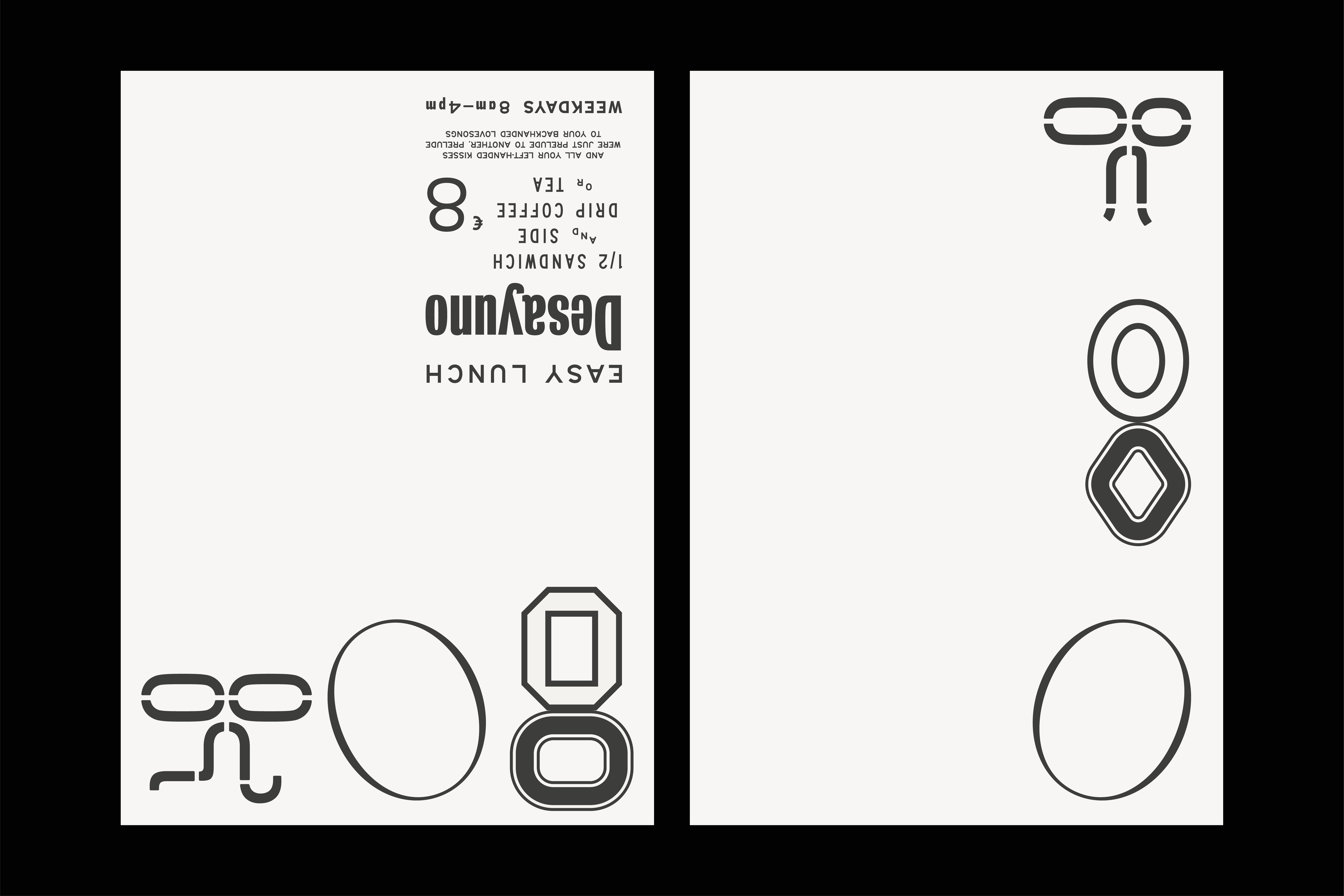
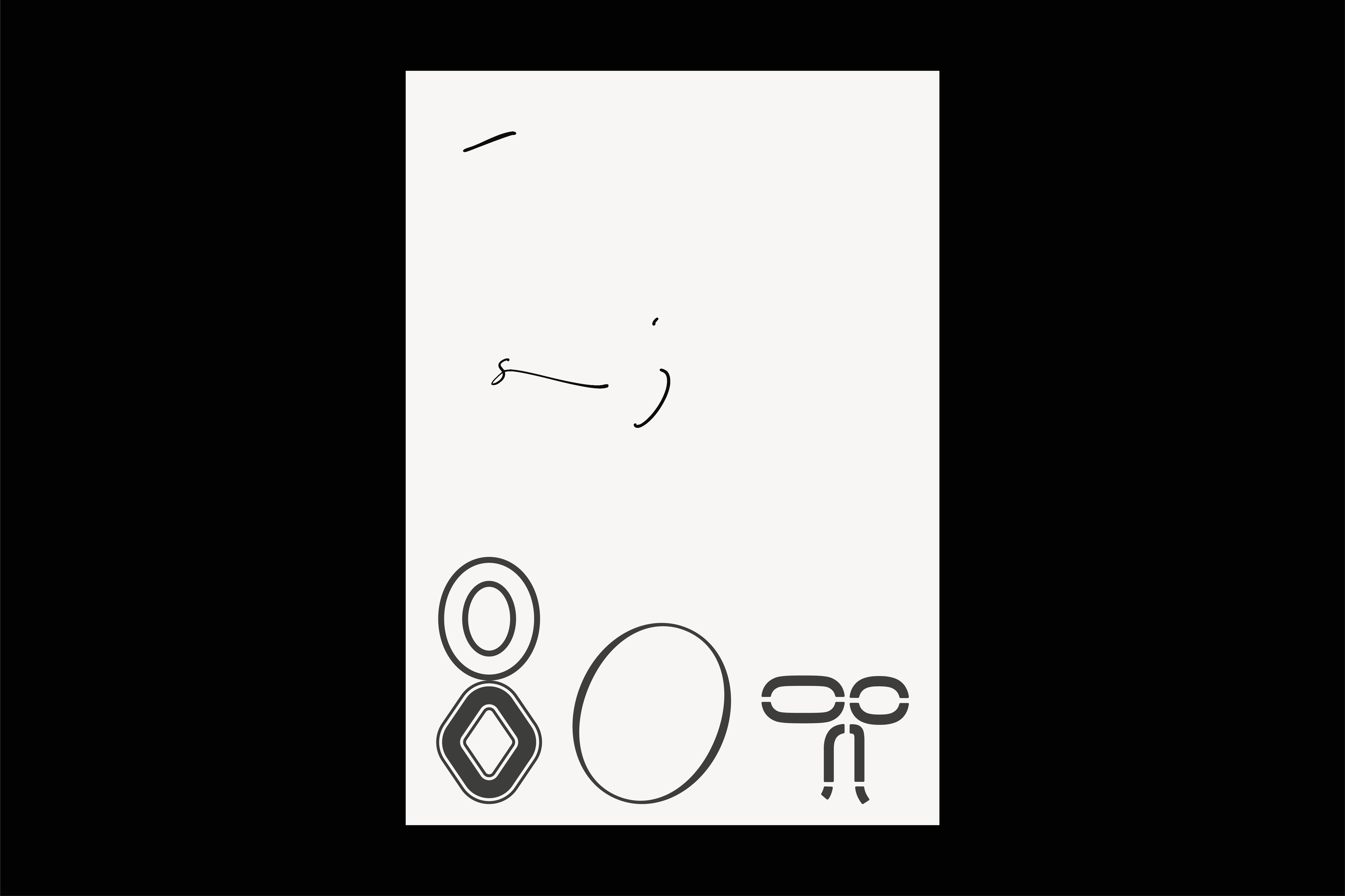
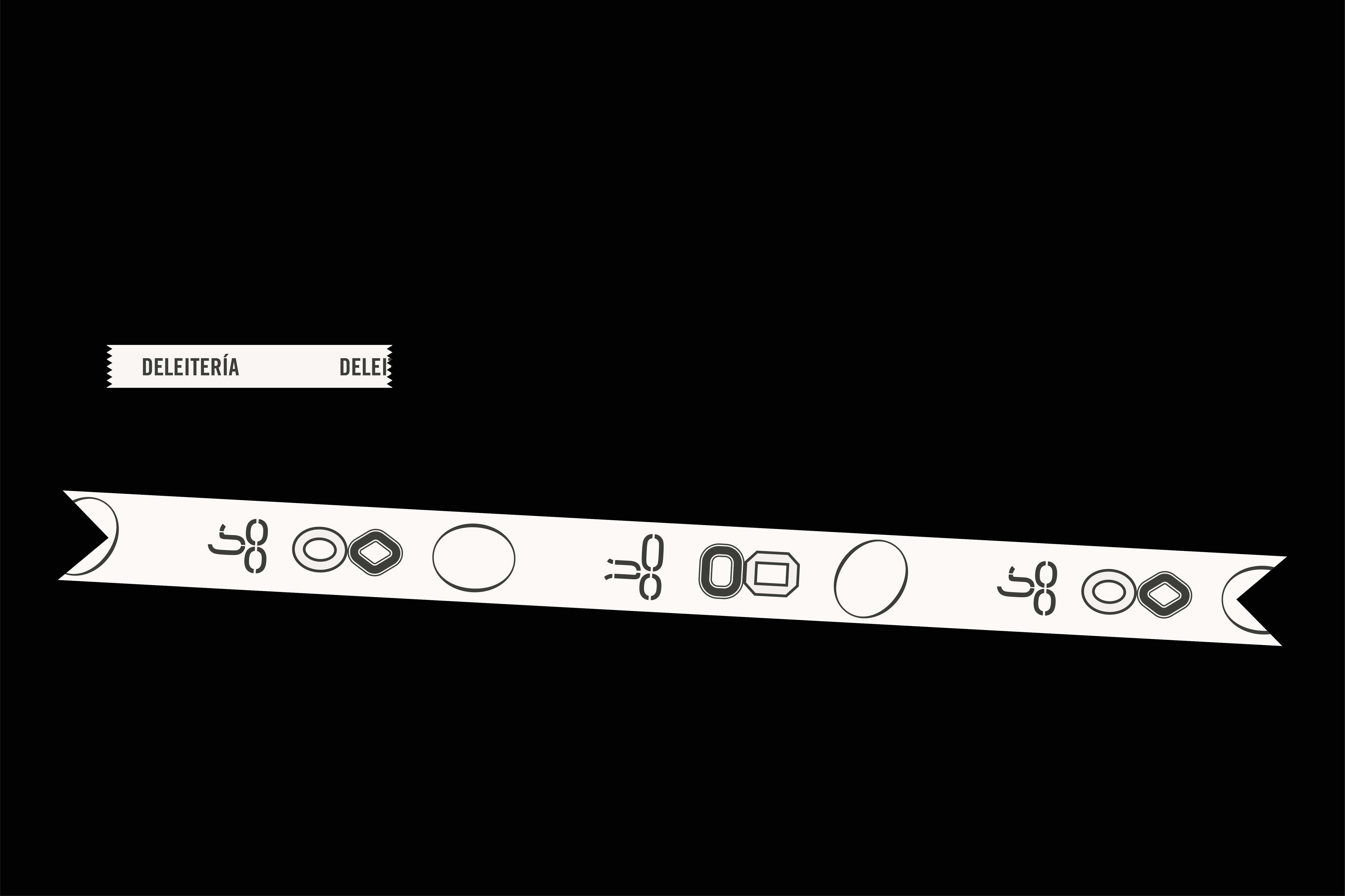
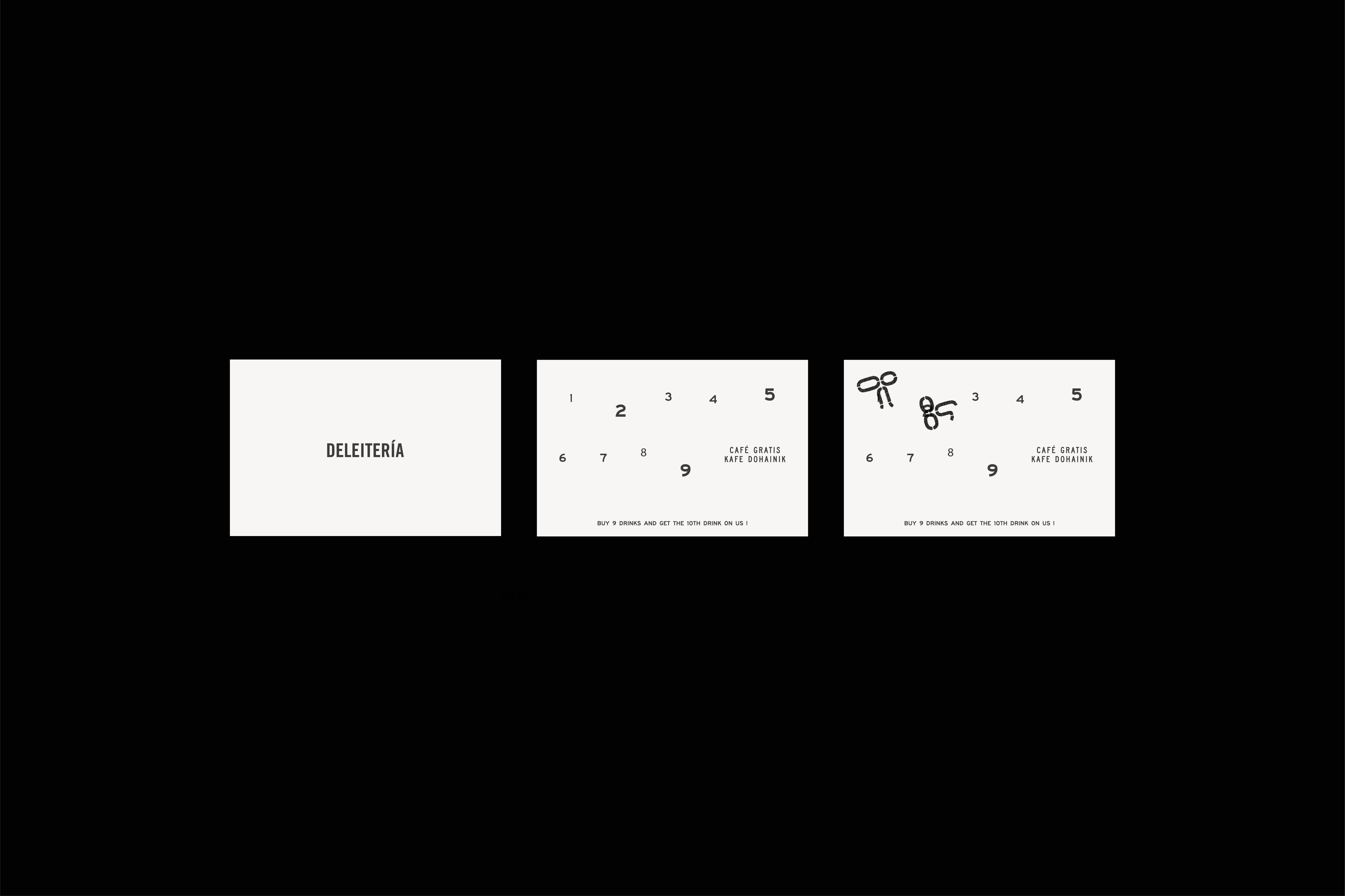
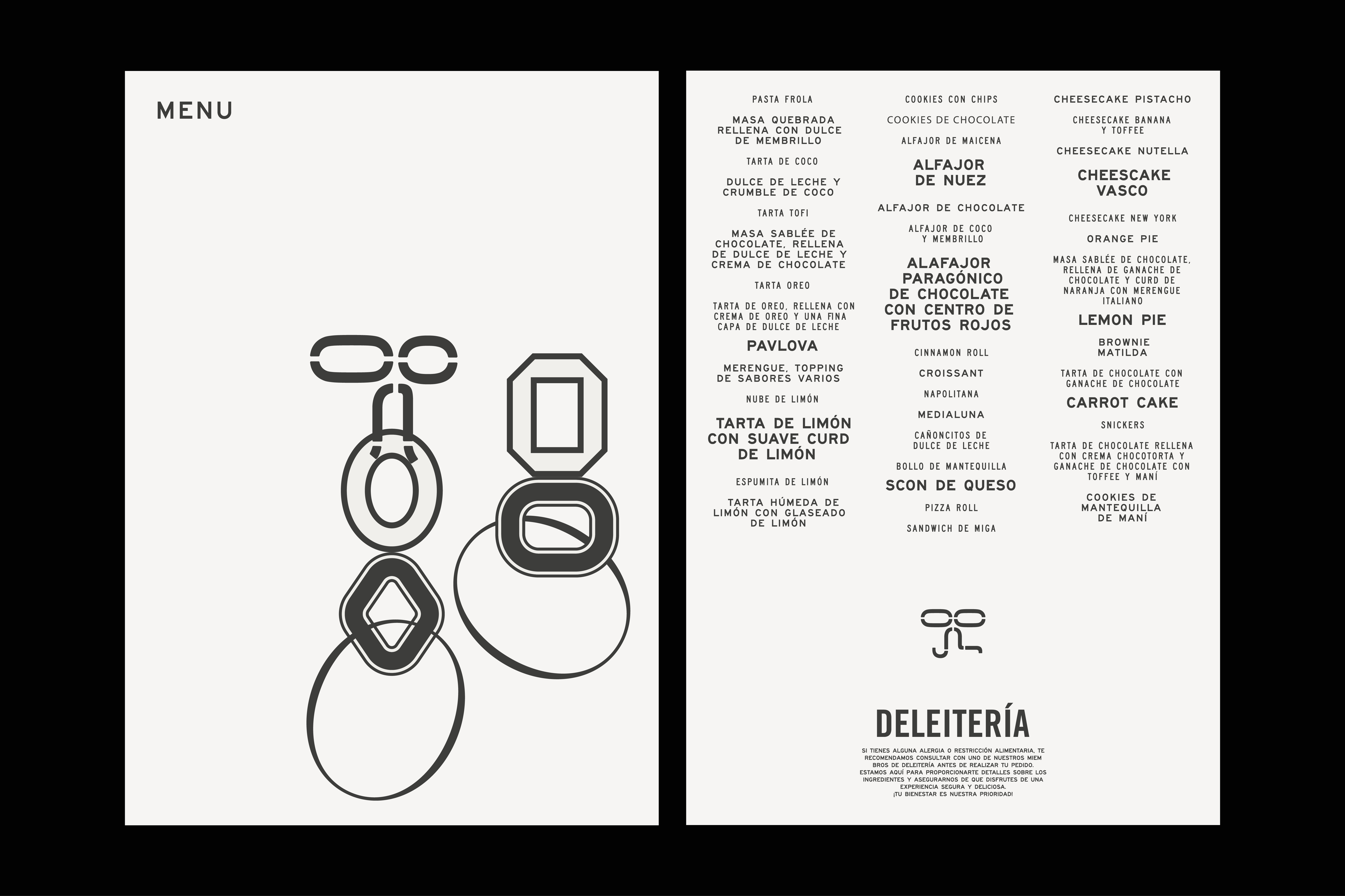
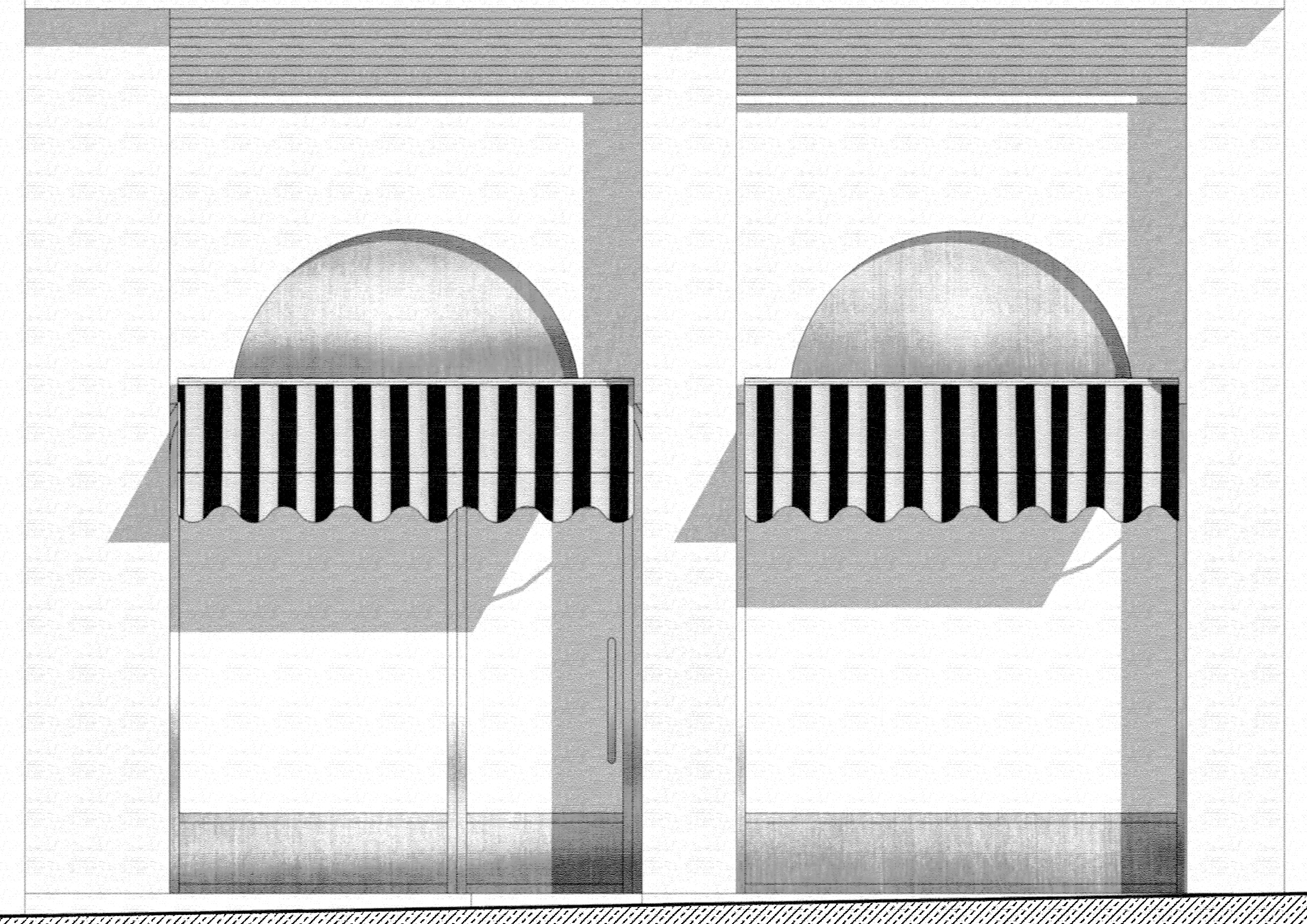
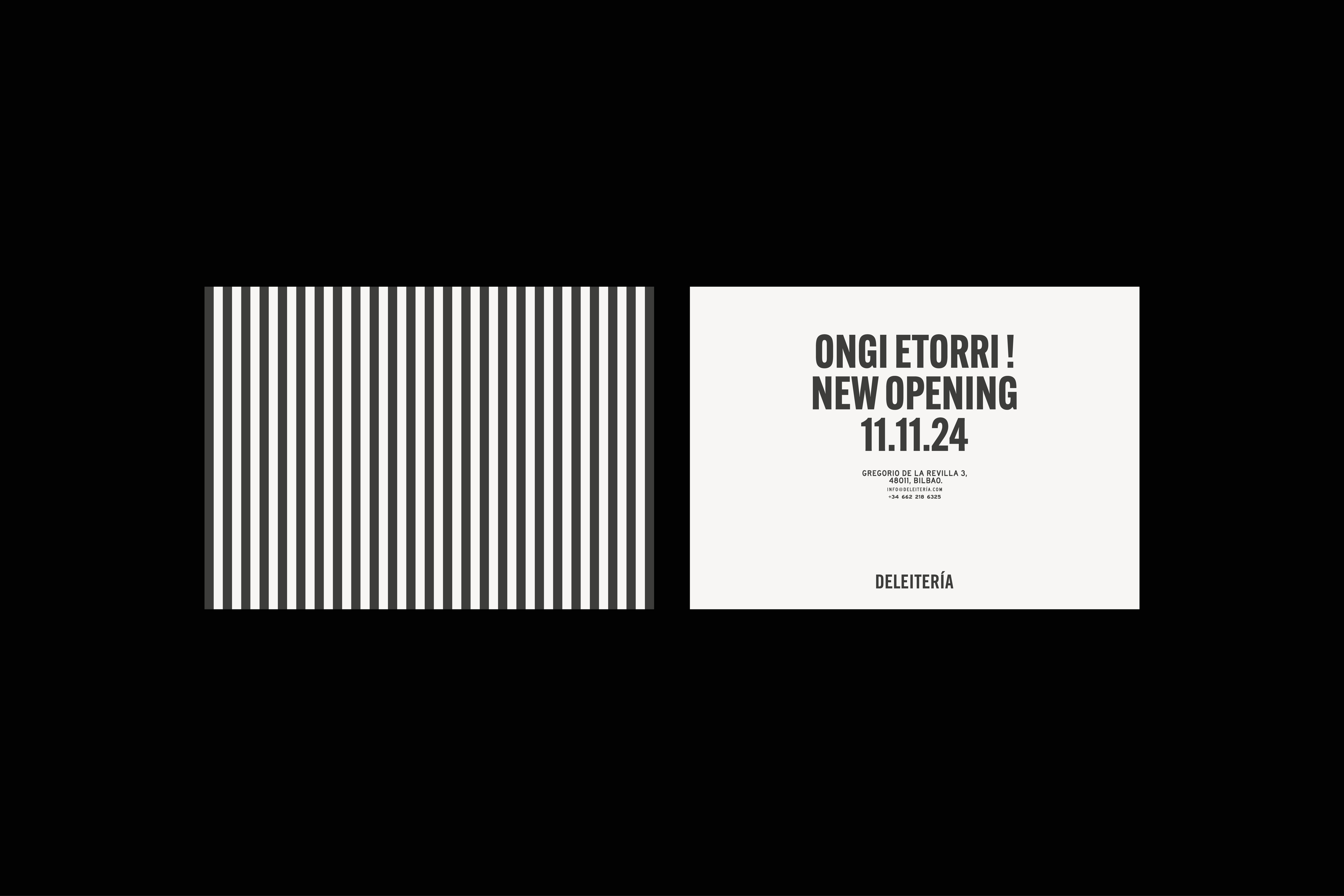
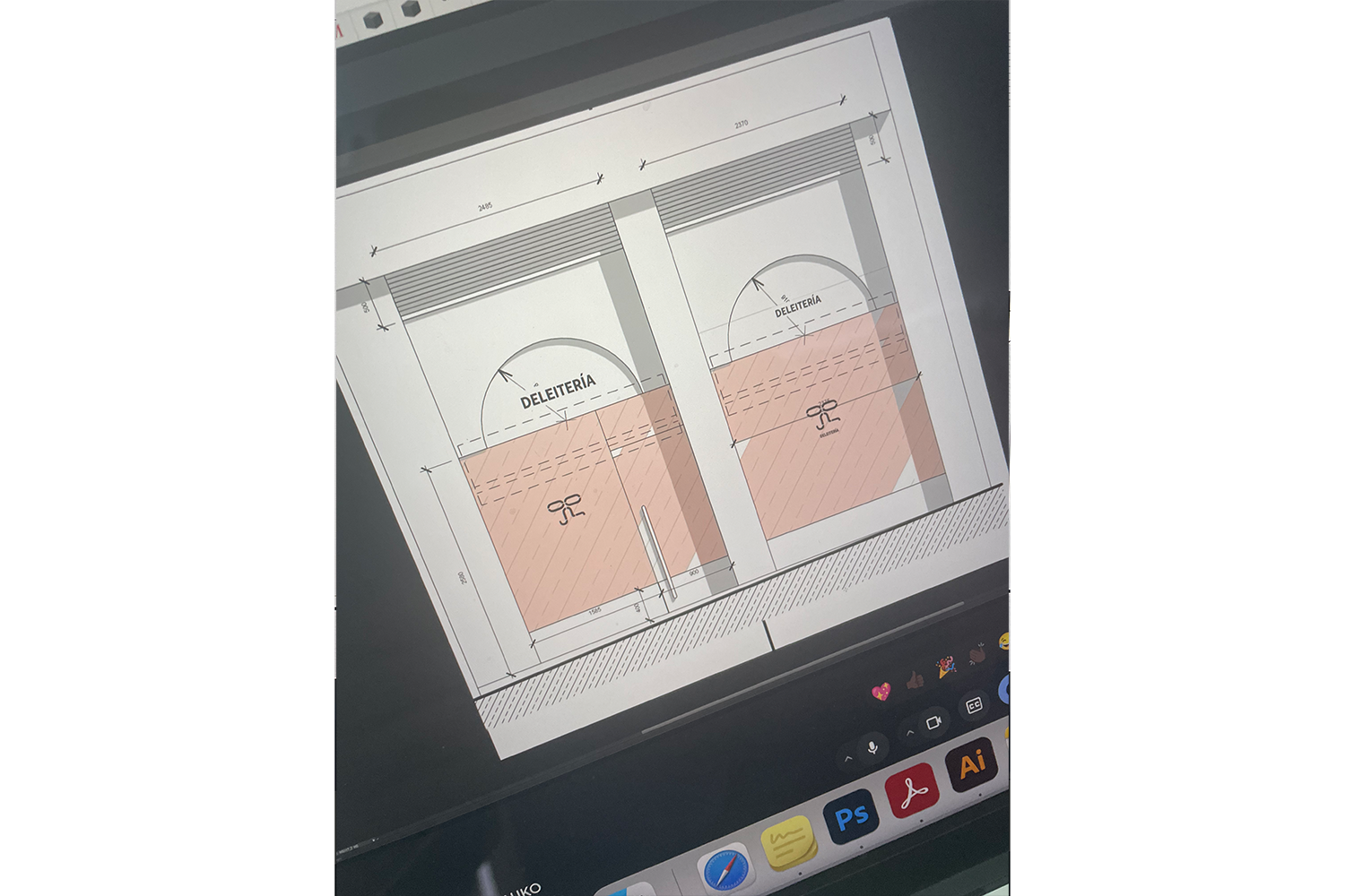
DELEITERÍA
Visual Identity
2025
Deleitería is a contemporary coffee space located in Bilbao that celebrates Argentinian pastry tradition with a refined and eclectic twist. Its visual identity draws inspiration from the tools used in the making of cakes and sweets—molds, whisks, rings, and cutters—translating their forms into a clean system of geometric shapes. The logo, a delicate ribbon, symbolizes the bond between generations and cultures: the gestures shared between mother and daughter, and the exchange between Argentina and the Basque Country. The visual system expands on this idea of union through interlocking shapes—circles, ovals, and squares—that evoke both ingredients and gestures: the swirl of a spoon, the layering of a cake, the softness of a crumb.
Black and white were chosen to give presence to the pastries while toning down the colorful and eclectic interior. This restrained palette highlights craftsmanship and precision, allowing the sweets to become the visual and emotional focus. The mix of typefaces in different weights and styles introduces a sense of freedom—a relaxed laissez-faire attitude that contrasts with the sophistication of fine pastry, making the brand both elegant and approachable.


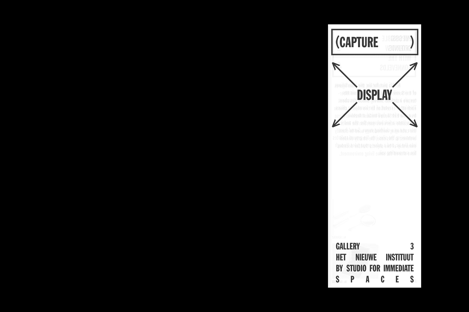
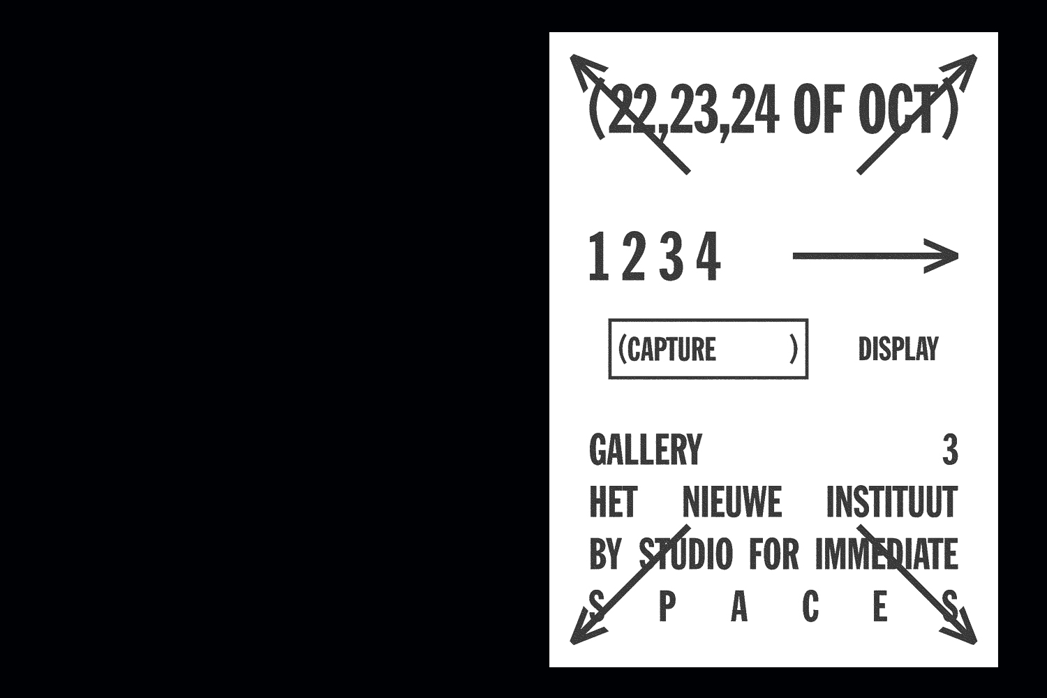
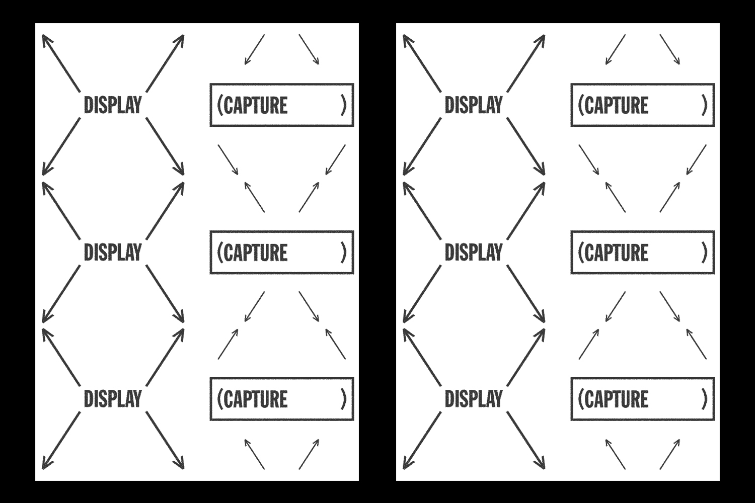
CAPTURE DISPLAY
Editorial, Visual Identity, Exhibition
2021
2021
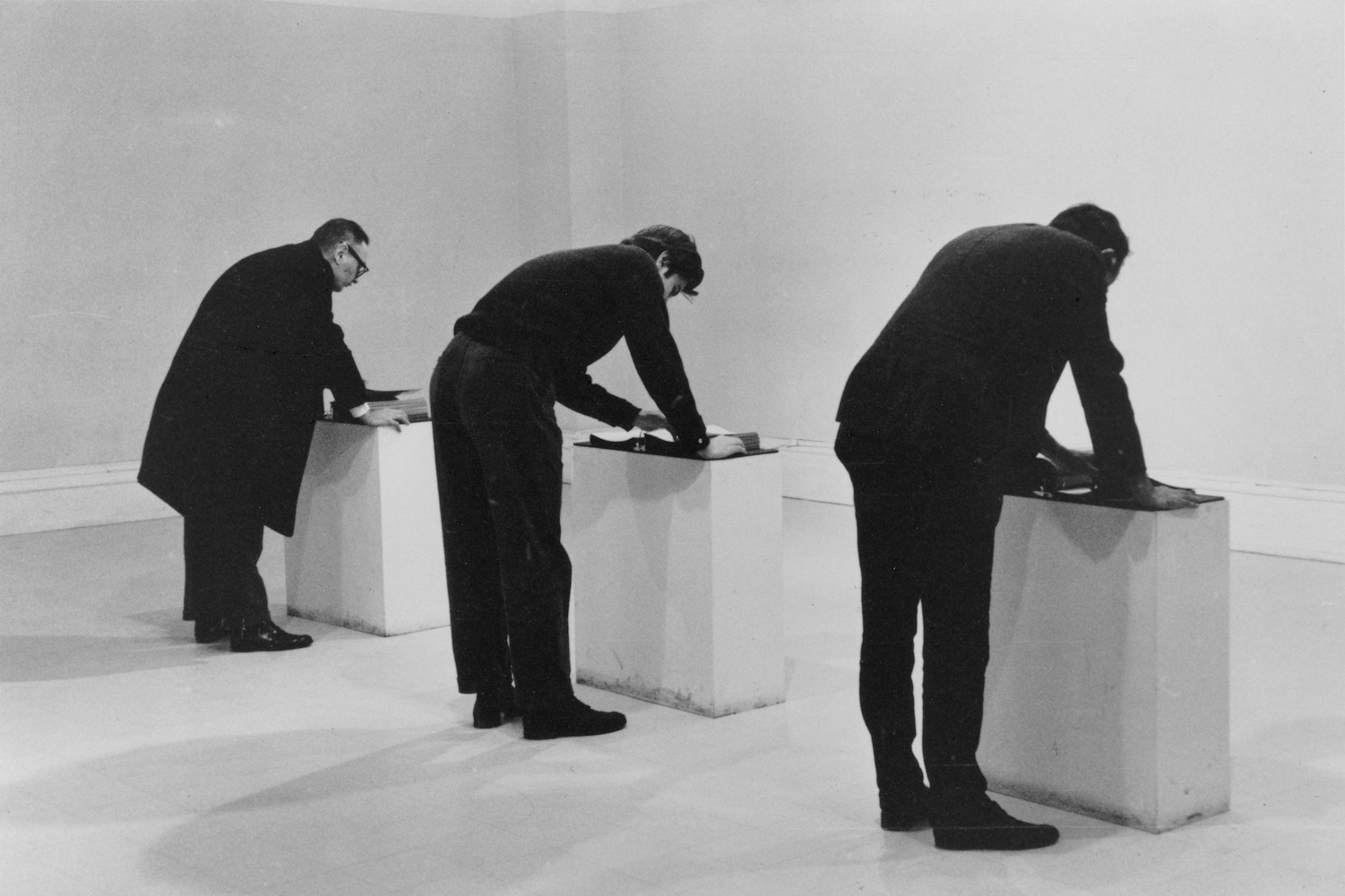
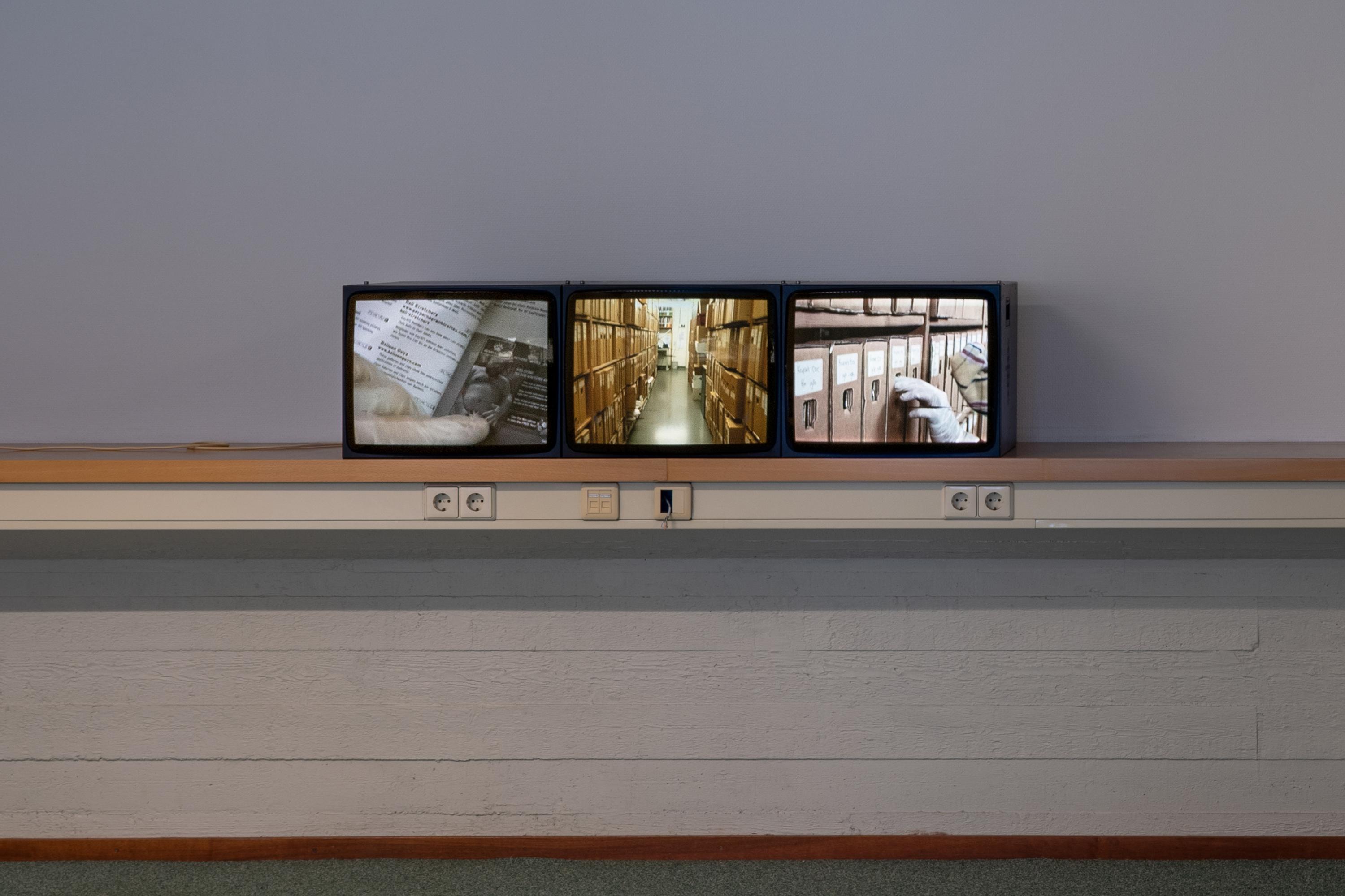
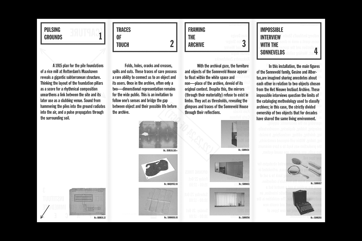
Sandberg Instituut’s Studio for Immediate Spaces spent a week in close contact with the collection and the spaces of Het Nieuwe Instituut. Working collaboratively, the participants identified key documents from the drawings, photographs and models belonging to the archives of Dutch architects and urban planners. They considered how things appear, how they are stored, who collected them and why they were kept and deposited. Finally, they mobilized the documents, giving thought and shape to what they wanted the documents to do differently. The result is an exhibition as a critical documentary, exposing modes of operating on the documents: copying, enlarging, folding, displacing, recontextualizing, deleting, editing, reclassifying, translating, hiding. Within self-imposed constraints, the production was kept to a bare minimum: two walls, one printer, one sound system, one tape roll. Four groups storyboarded strategies for a potentially cinematic space, articulated in four chapters, each linking back to a set of documents from the institute’s collection. Using the archive is not a neutral but a creative act with an aesthetic intention, an audience and a purpose. The exhibition is the means to select, present and create new adjacencies, allowing for new types of knowledge circulation.


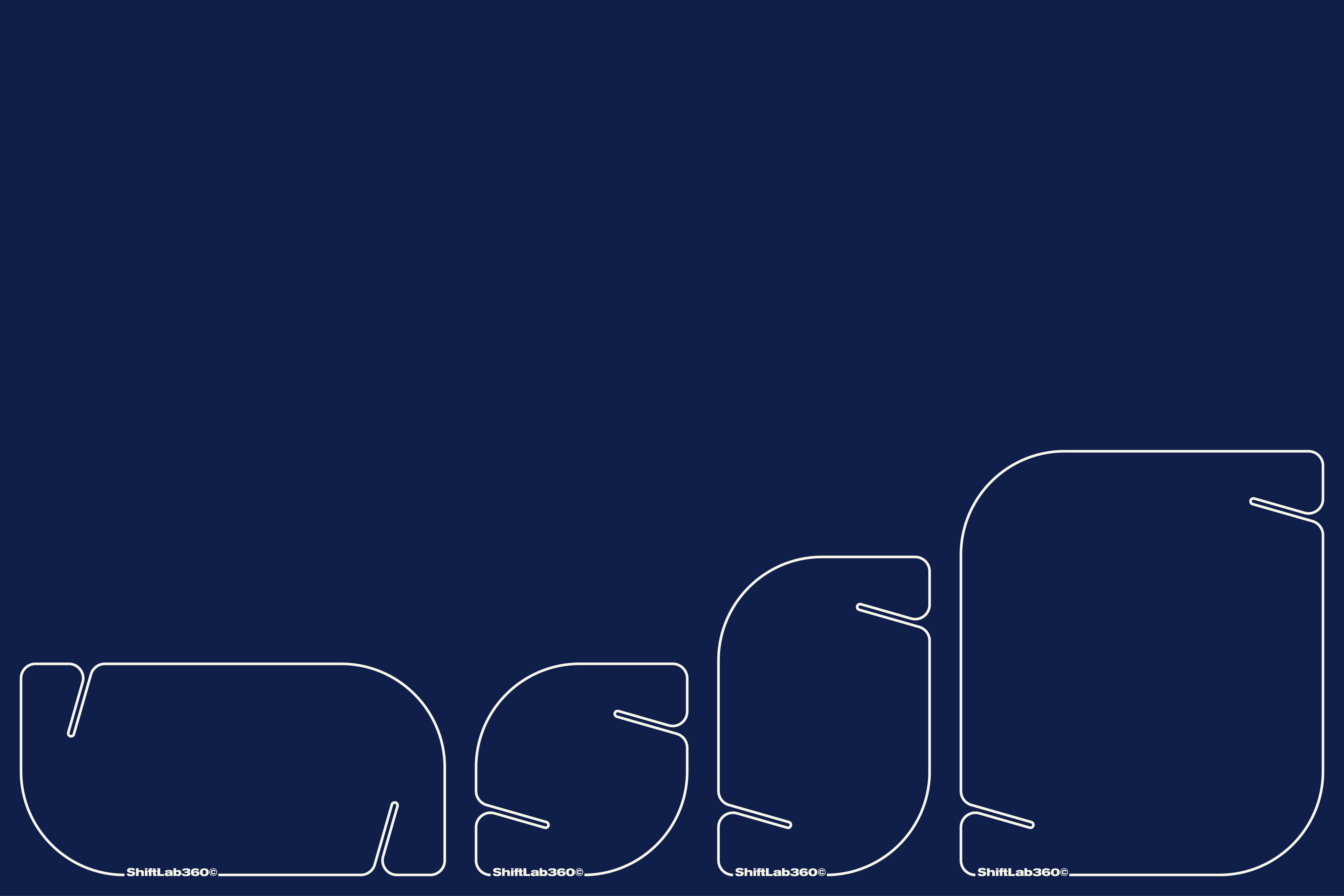
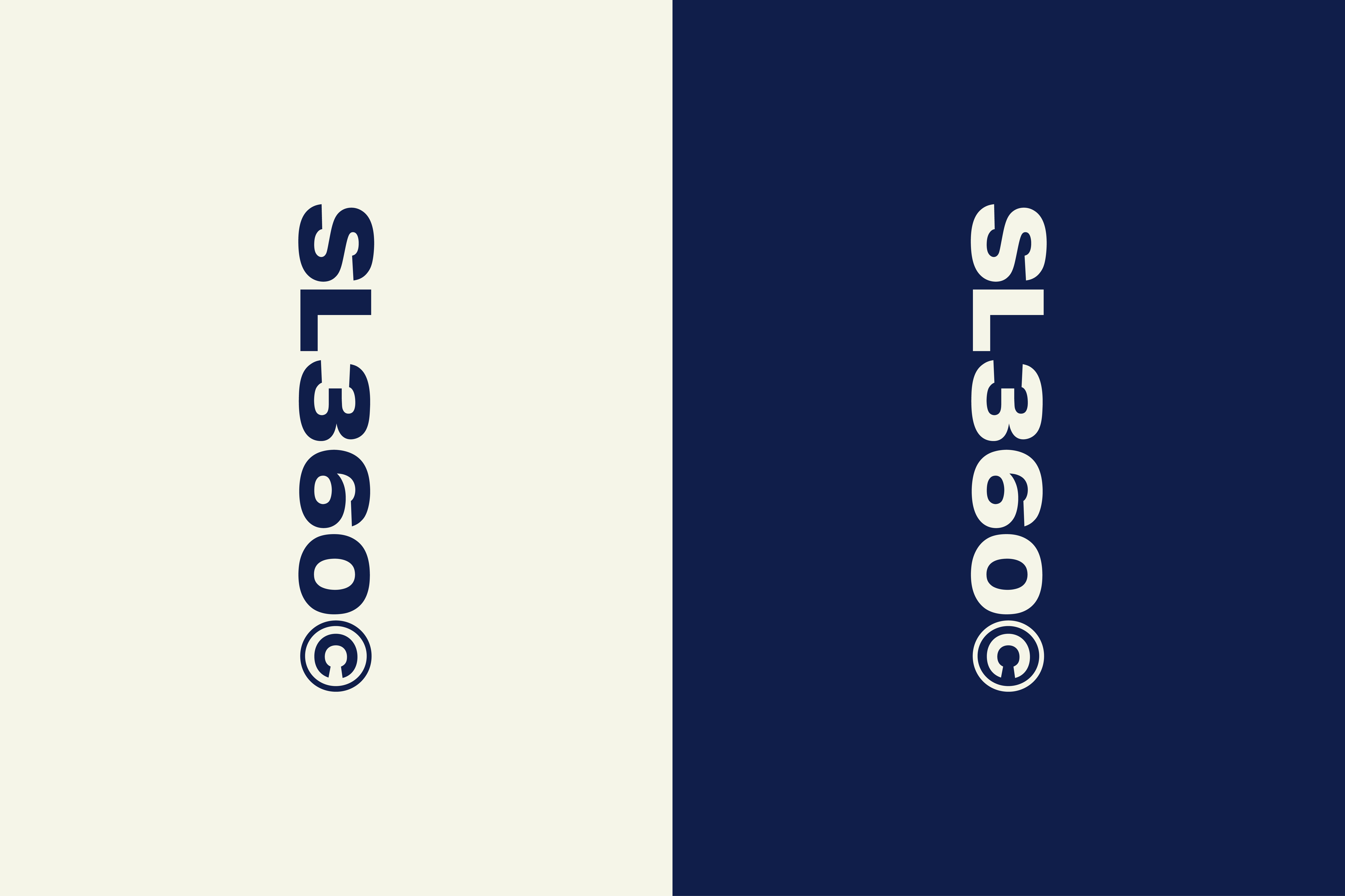
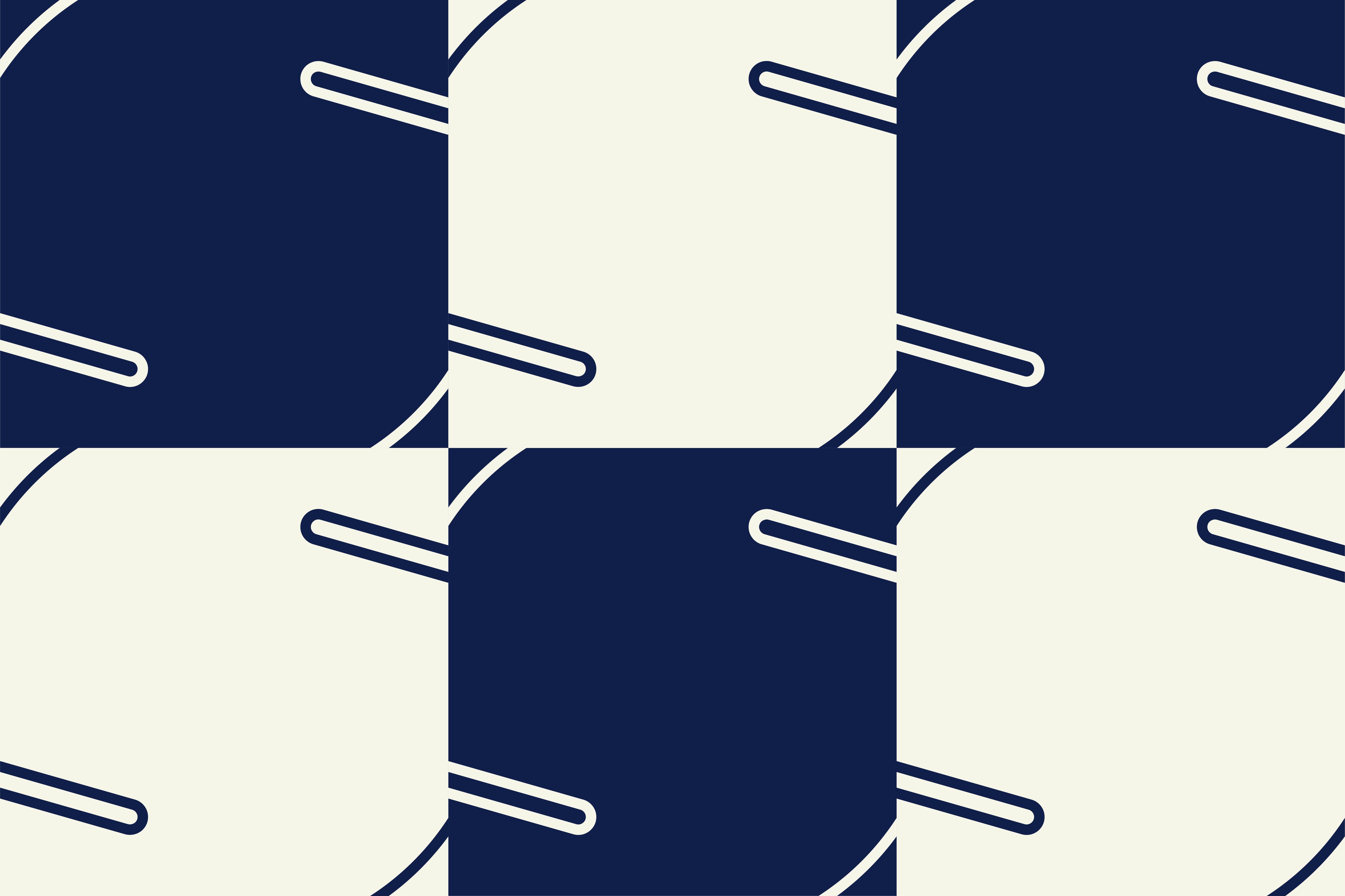
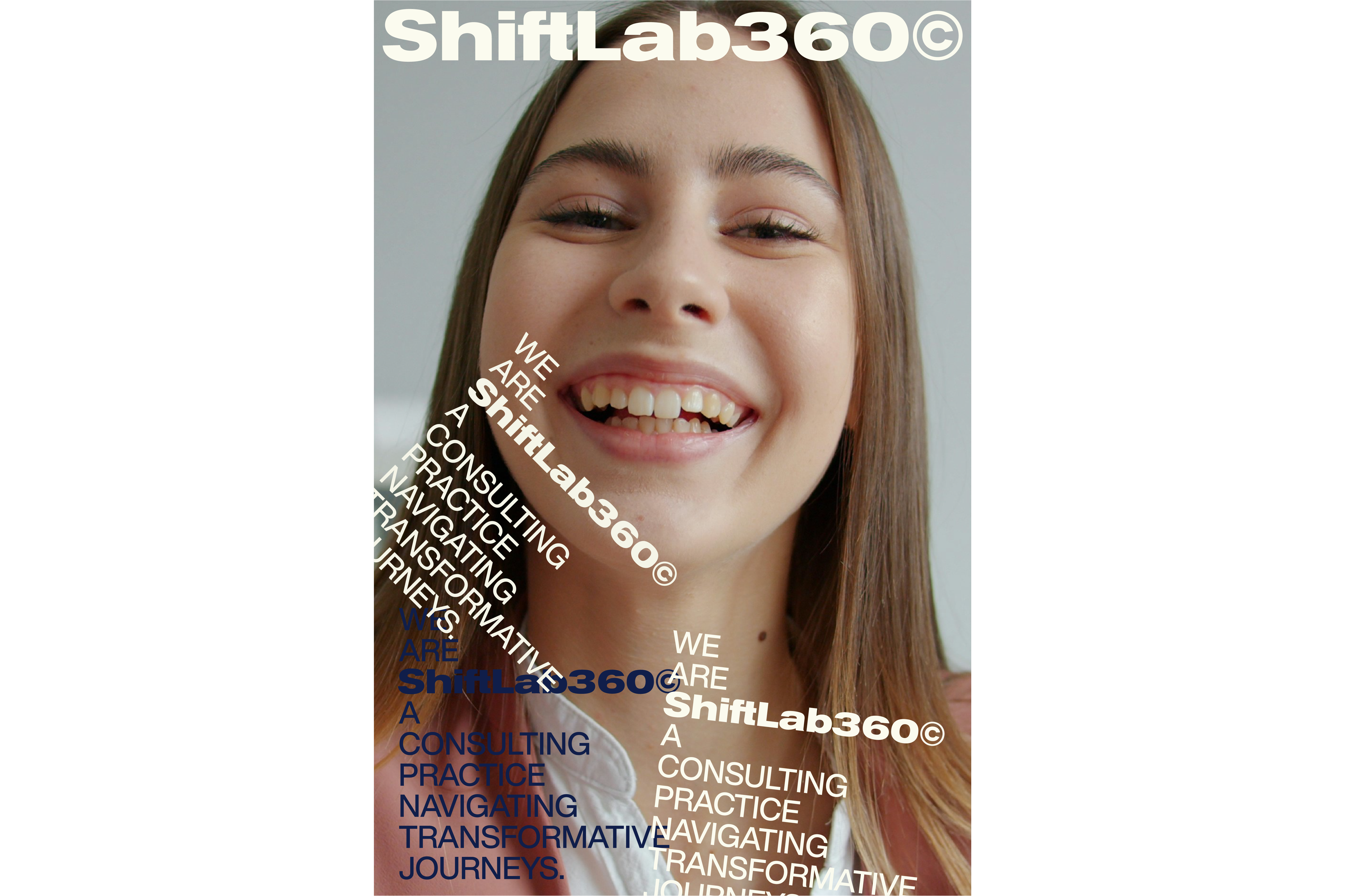
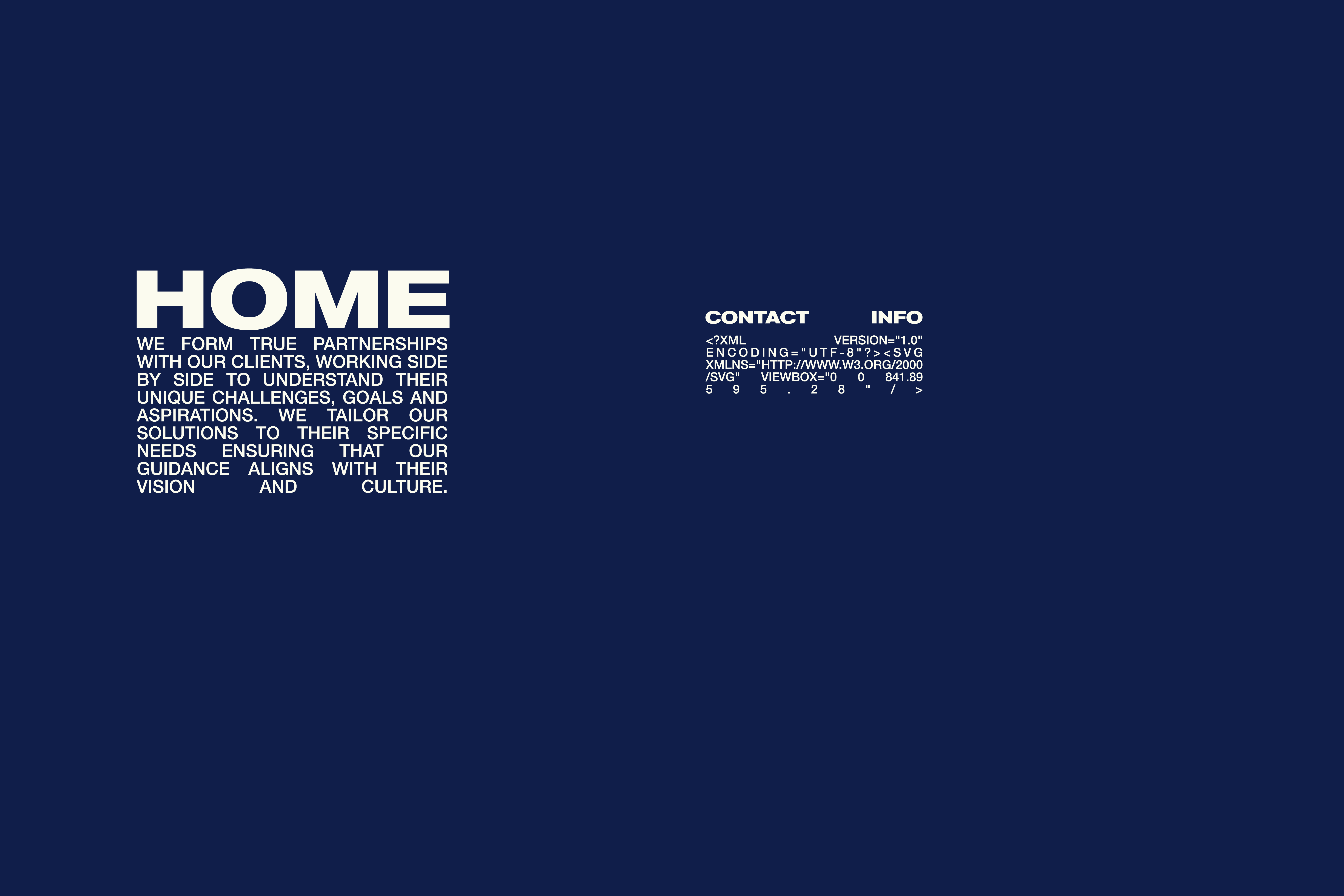
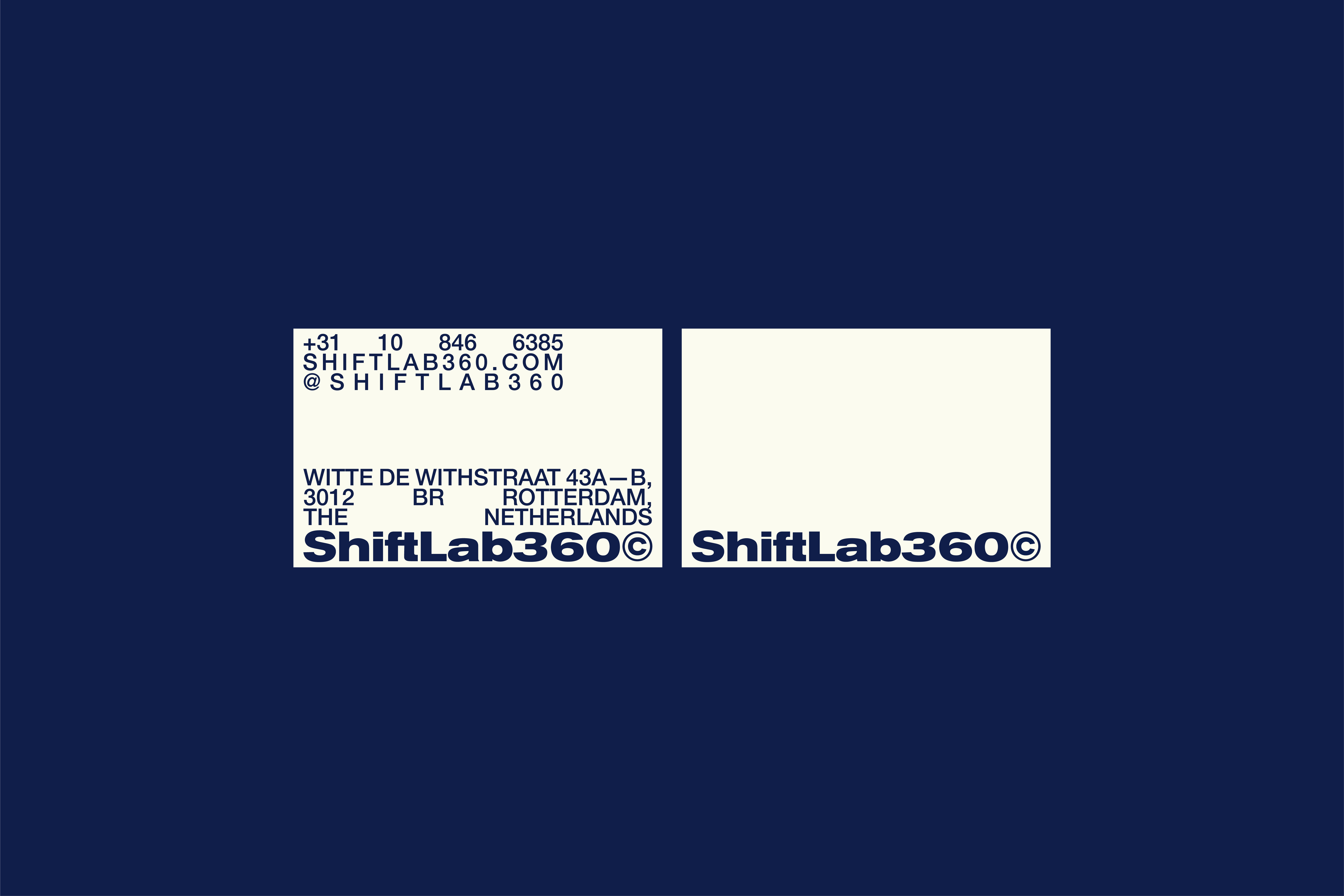
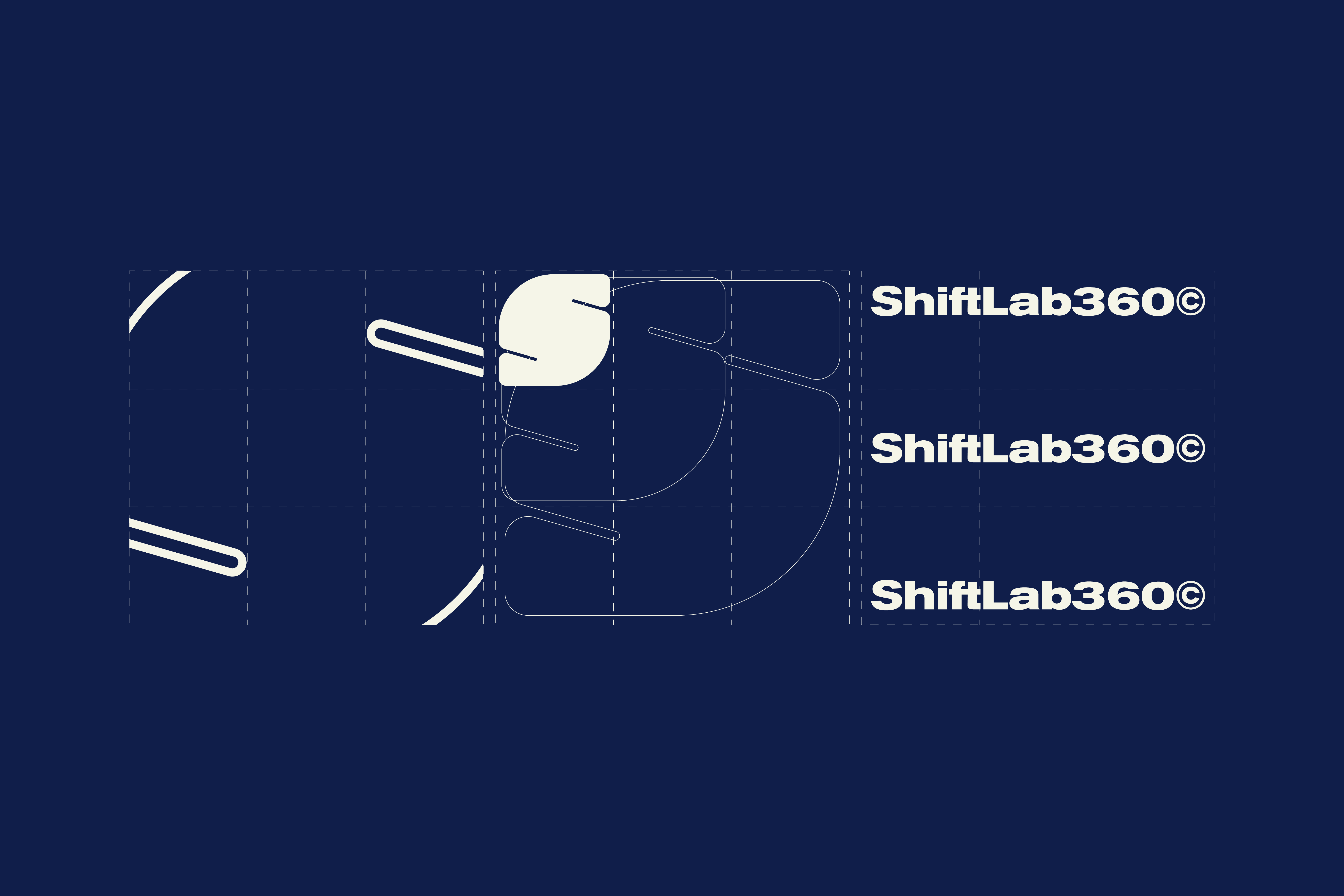
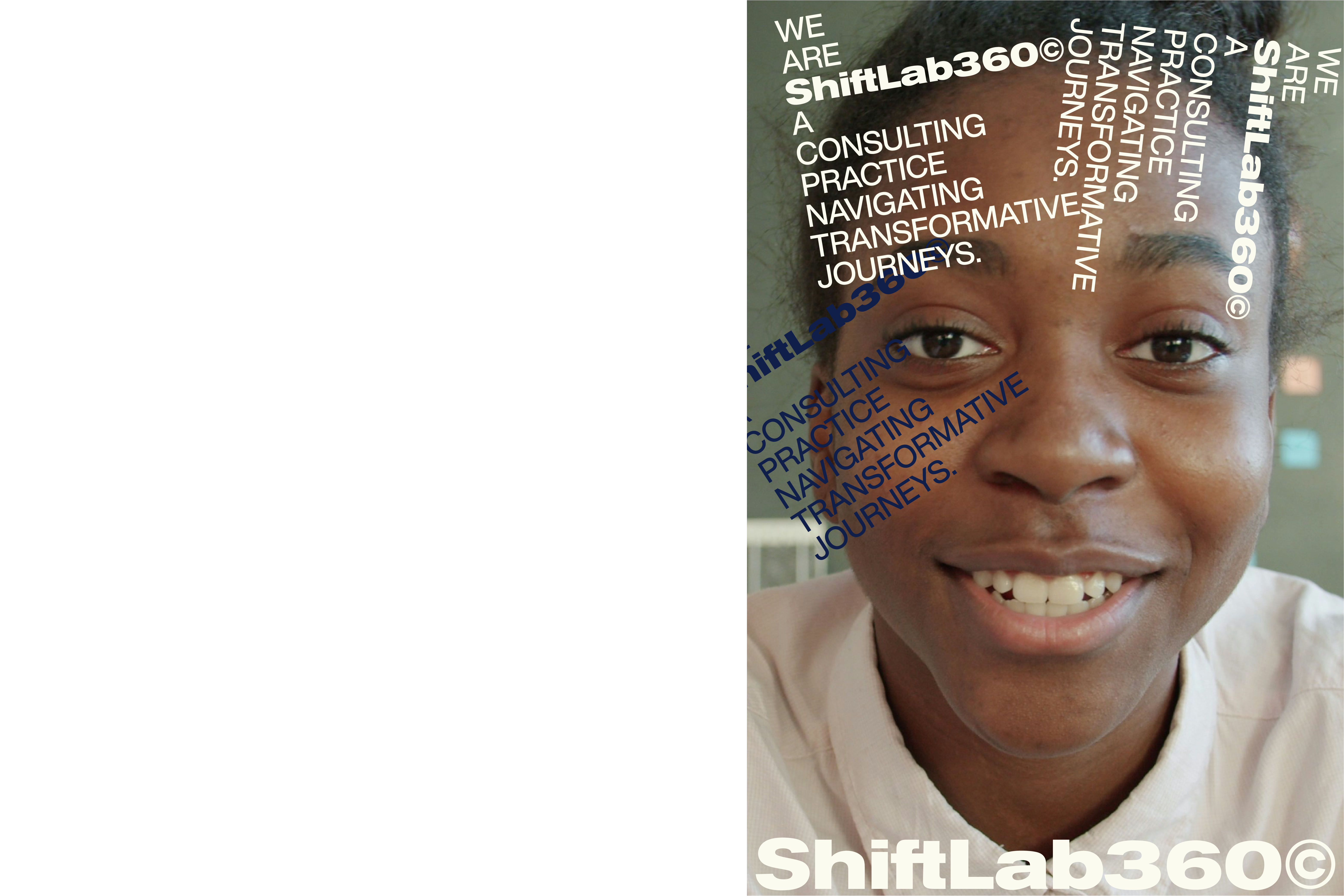
SHIFTLAB360©
Visual Identity
2024
2024
ShiftLab360© is a Rotterdam-based consulting practice dedicated to navigating transformative journeys. We approach transformation holistically — exploring strategy, processes, people, culture, and organizational dynamics. Through experience, cutting-edge methodologies, and a collaborative mindset, we help organizations unlock their true potential and achieve sustainable success. The identity of ShiftLab360© draws inspiration from the propeller of a boat, the port’s industrial landscape, and the bollards that anchor vessels — symbols of motion, stability, and connection. Its visual language combines precise geometric forms with fluid circular shapes, expressing both structure and adaptability. Deep navy tones evoke trust and depth, while soft neutrals bring balance and clarity. The typography, rigorous yet modern, captures the spirit of constant evolution — propelling ShiftLab360© forward as a catalyst for meaningful change.


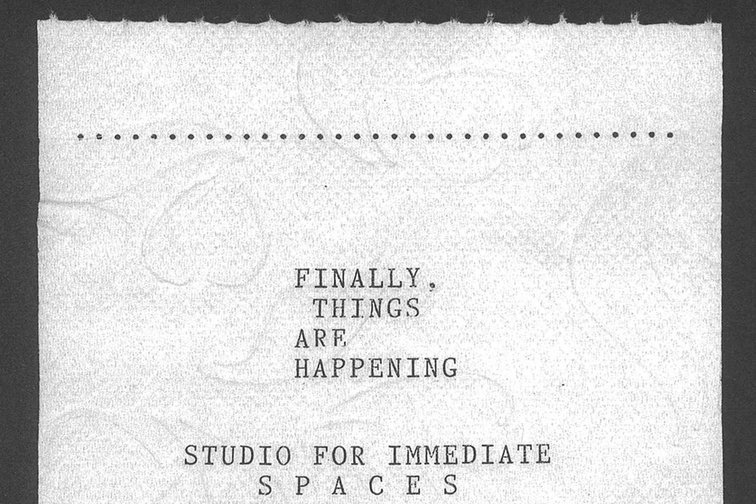
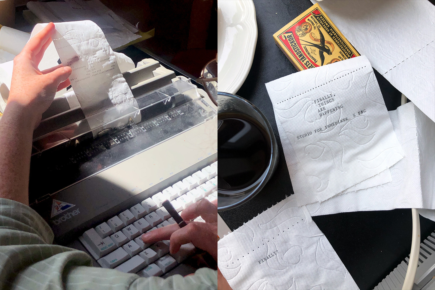
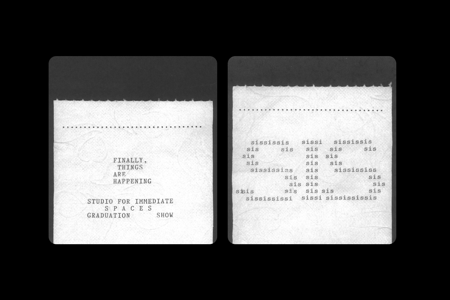
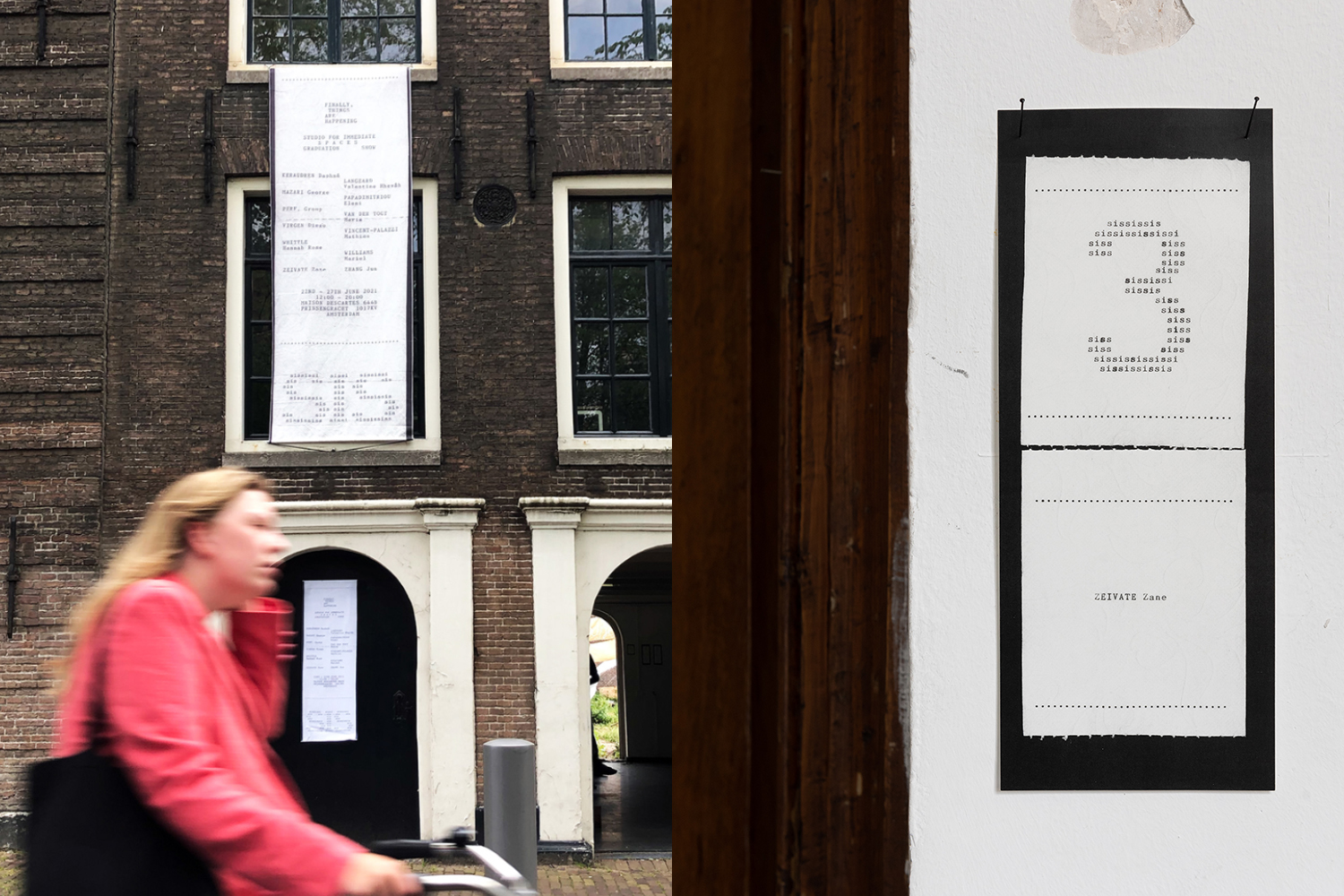
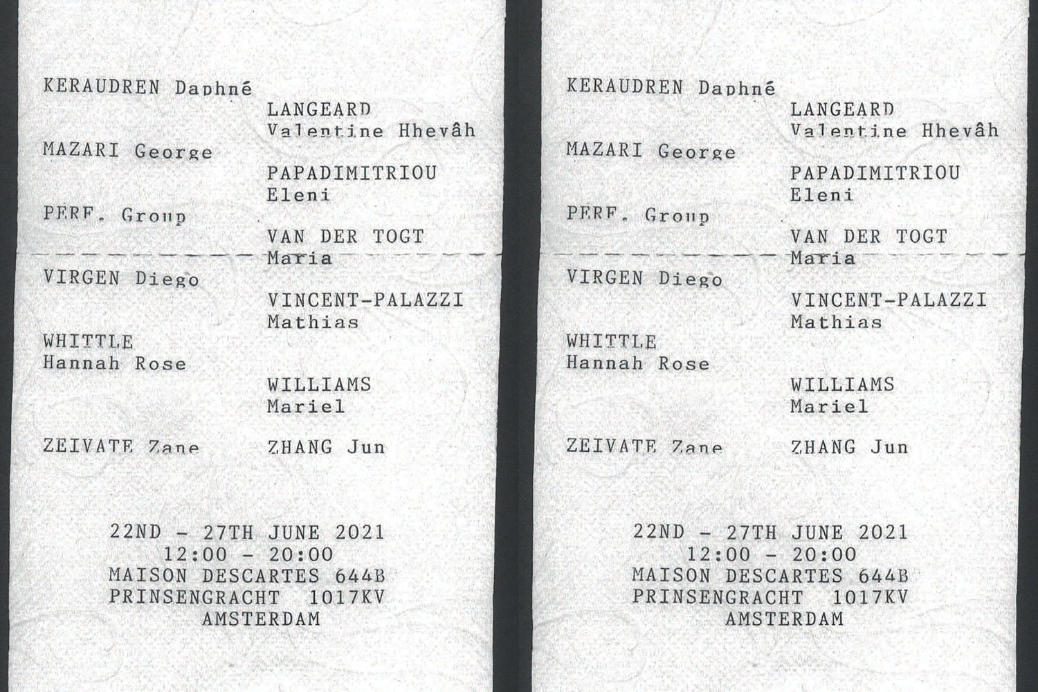
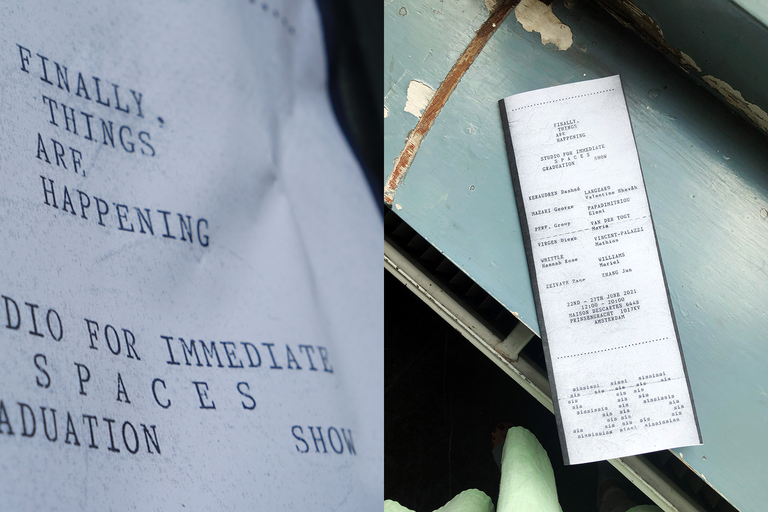
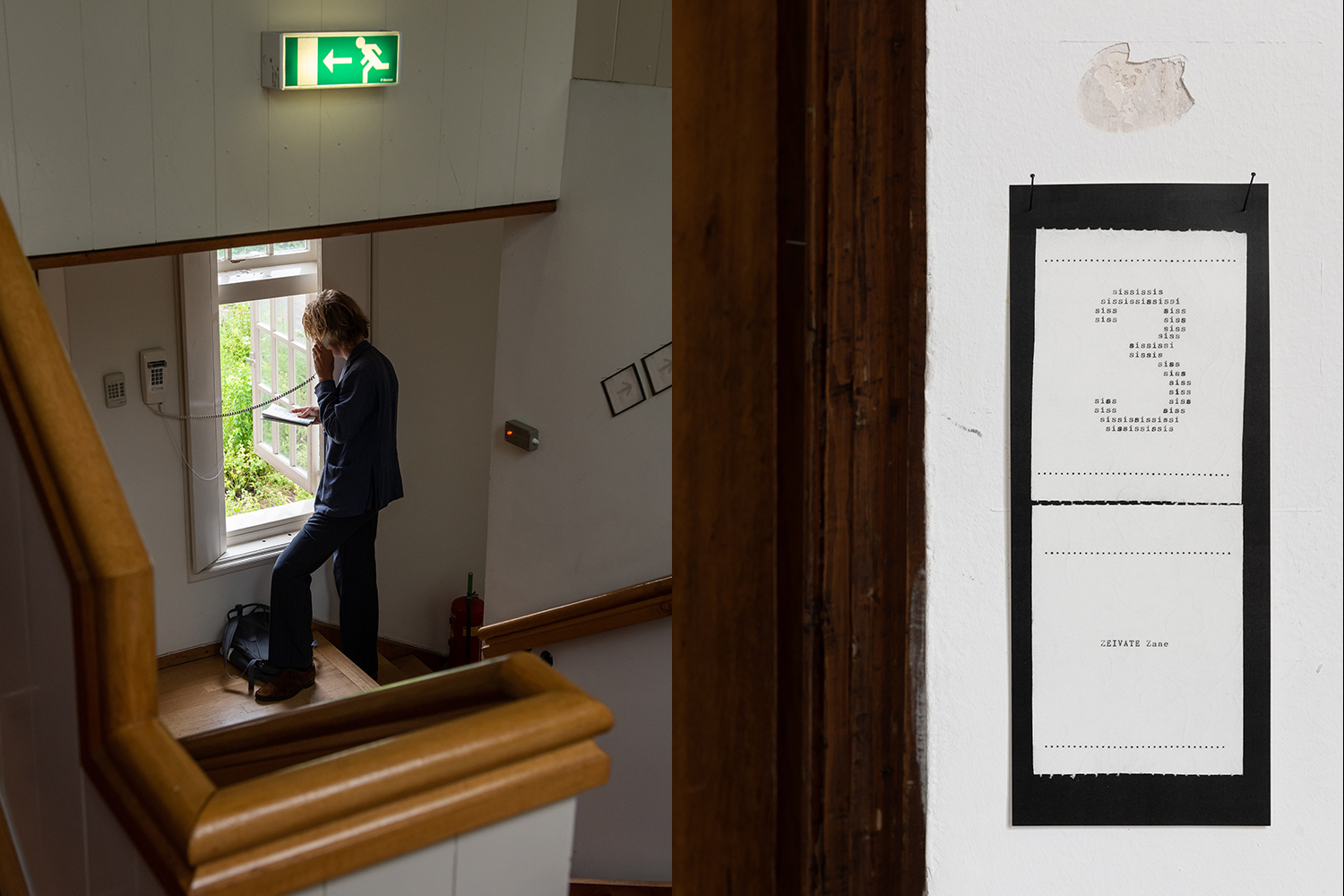
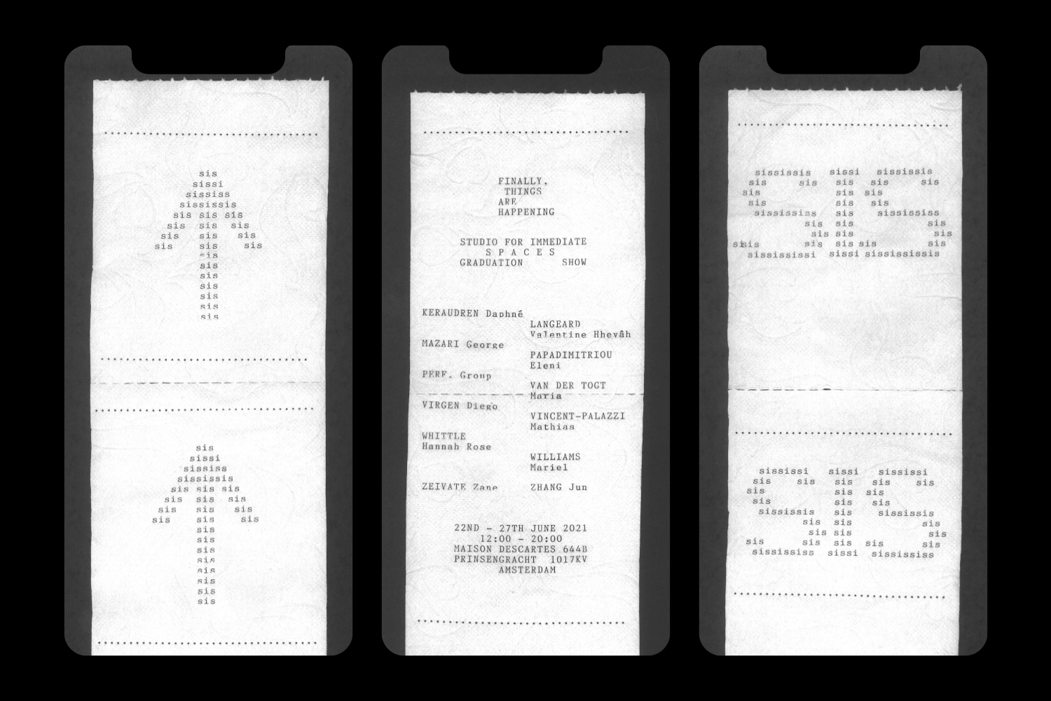
FINALLY, THINGS ARE HAPPENING
Visual identity, Editorial
2021
2021
With "FINALLY, THINGS ARE HAPPENING" Studio for Immediate Spaces (Sandberg Instituut) is proud to present works of its 2021 graduates. Through experimental and material research into the meanings and possibilities of coming together, sharing knowledge, caring for another—be it humans or nature—all works unite under the ambition to create or critically reflect on spaces to facilitate a new sociability. Through various media, ranging from film, performance to sculpture and environment, the works manifest as signs and symbols of a new normal that has changed the way of living together in recent months, creating novel perceptions of space, imagining alternative rituals and practices. For the past months Reneenee/Maison Descartes and Kristoffer Zeiner gave refuge to the Studio for Immediate Space in times of harsh social regulations. For FINALLY, THINGS ARE HAPPENING Reneenee/Maison Descartes will once again host the Studio to showcase the results of its graduates’ works, which to a large part were conceived and fostered in this magical place.
Featured in Slanted Magazine 40 Experimental Type.
Featured in Slanted Magazine 40 Experimental Type.

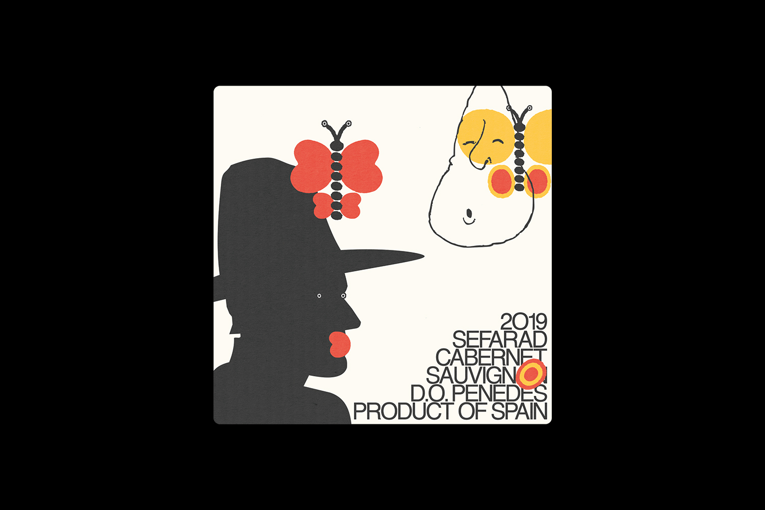
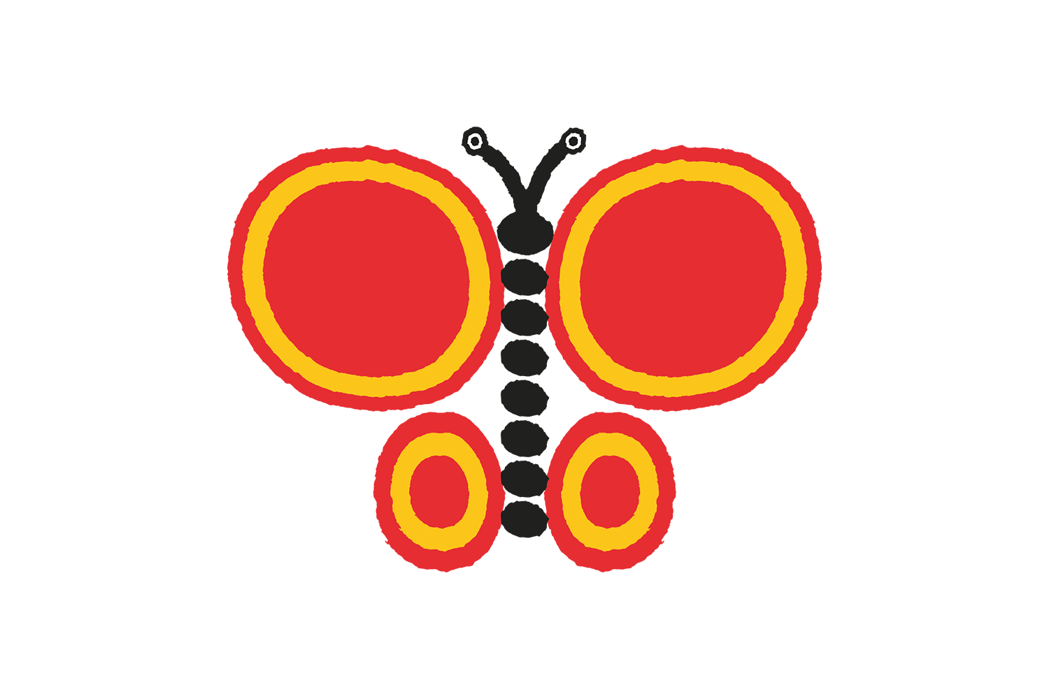
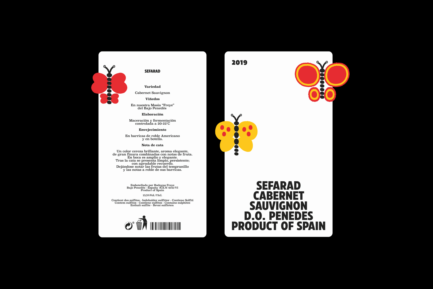
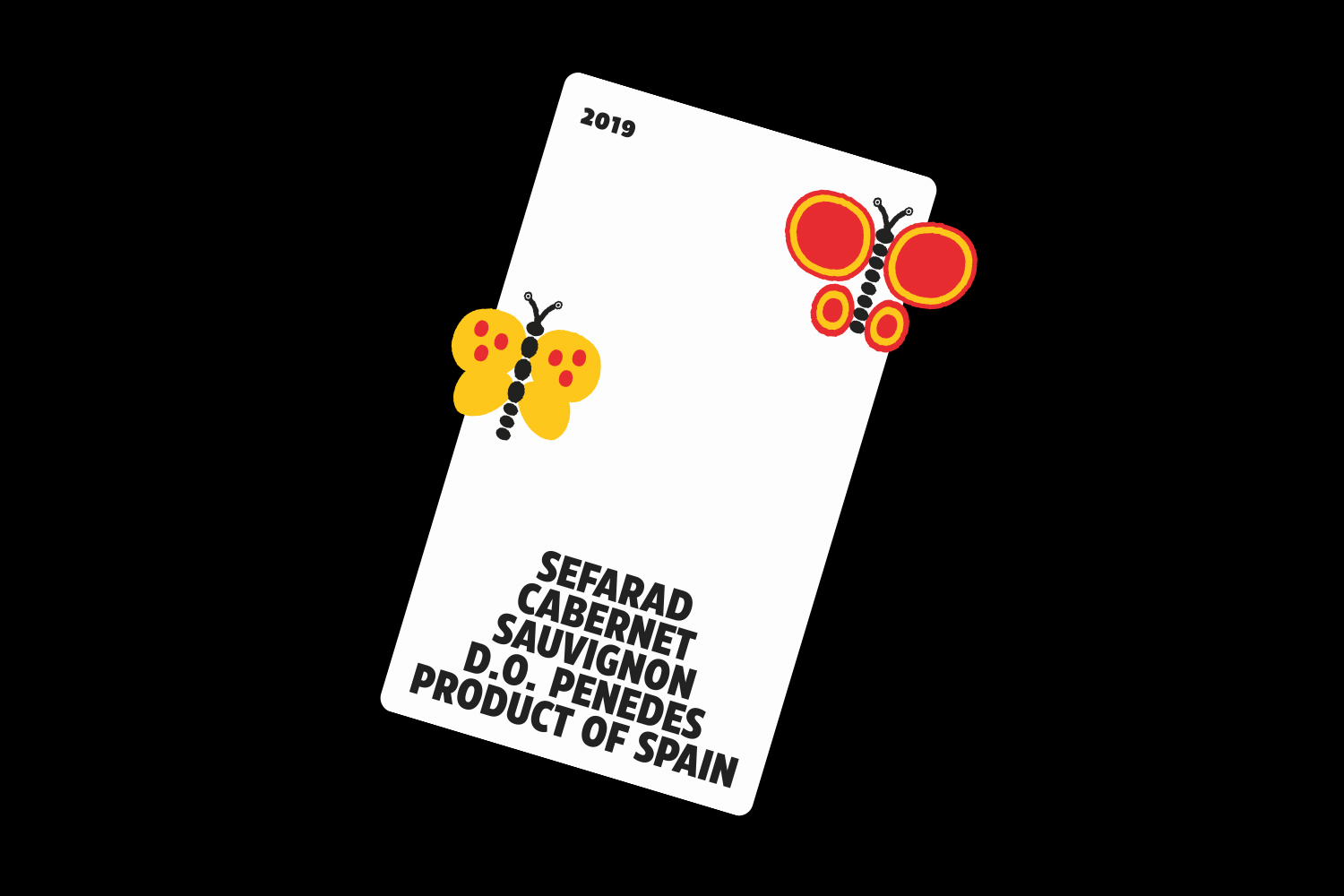
SEFARAD
Packaging, Illustration
2023
2023
Commissioned to design a kosher Spanish wine label, to be sold in Israel. Sefarad is the Hebrew word for Spain, and the butterflies featured in the design represent the diaspora of the Jewish people. The butterflies were created by desintegrating and choosing elements from Dick Bruna’s illustrations found on his personal website – the globally acclaimed illustrator and father of ‘Miffy’, the most famous bunny in the world. These replica images allowed me to create a digital collage, and this combined with Eastman Condensed led to a unique work, which doesn’t follow traditional wine label conventions.

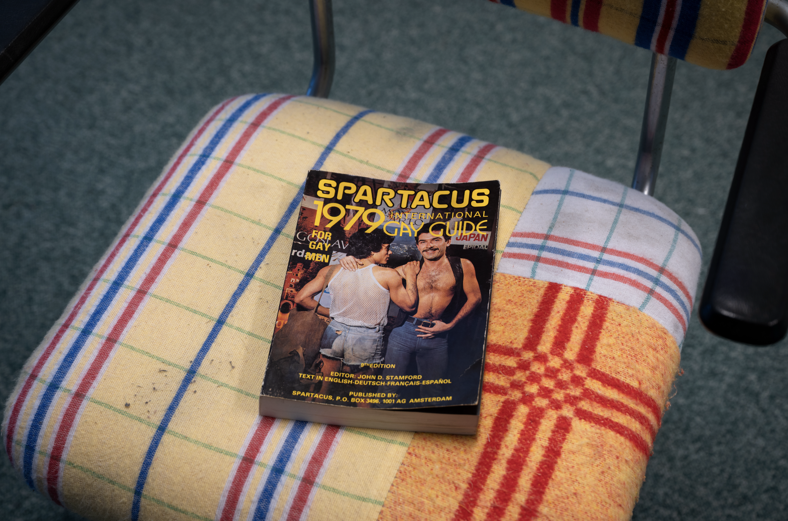
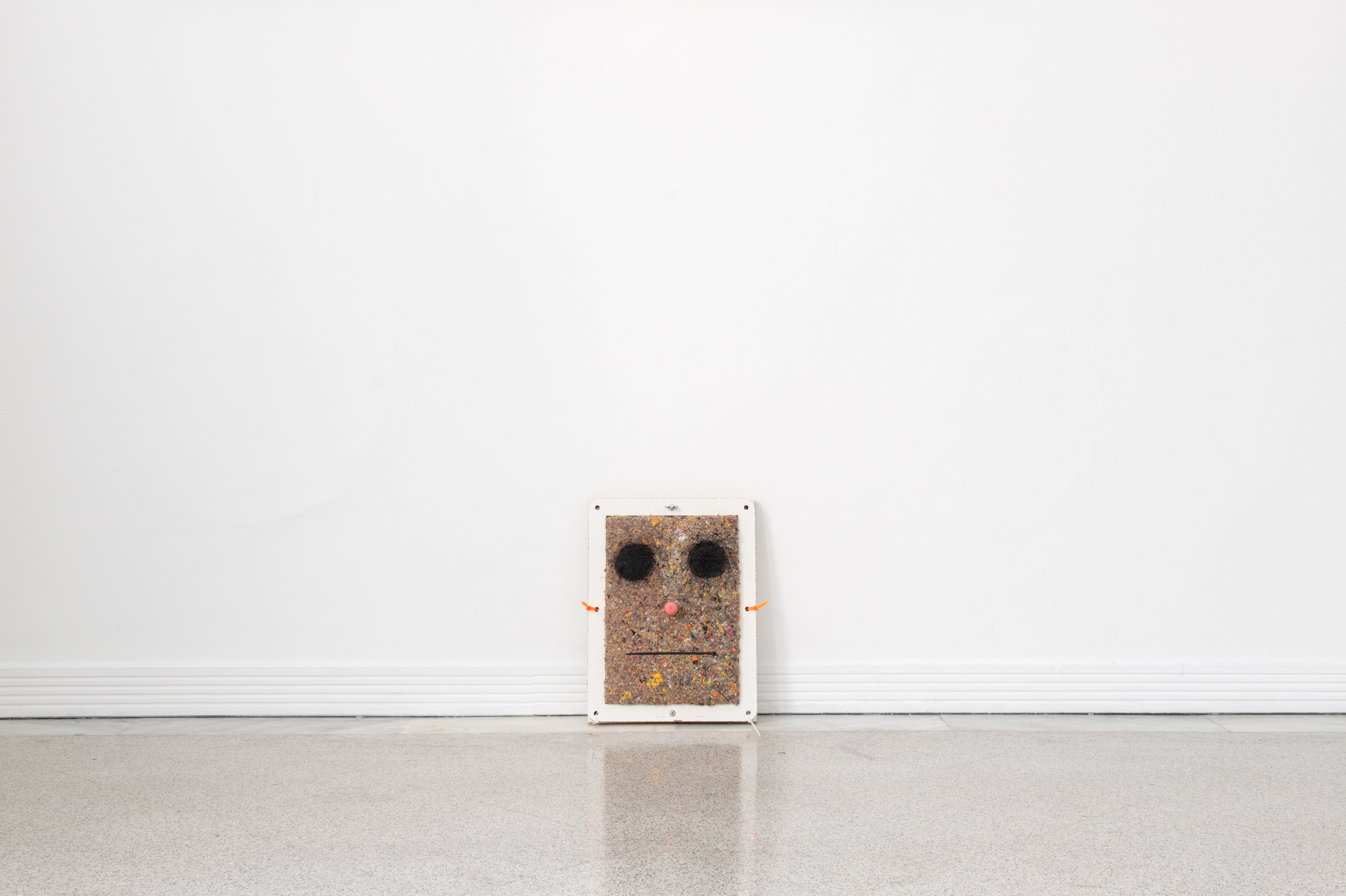
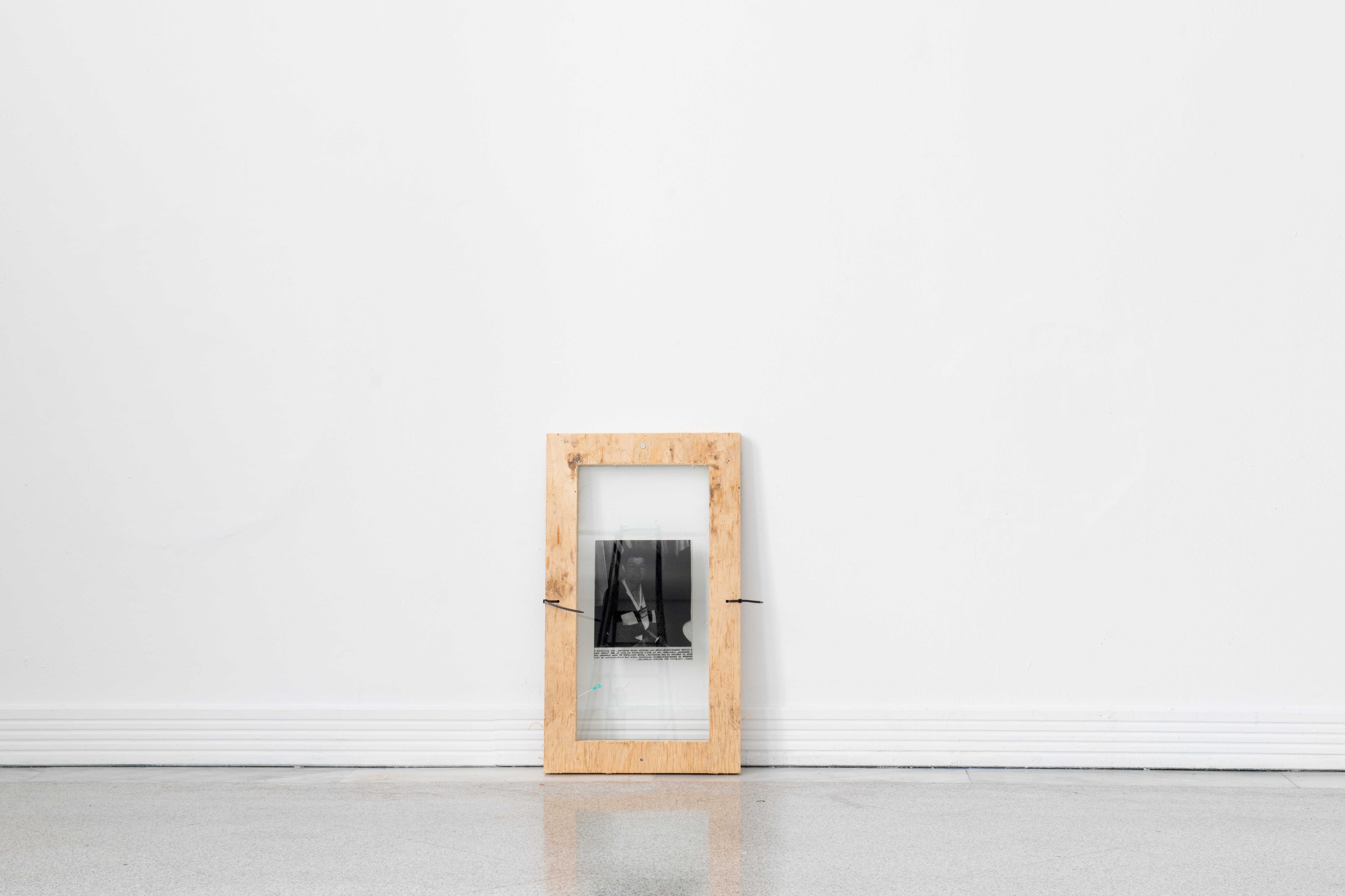
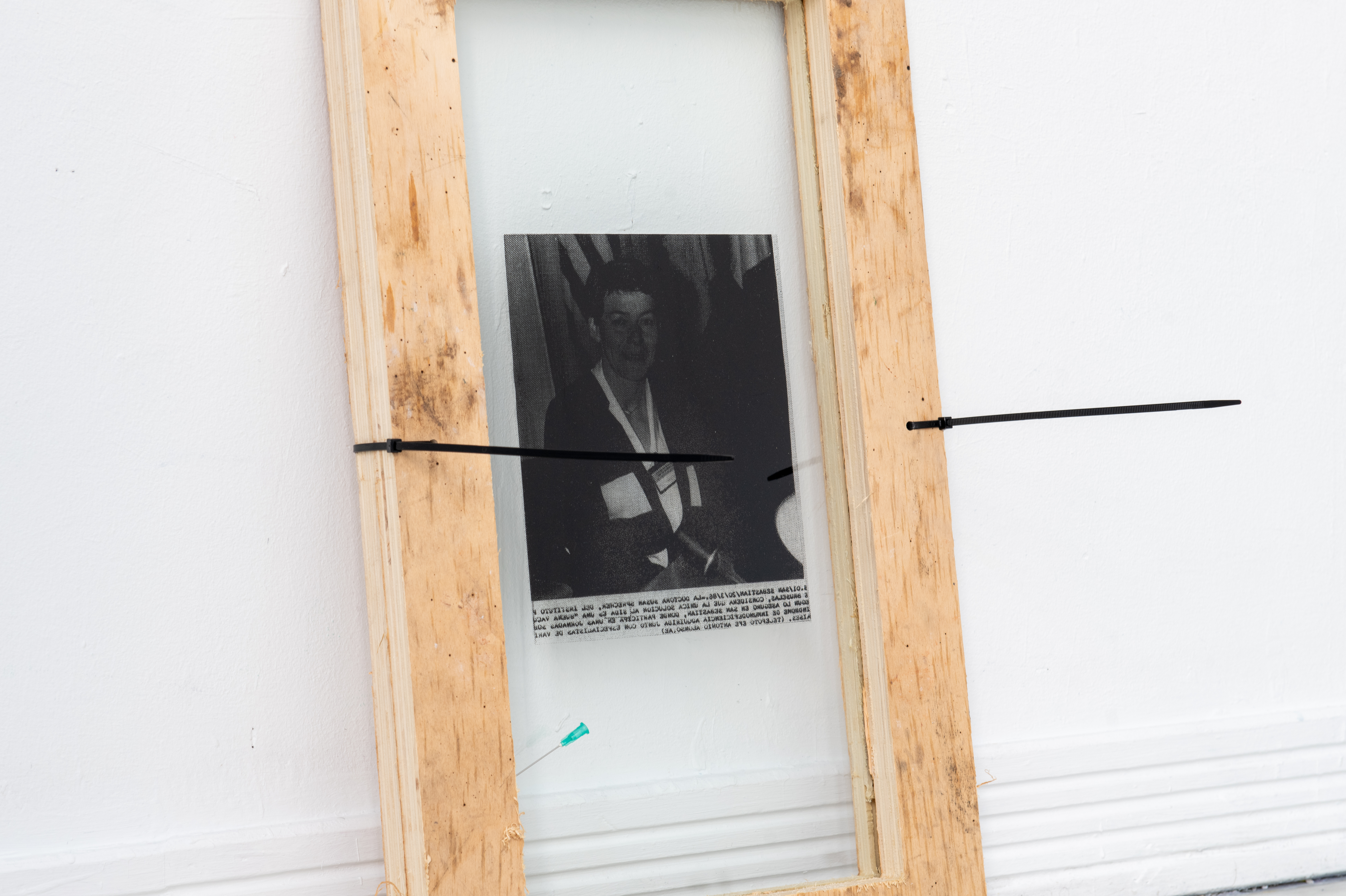
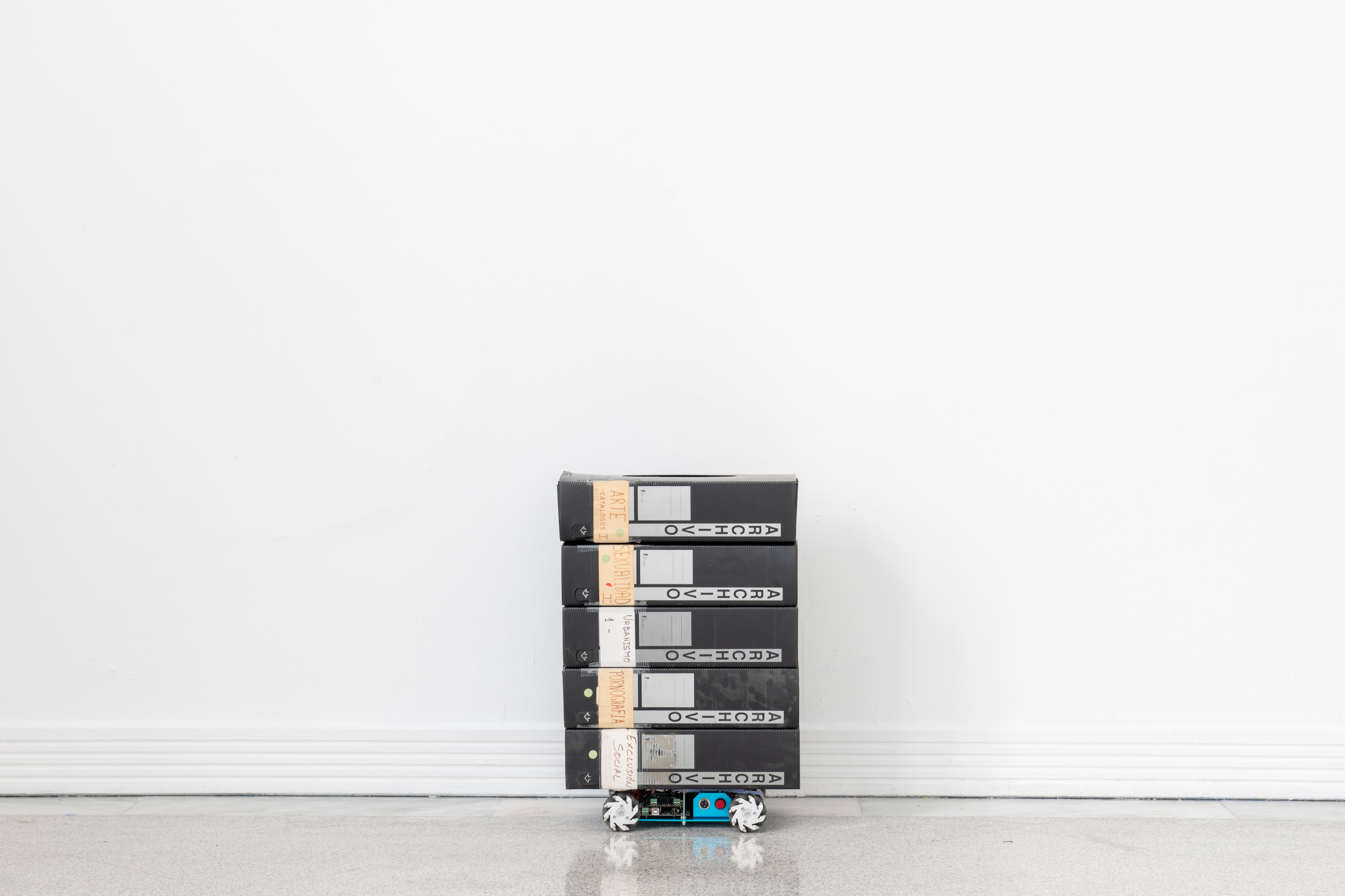
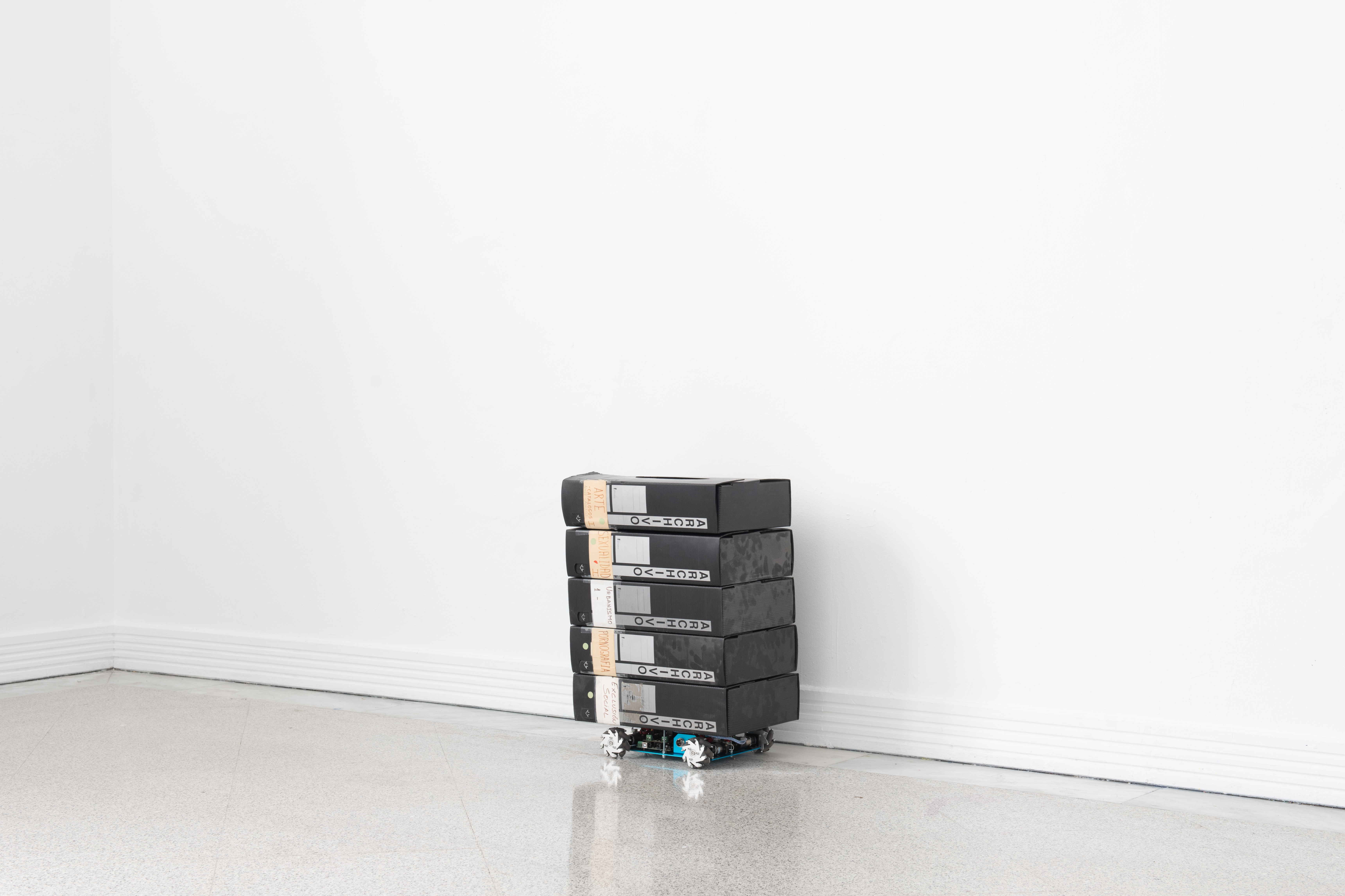
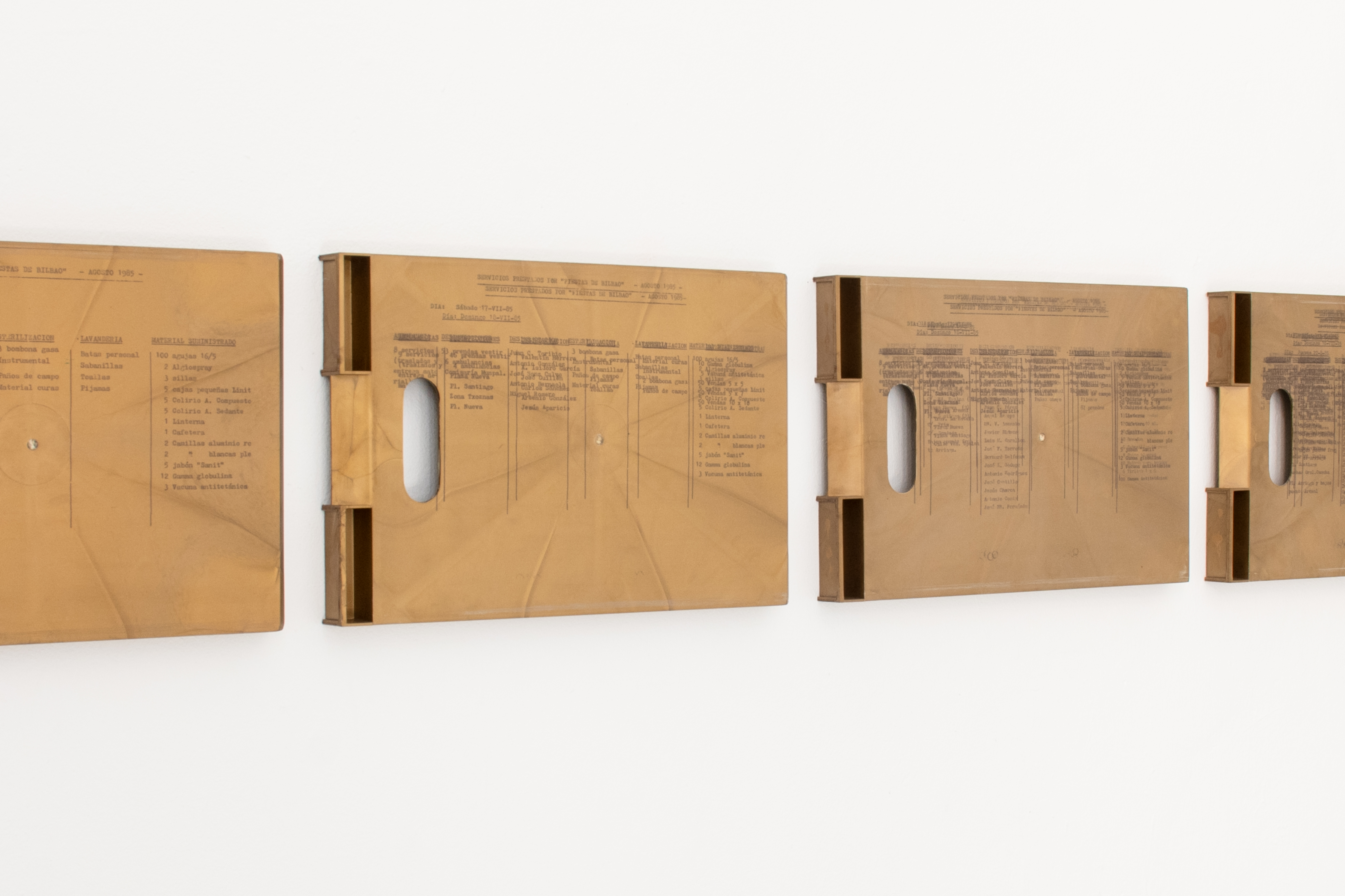
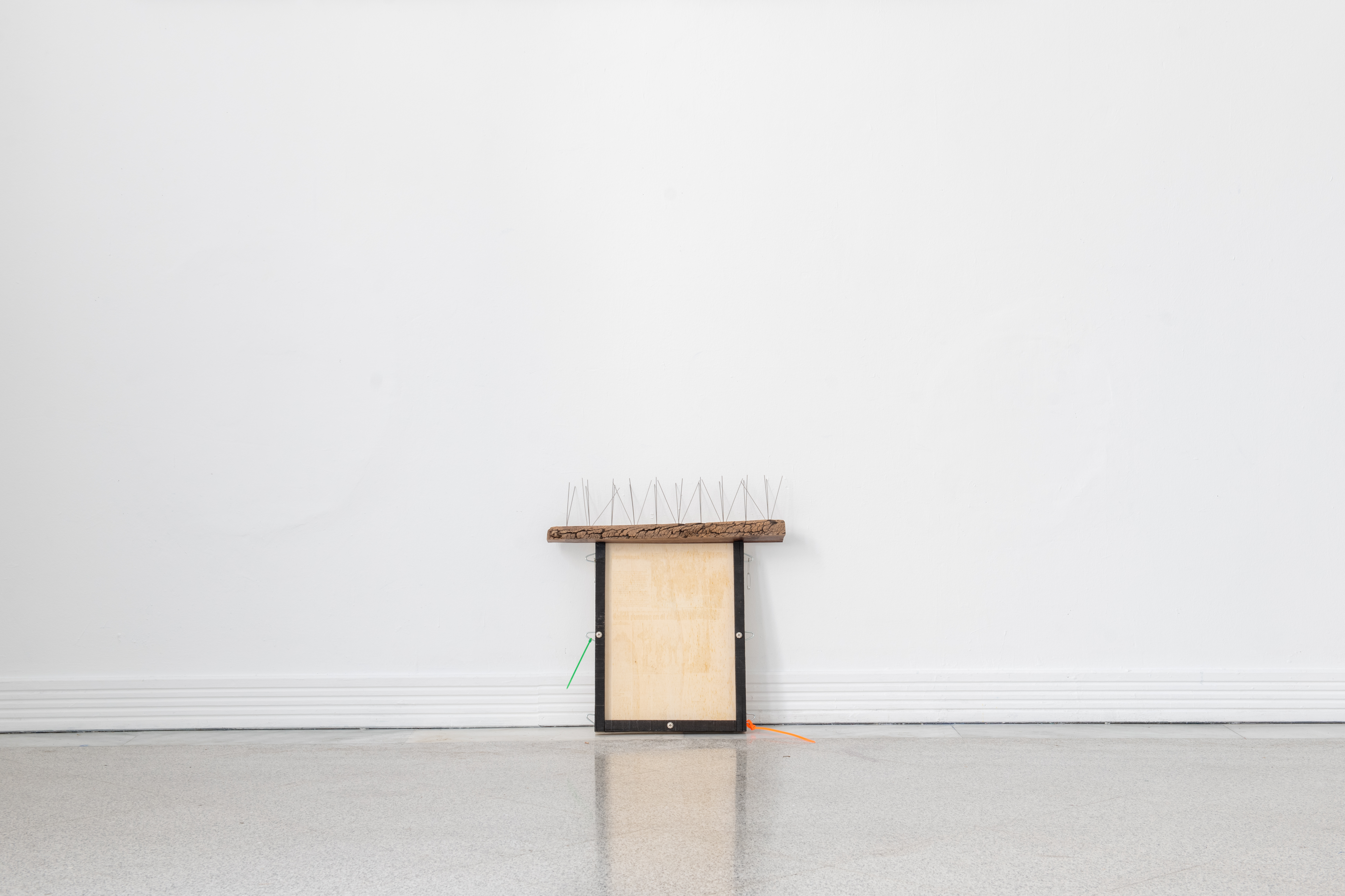
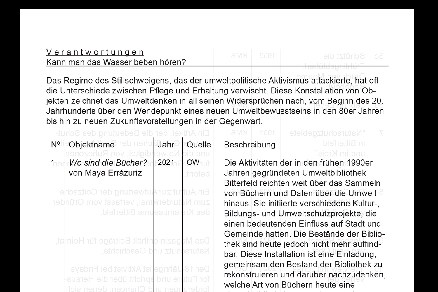
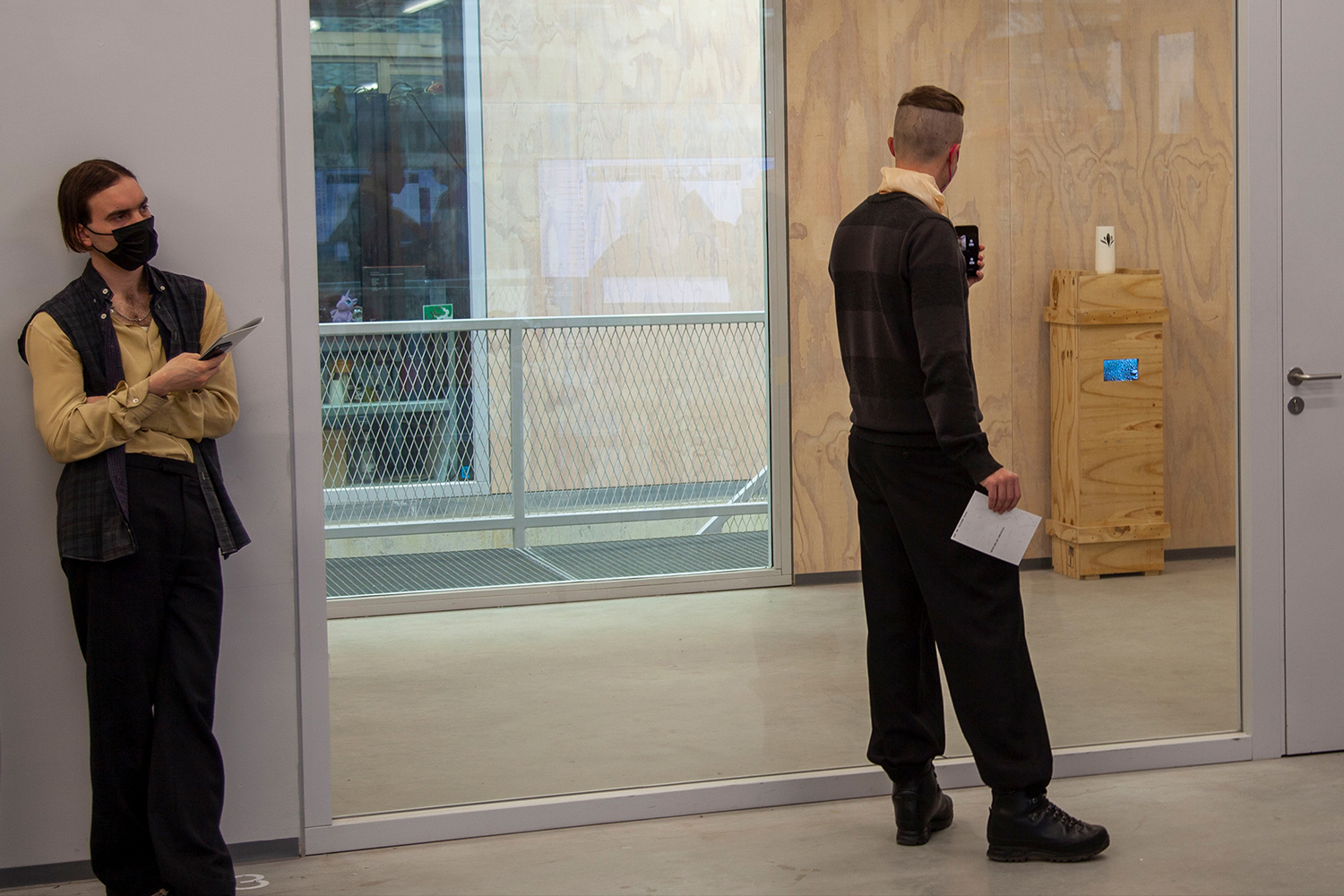
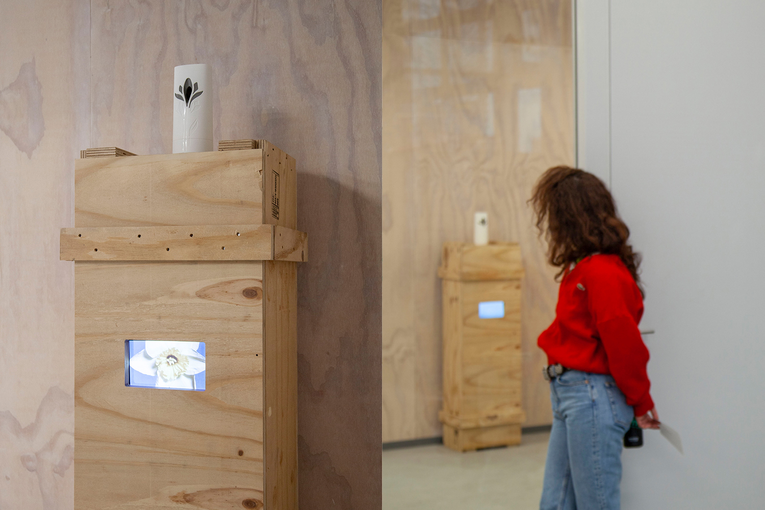
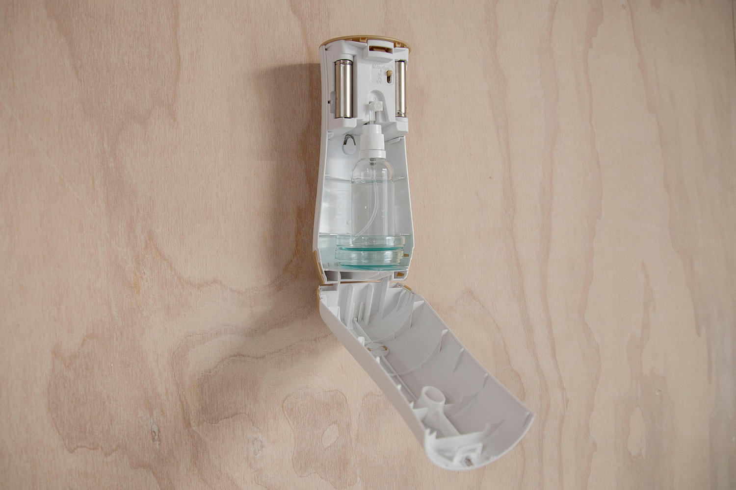
OPEN STUDIOS
project type - Installation
year - 2025
During the public opening of the studios at BilbaoArte, the works presented acted as a catalyst for my ongoing investigation into the HIV/AIDS crisis in the Basque Country. In this terrain, the crisis did not appear as an isolated event but as a nexus of overlapping violences that claimed the lives of many young people —the Basque Lost Generation— encompassing the Basque conflict, the spread of heroin, a profound socio-economic collapse, and the sudden eruption of a virus that stained bodies and communities alike.
Through archival research, the work staged itself as a language that gives form to the idea of void, paradoxically materializing absence and rendering it into a subtle, almost intangible presence. By reactivating these layered histories, the work staged the collision of hygienist policies and radical disident experiences during the 1980s and 1990s, where stigma, desire, and resistance circulated in relentless, transforming loops, tragically and permanently reshaping the landscape and social fabric of the Basque Country.
Special Thanks to
Bilboko Udal Artxiboa
Archivo Municipal de Bilbao
Centro de Documentación de Mujeres
Maite Albiz
Emakumeen Dokumentazio Zentrua

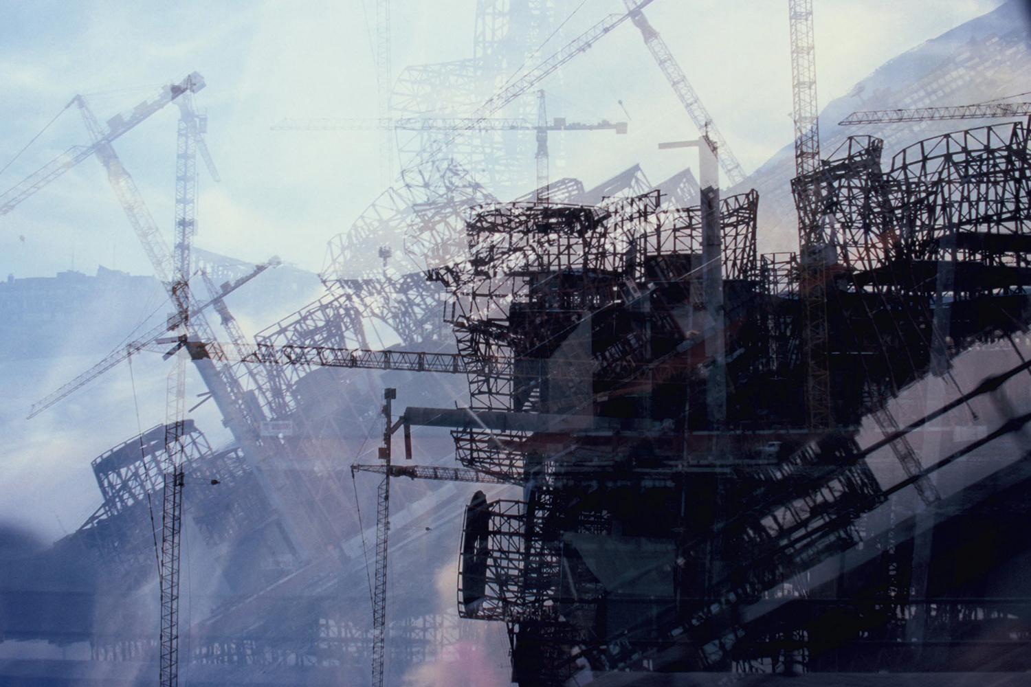
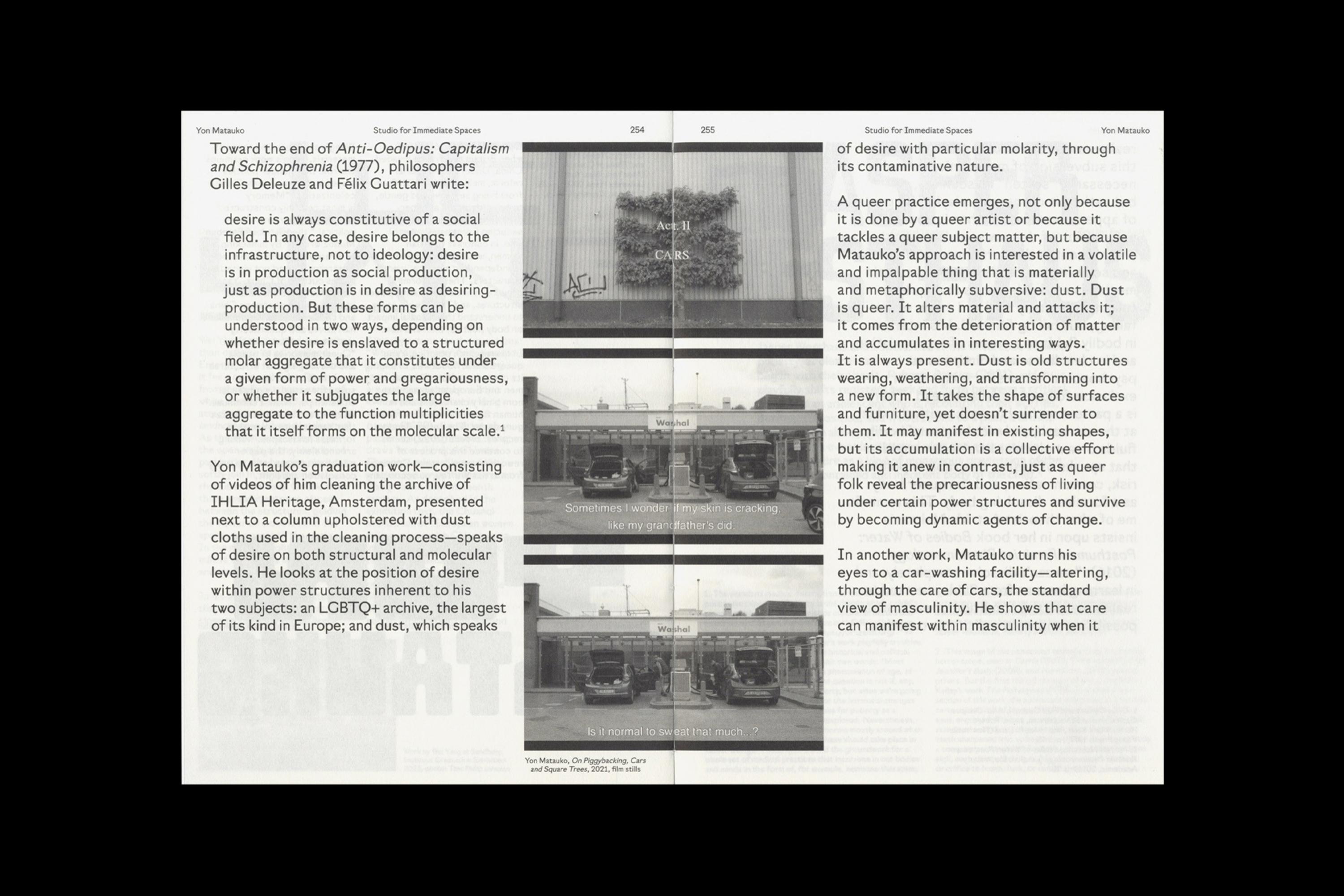
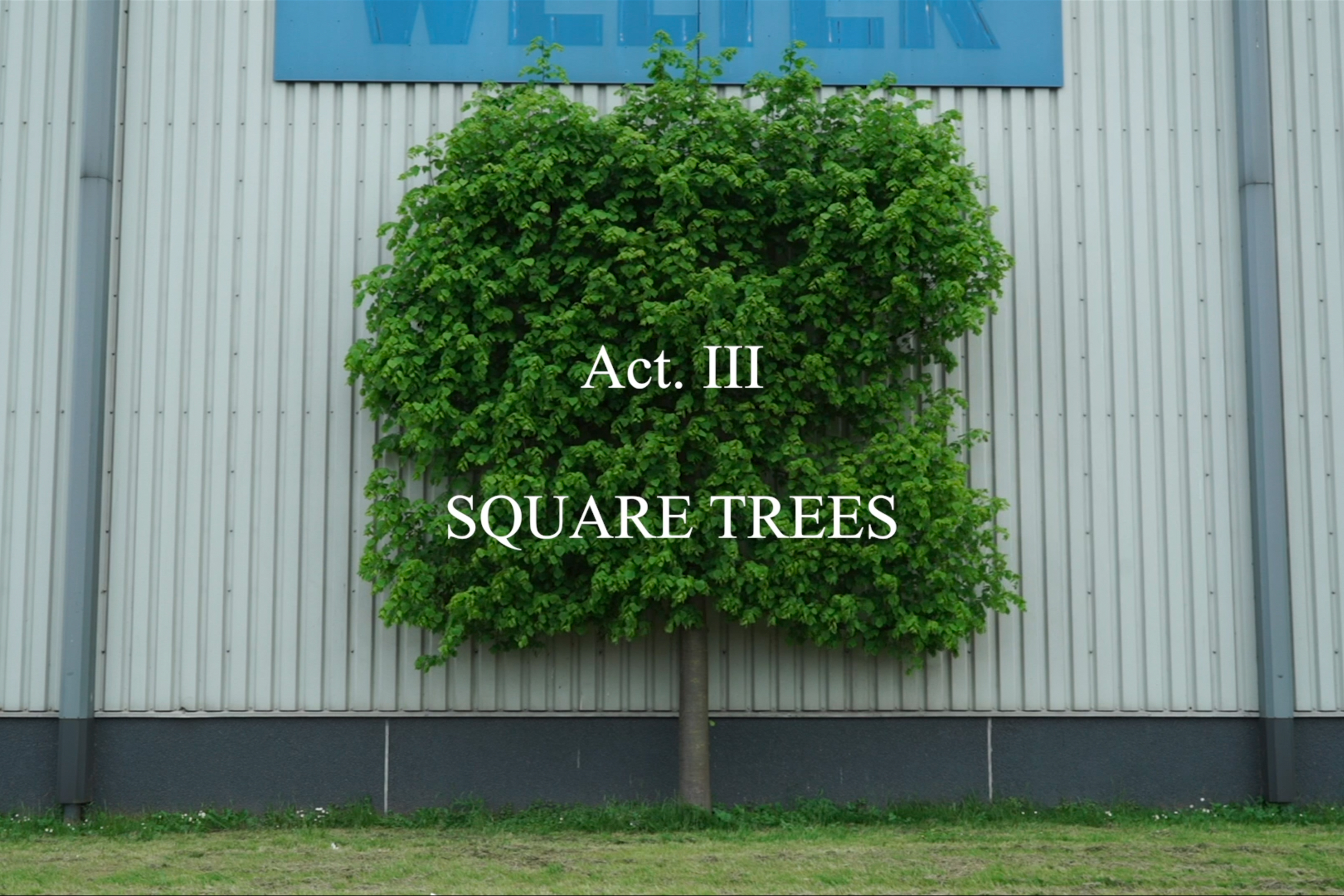
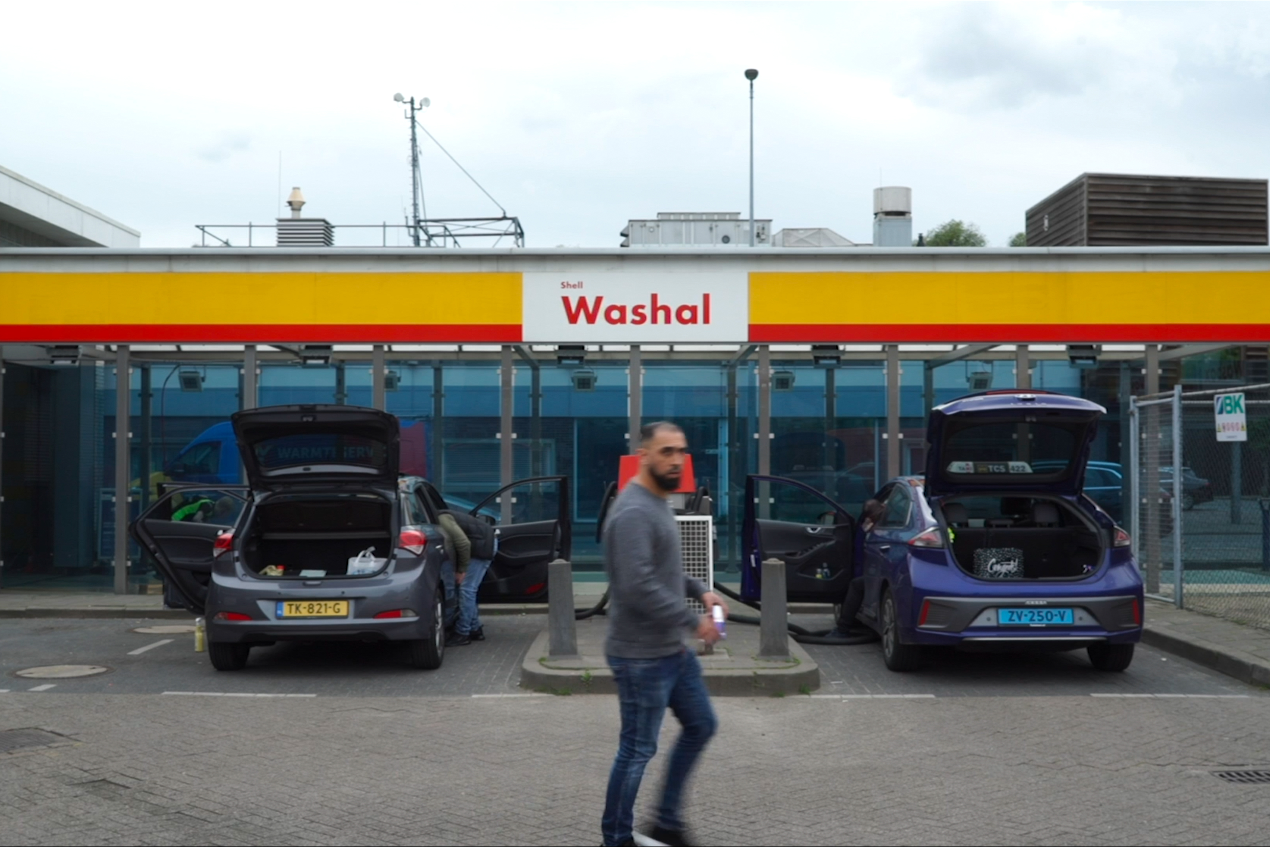
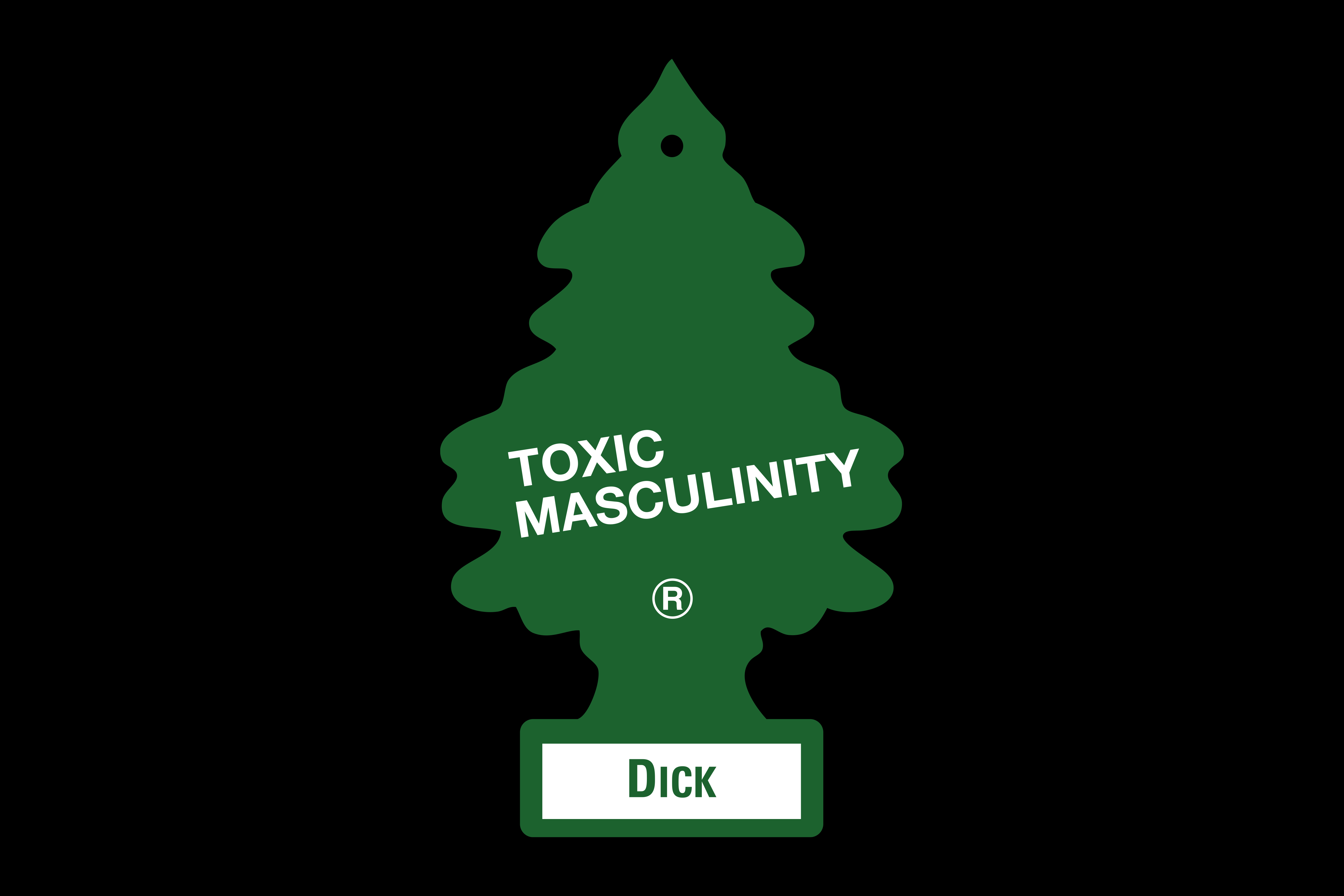
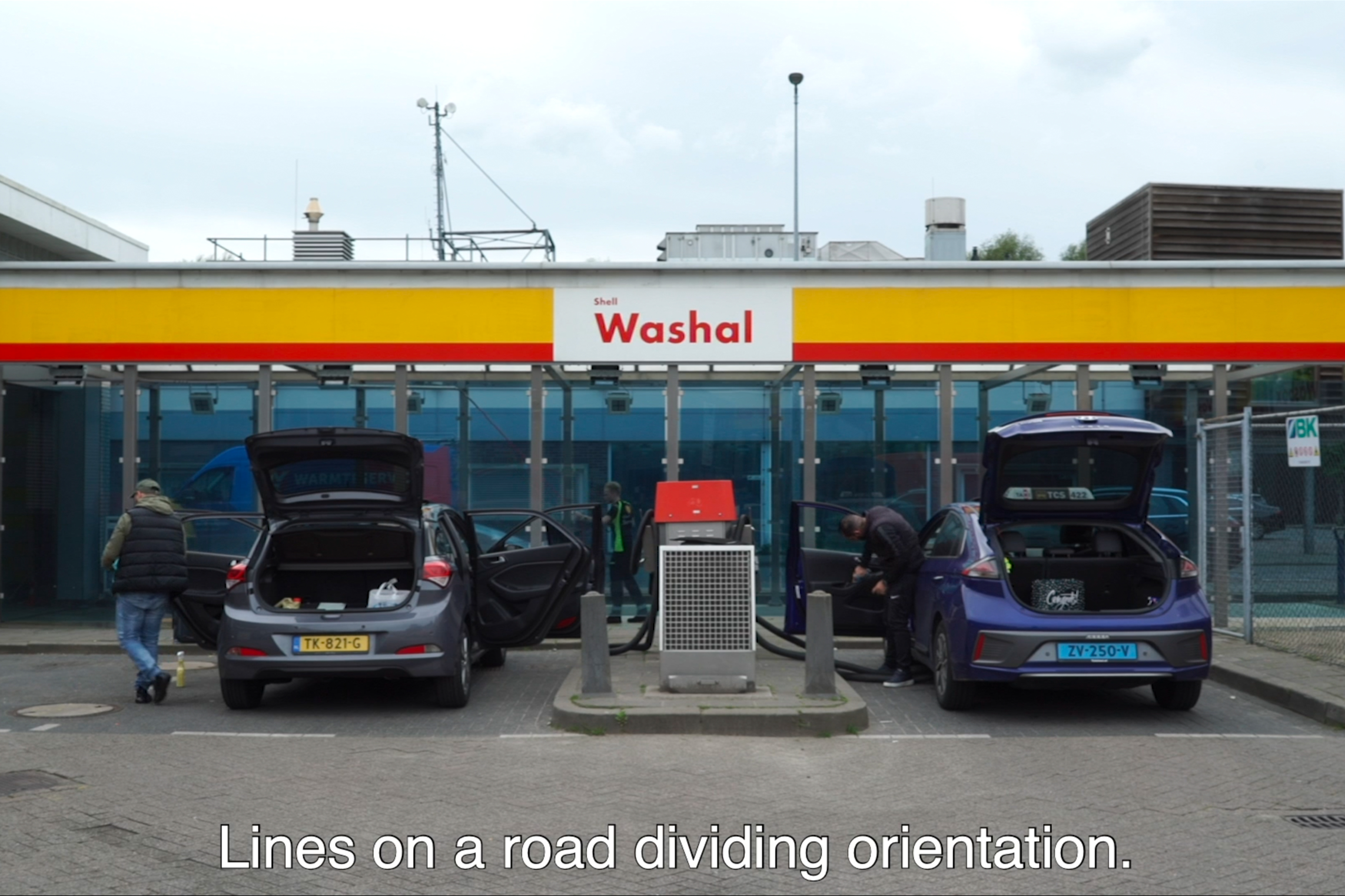
ON PIGGYBACKING, CARS
AND SQUARE TREES
Site-Specific Video Installation
2021
2021
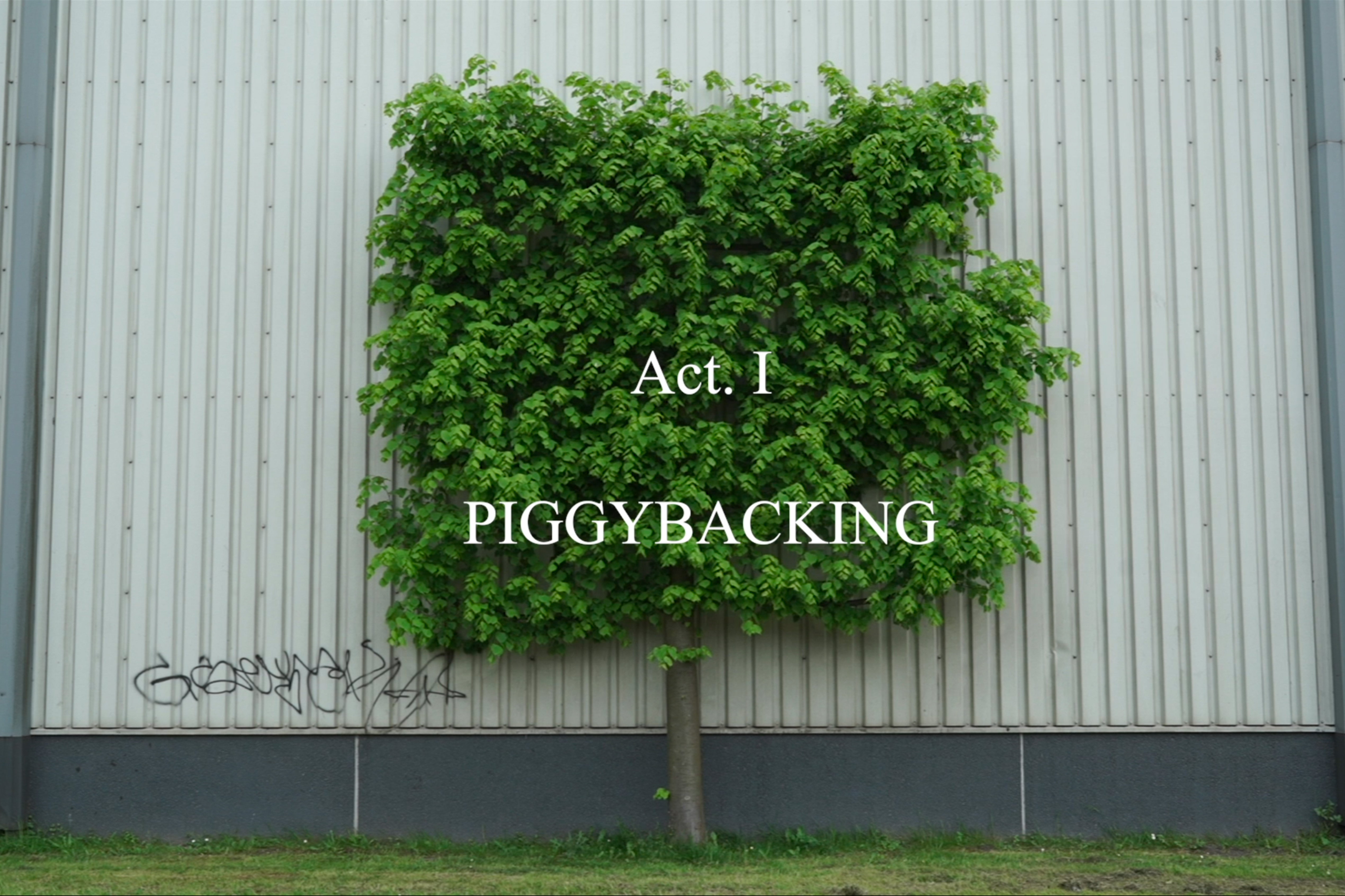
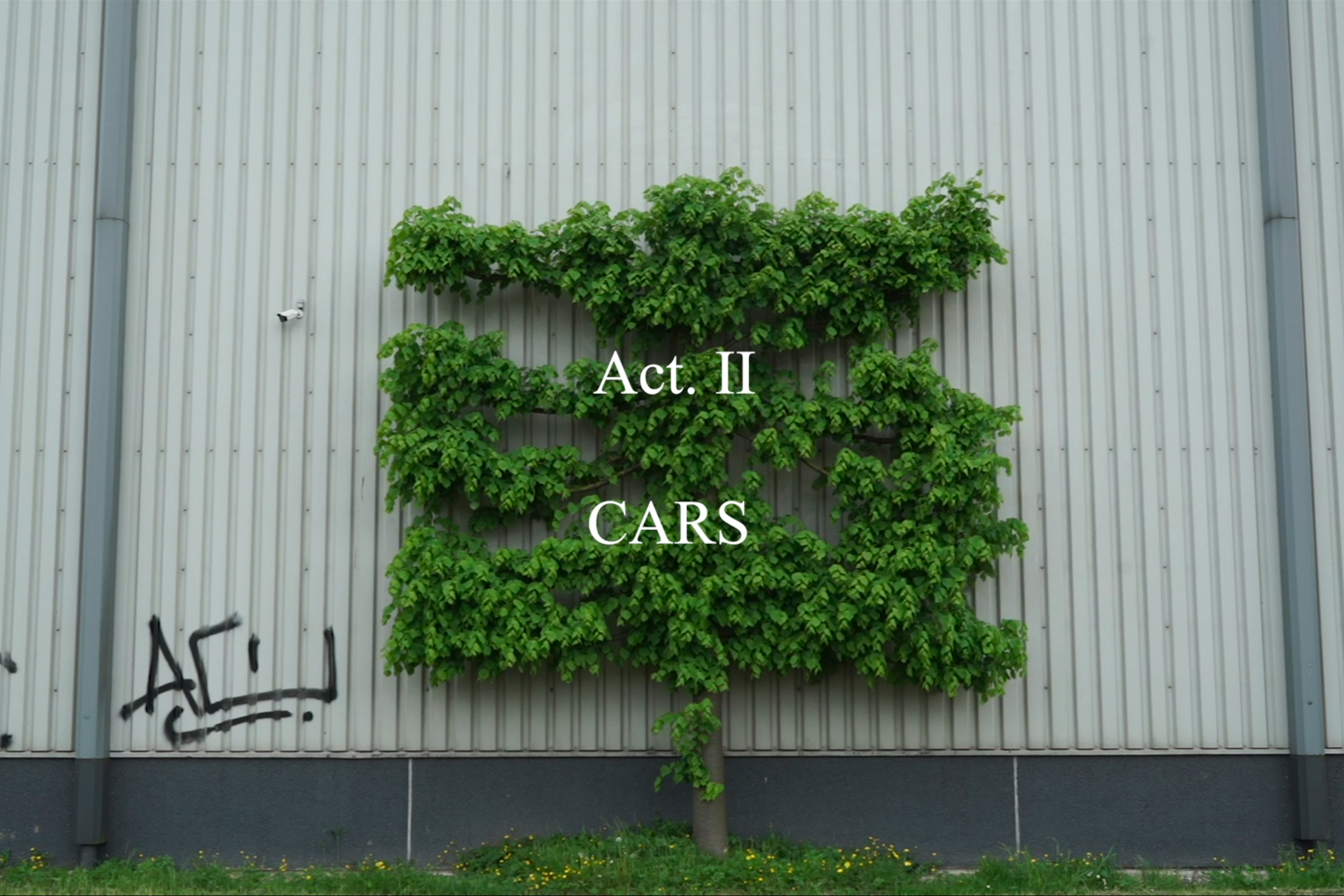
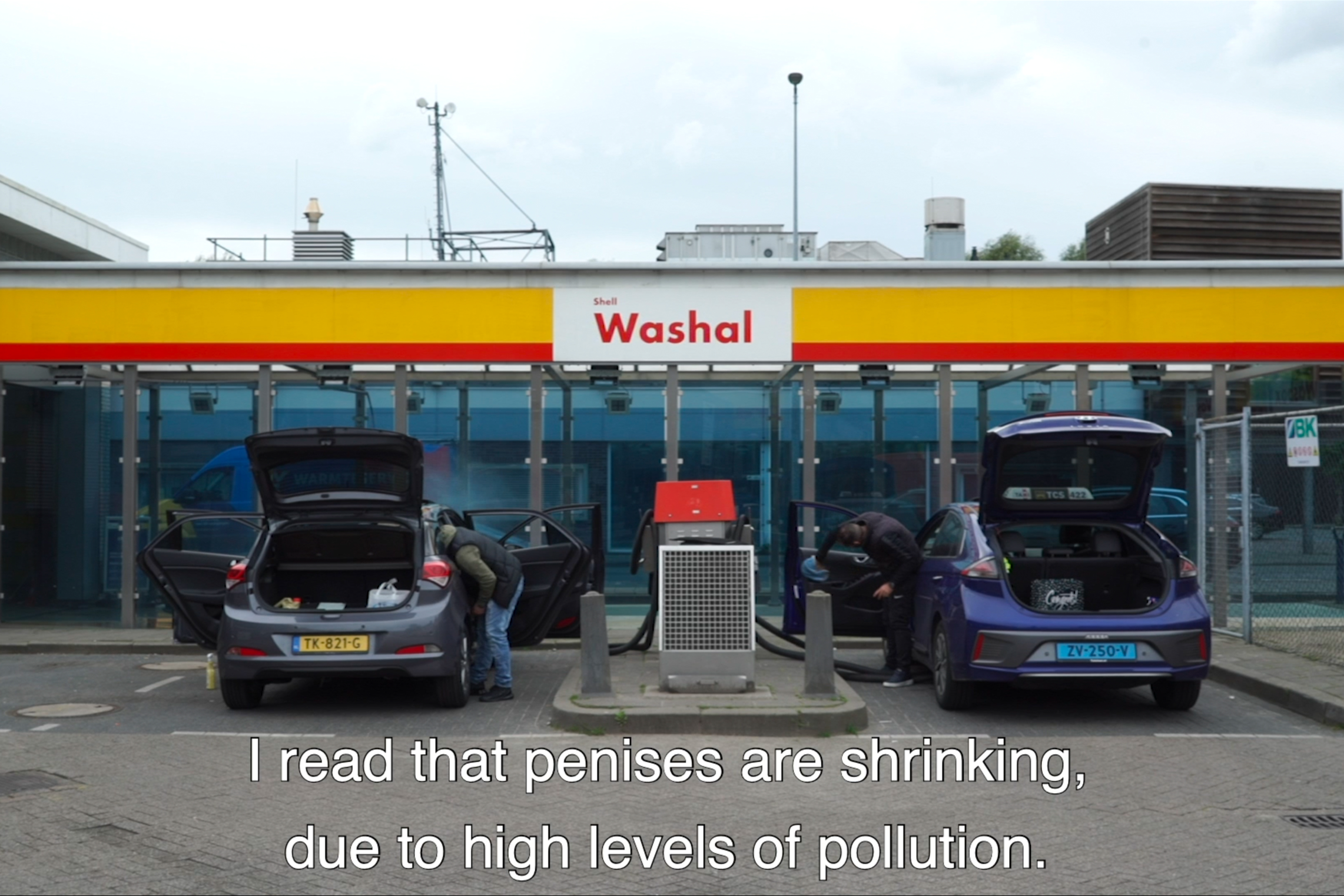
On Piggybacking, Cars and Square Trees is a site-specific installation that explores from a queer gaze the multiple ways in which generic architectural sites, i.e. the carwash, and technologies of movement, i.e. the car, play a role in contributing, sustaining or sometimes subverting the reproduction of socio-cultural values and gender patterns. From a gender studies perspective, the ritualistic process of cleaning and maintaining a car can be seen as a political performance that could be considered a “feminisation of masculinity”, opening a door to a new critical model of masculinity – a so-called ‘caring masculinity’ – which contributes to equalising gender roles and embraces the affective, relational, emotional and interdependent qualities of care.

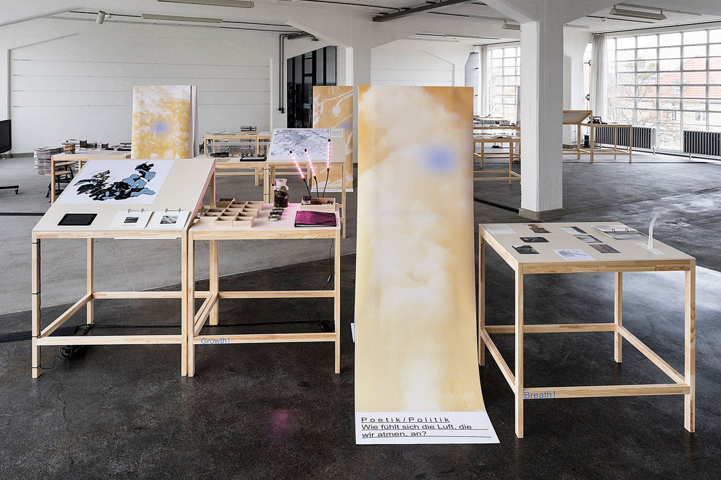
VEGETATION UNDER POWER
Editorial, Visual Identity, Exhibition
2021
2021
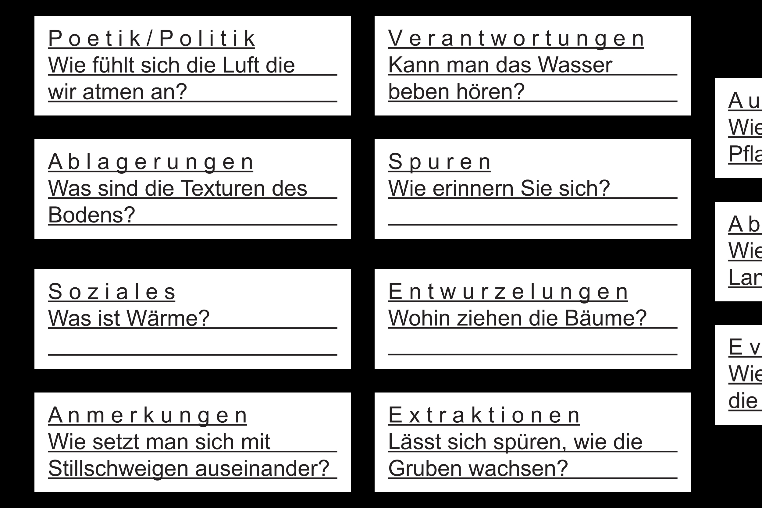
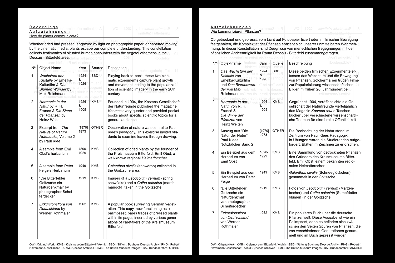
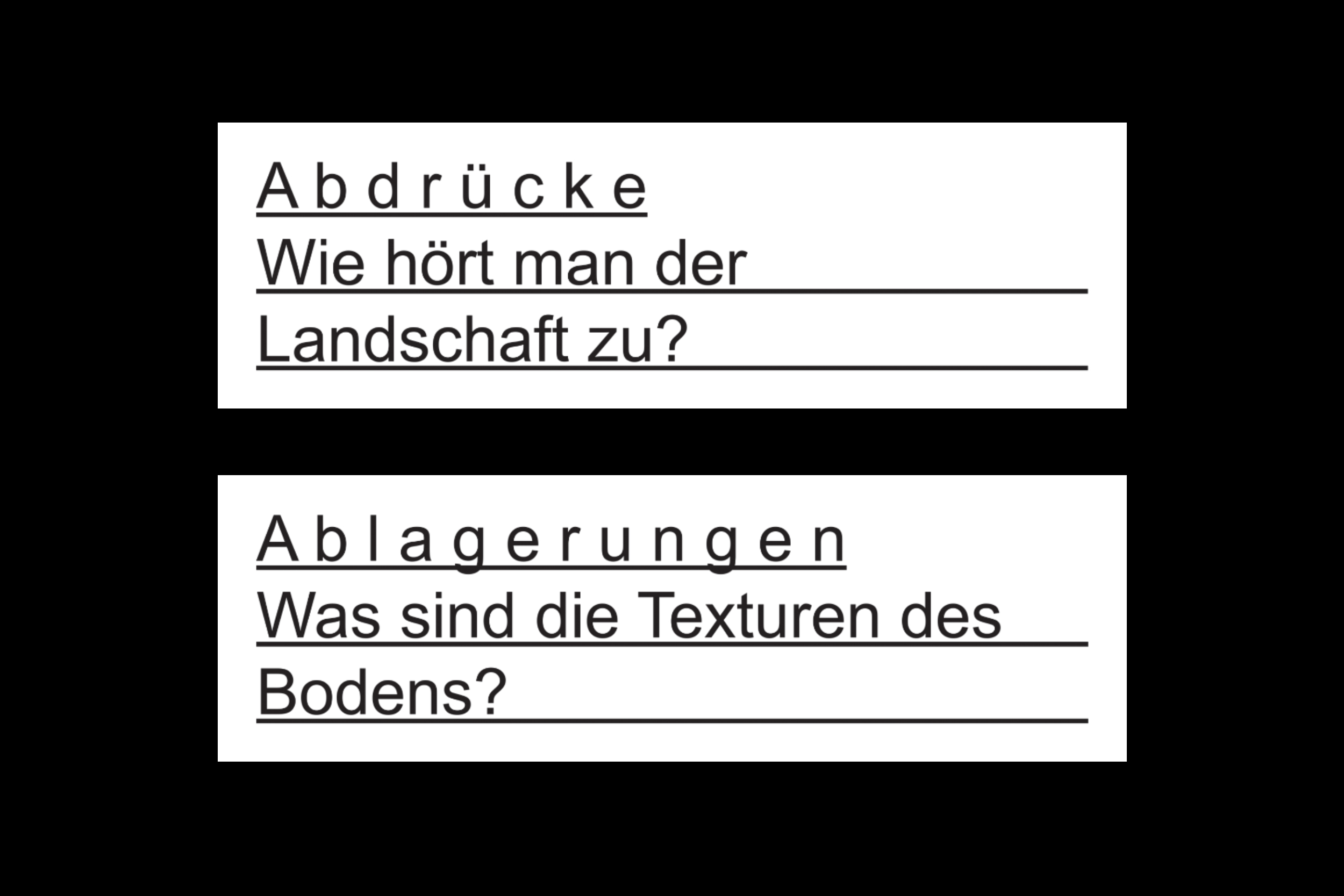
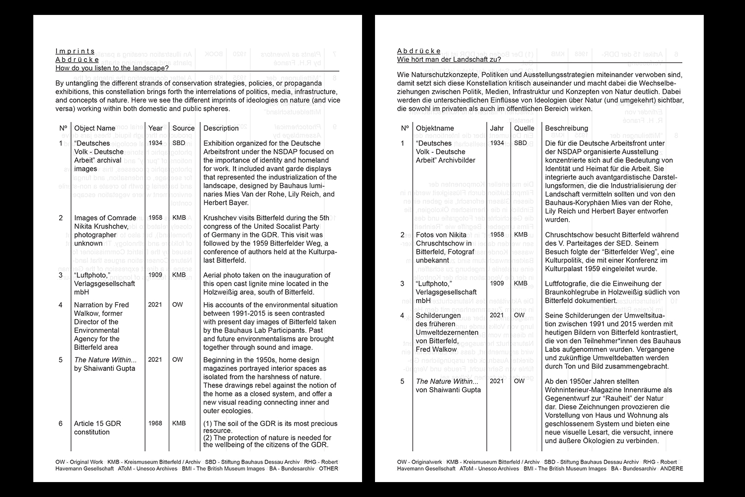
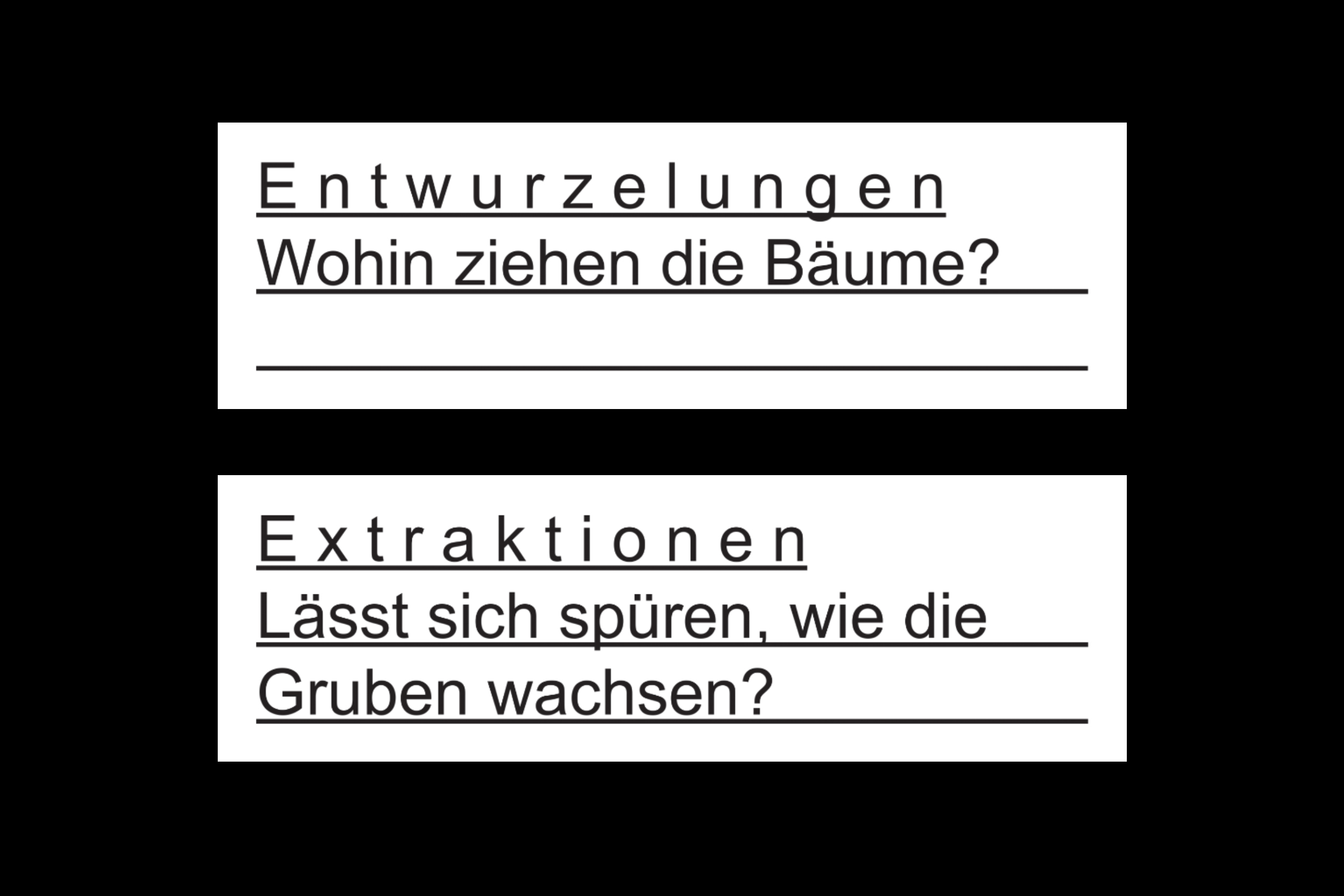
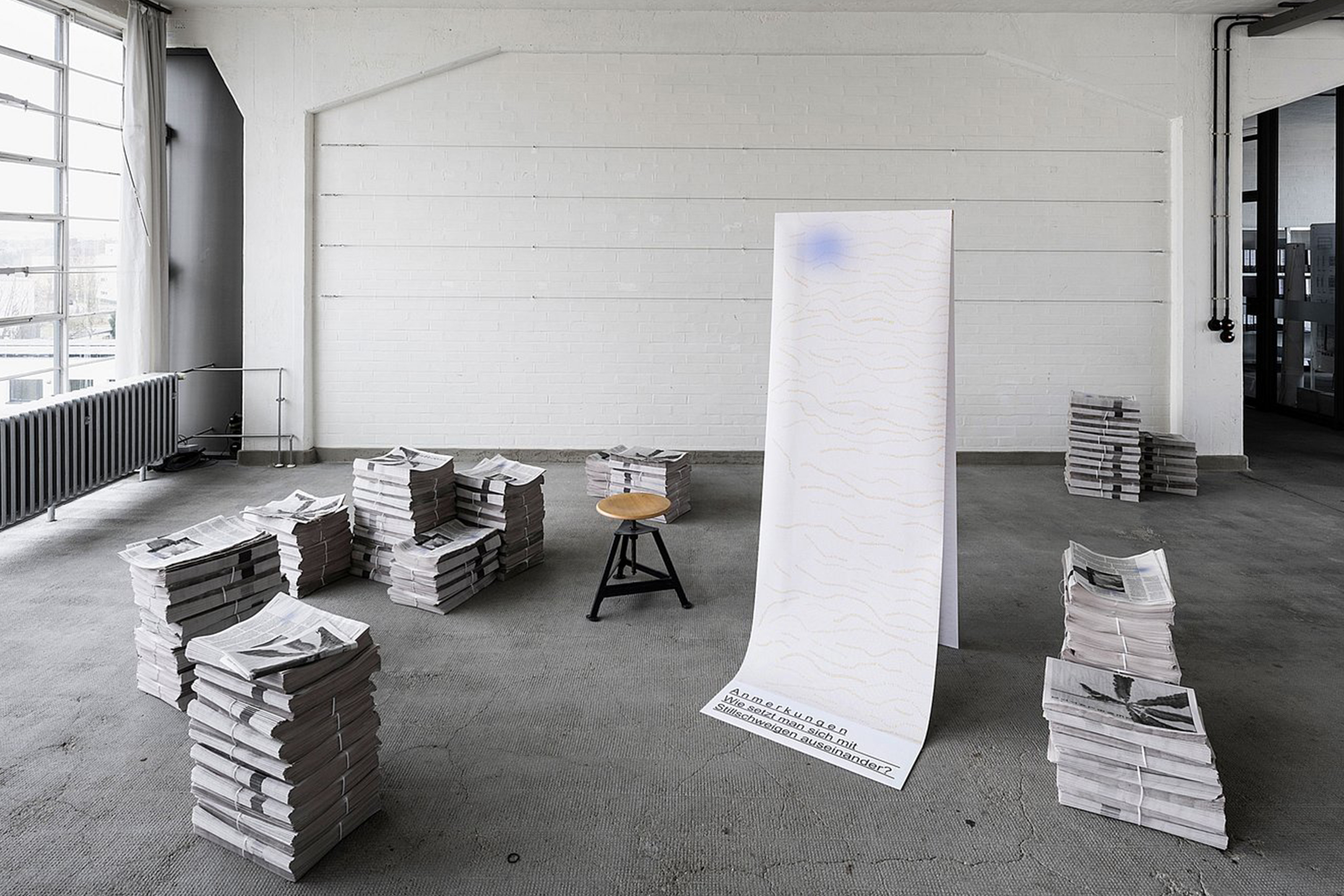
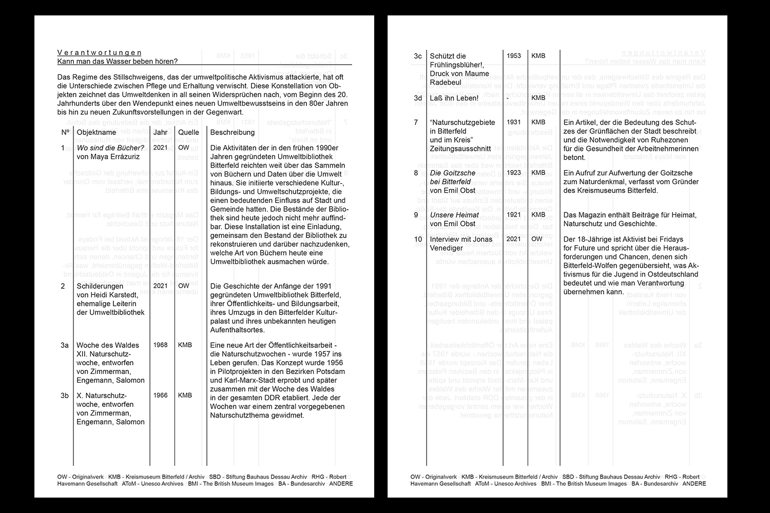
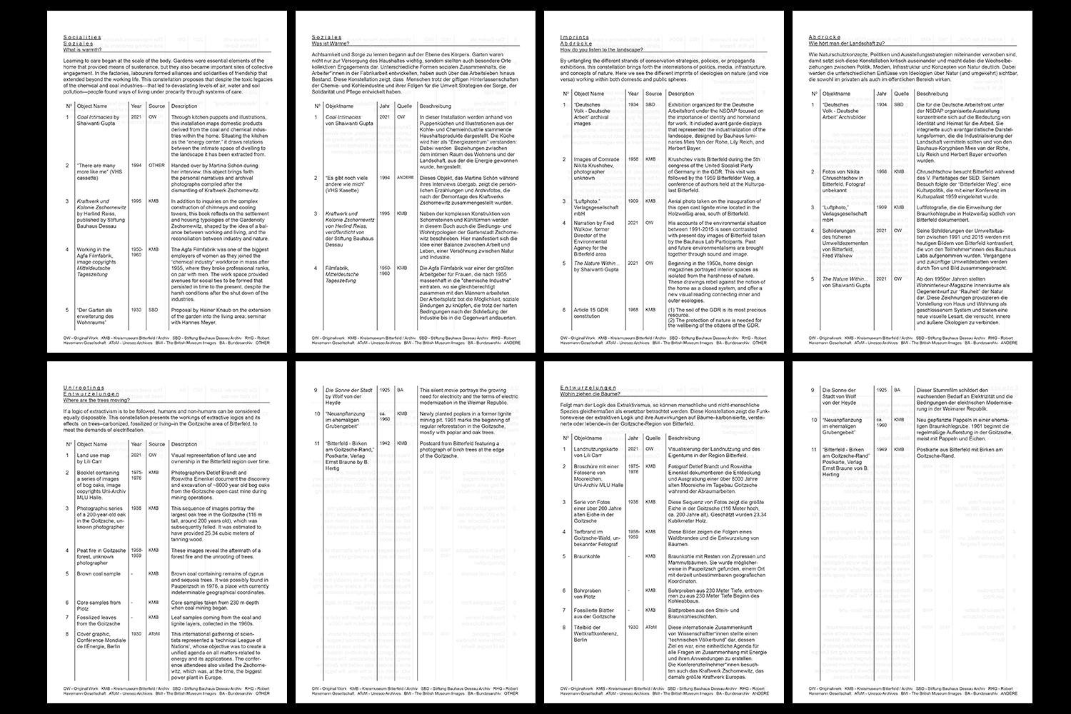
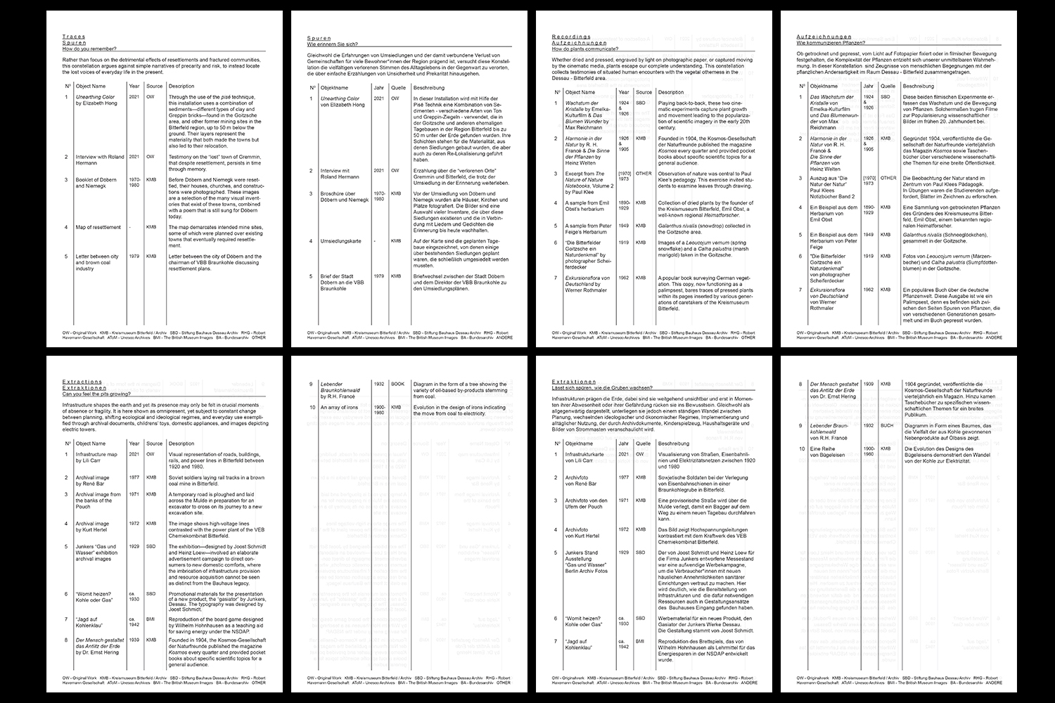
Following the Bauhaus Dessau corporate design guidelines, graphic elements were designed for Vegetation under Power exhibition.The Kreismuseum Bitterfeld, Bitterfeld’s county museum, contains a black box with herbaria dating from 1931. This collection, compiled by botanist Hans Weber, is an inventory of the flora gathered in the nearby Goitzsche region, a forested area of floodplains. Taking the herbaria as its starting point, Vegetation under Power interweaves stories about Bitterfeld’s energy-defined landscape with the modern legacy of the Bauhaus. The exhibition presents a landscape formed by 11 constellations: Poetics/Politics, Evidences, Sediments, Traces, Socialities, Recordings, Imprints, Extractions, Un/rootings, Stewardships, and Annotations, linking the plant collection to public debates on forest dieback, nature conservation, air pollution and growing environmental awareness, highlighting the relationship between ecology and economy. Using archival documents, interventions and field studies, the transformation of nature is related to the history of the Bauhaus.
The dynamic interplay of these facts gives rise to questions about how we care for and preserve landscapes that are seemingly irretrievably lost. What does it mean to care for post-industrial landscapes? And how can we push for the renaturation of our environment today?
Photos © Thomas Meyer


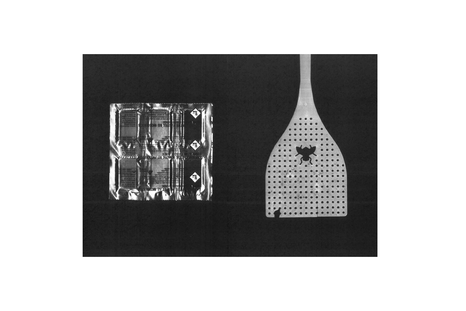
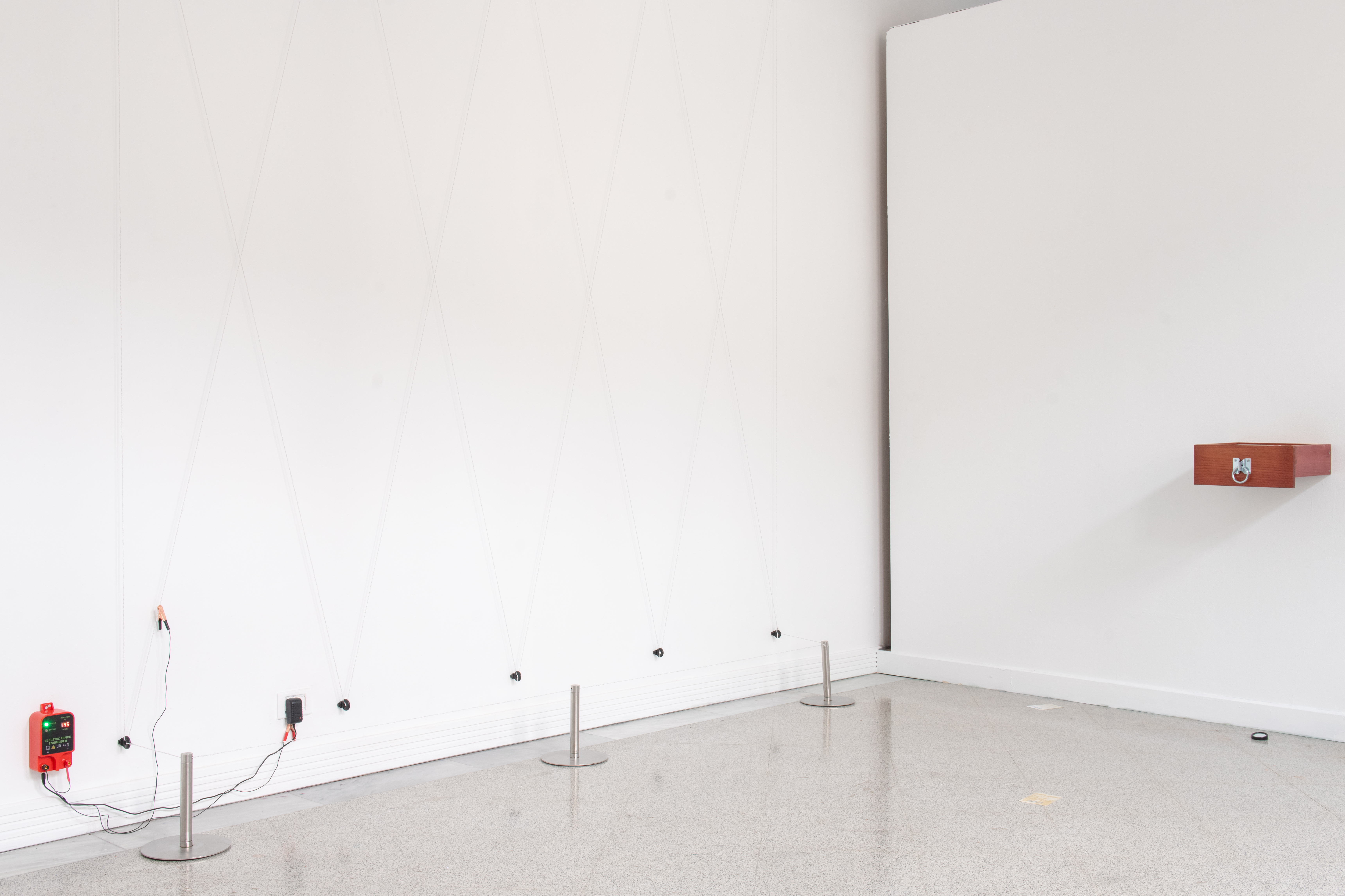
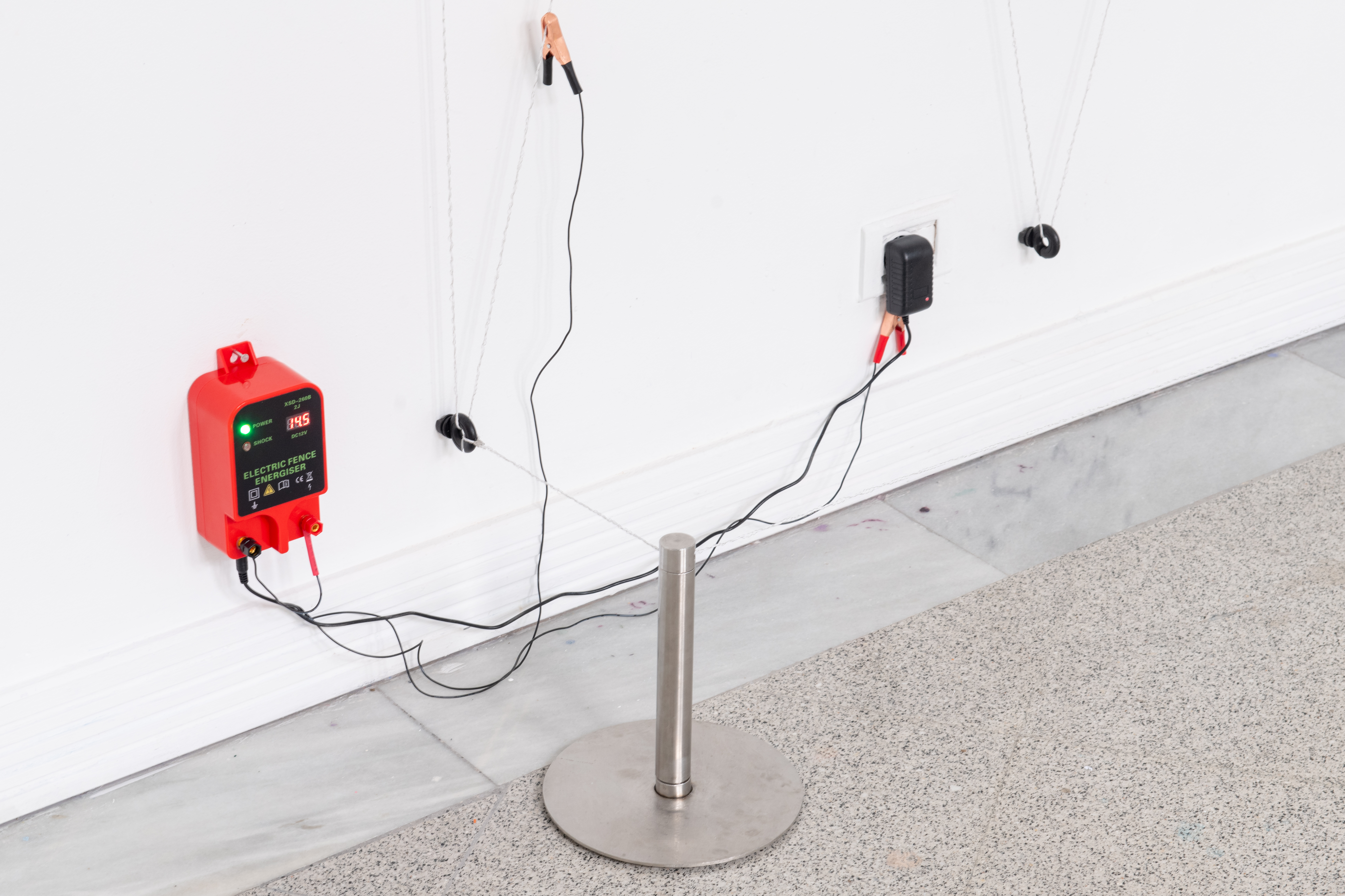
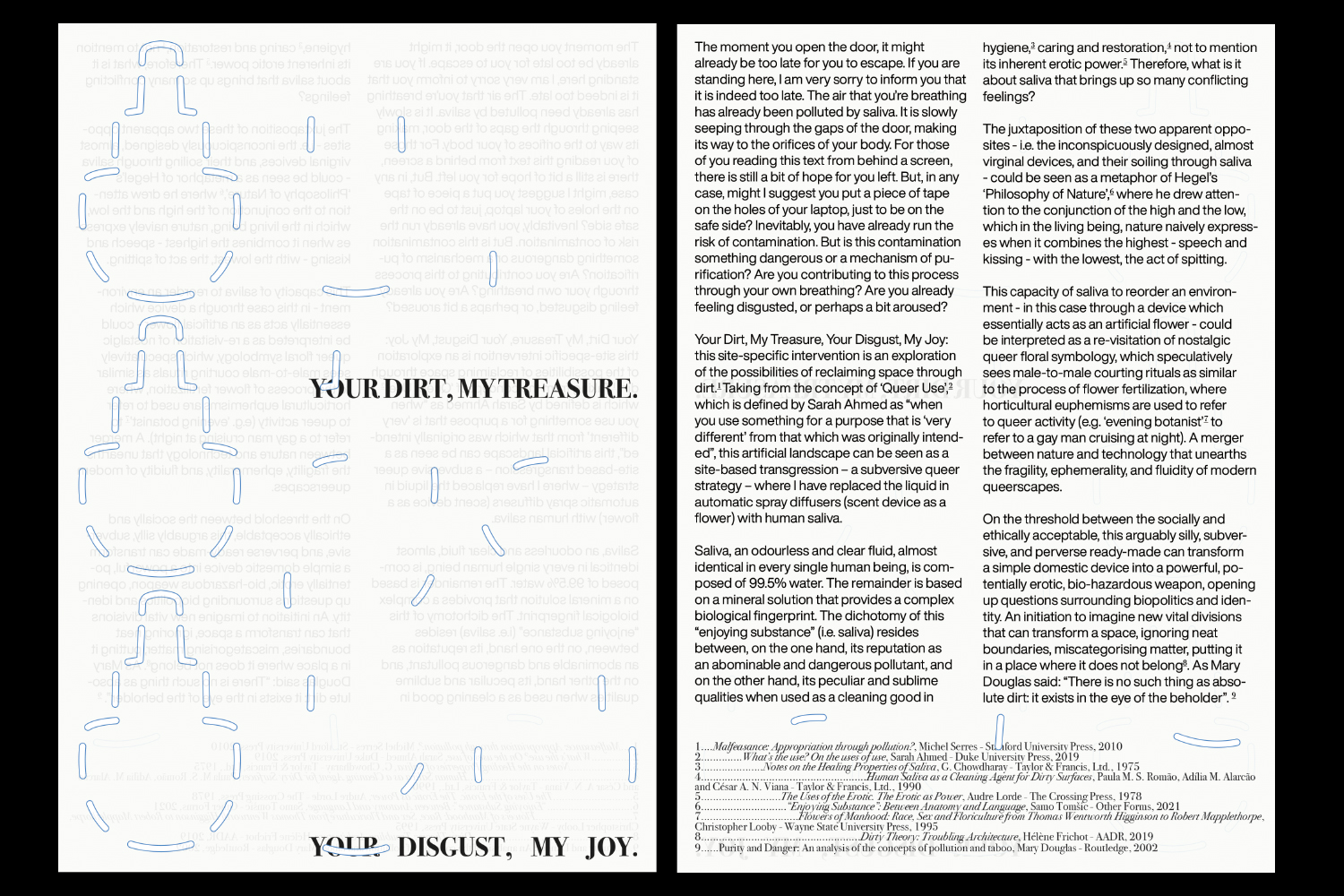
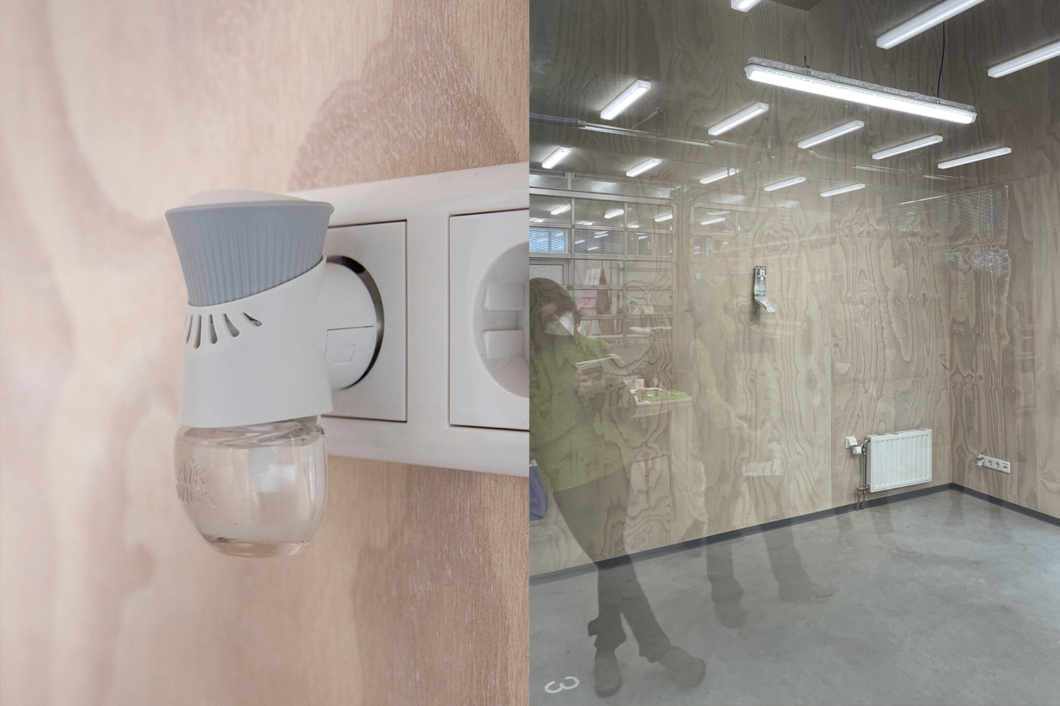
YOUR DIRT, MY TREASURE
YOUR DISGUST, MY JOY
Site-Specific Installation
2022
2022
This uncanny installation was devised by producing a set of critical applications, tools and situations for spatial agency by appropriating space through the dispersion of human saliva. These sculptural gestures—bodily fluid released as mist and a screen displaying magnified saliva—function as exercises in scale, exemplifying the tension between bodily fluids and manufactured devices, aerial circulation and spatial atmosphere, estrangement and magnification. By adopting the language of consumerism and combining it with scientific—or rather pseudo-scientific—visualizations, the work enacts a tactical intervention that engages broader modern scientific and medical discourses on hygiene, discourses that historically produced spatial segregation and continue to do so today. The result is an intimate yet unsettling spatial proposition in which desire, ambivalence, and transgression emerge as emancipatory gestures—acts of appropriation performed through forms
of apparent pollution.
of apparent pollution.
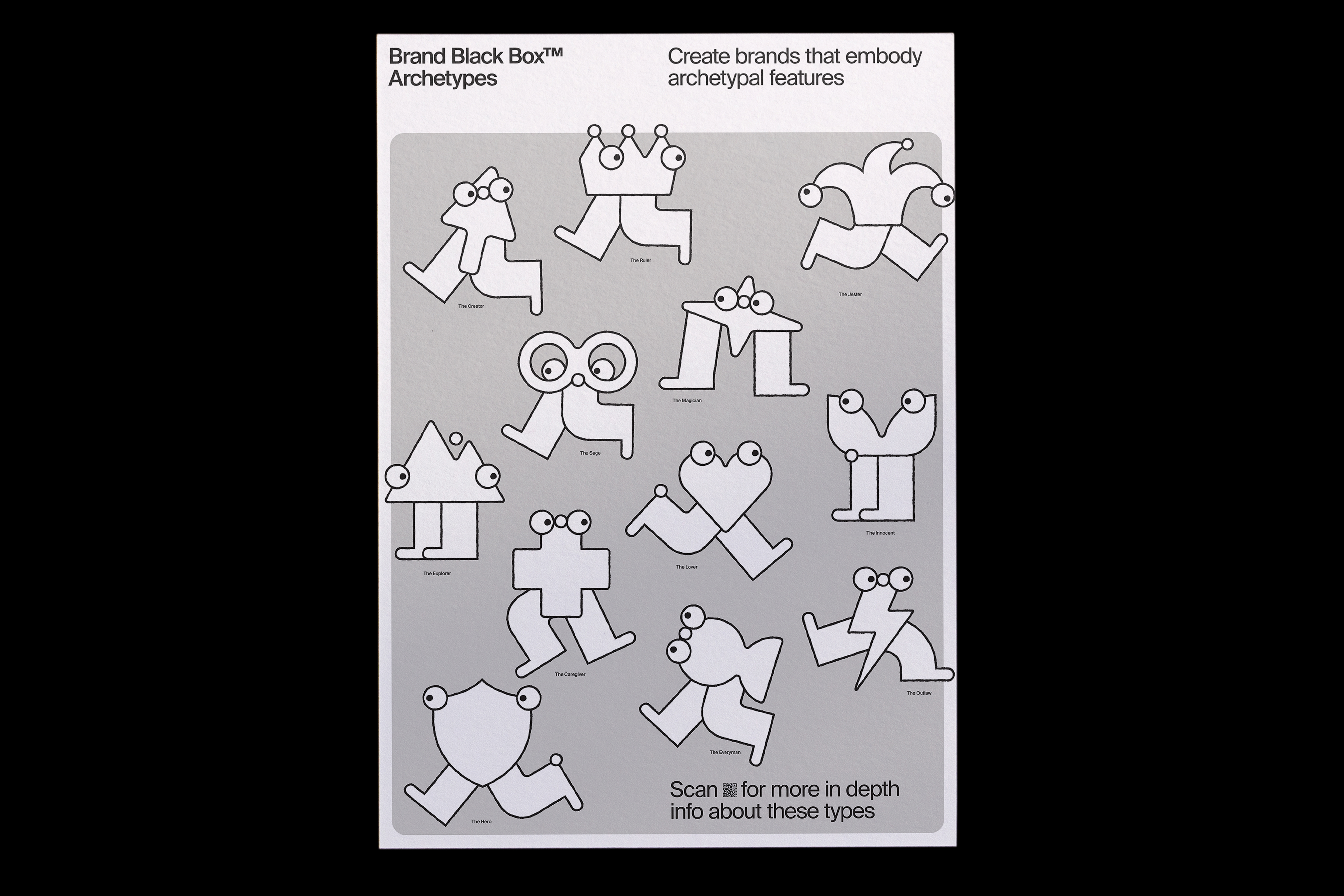
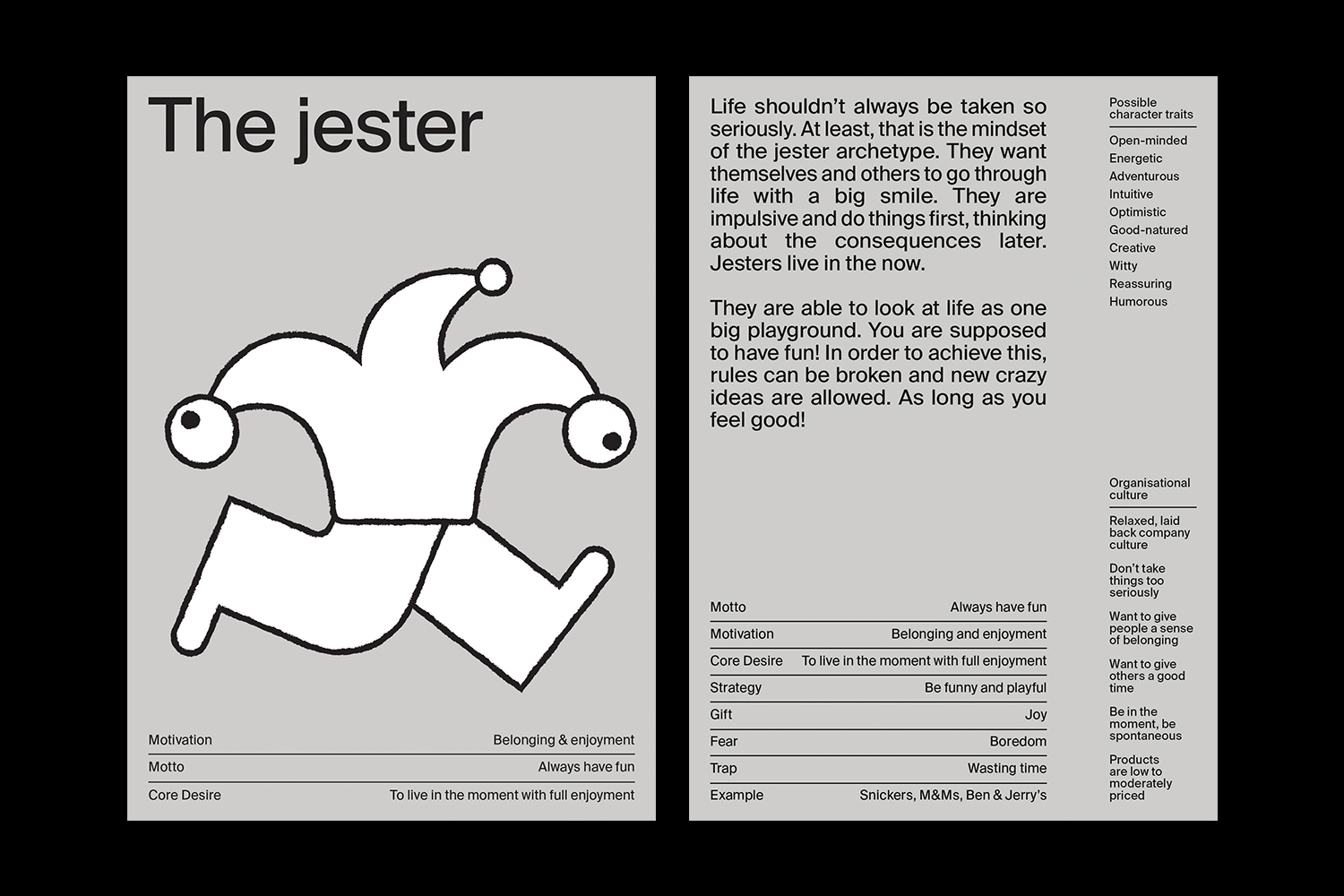
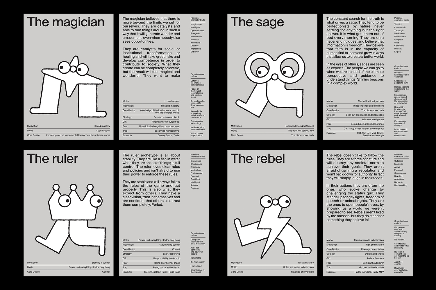
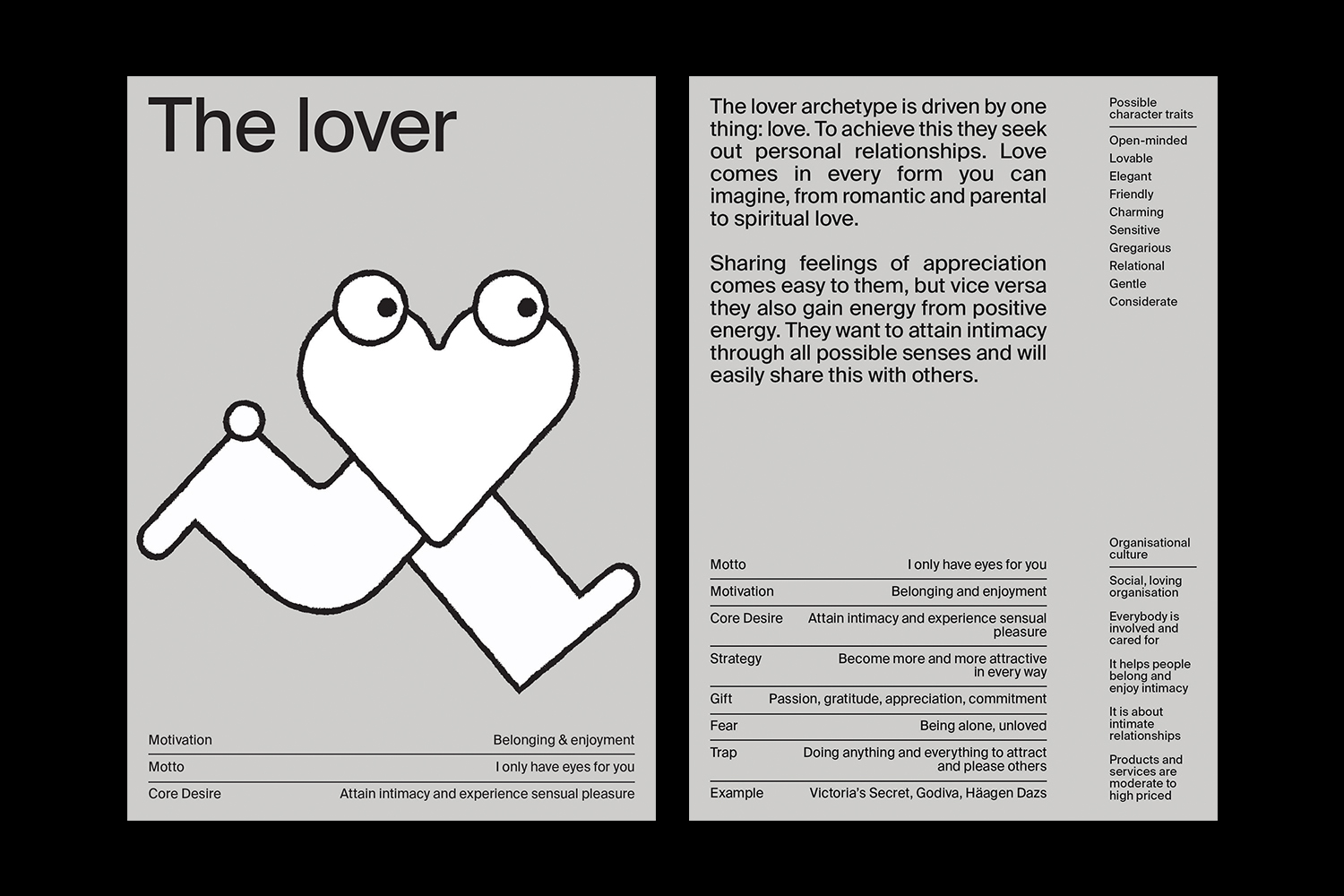
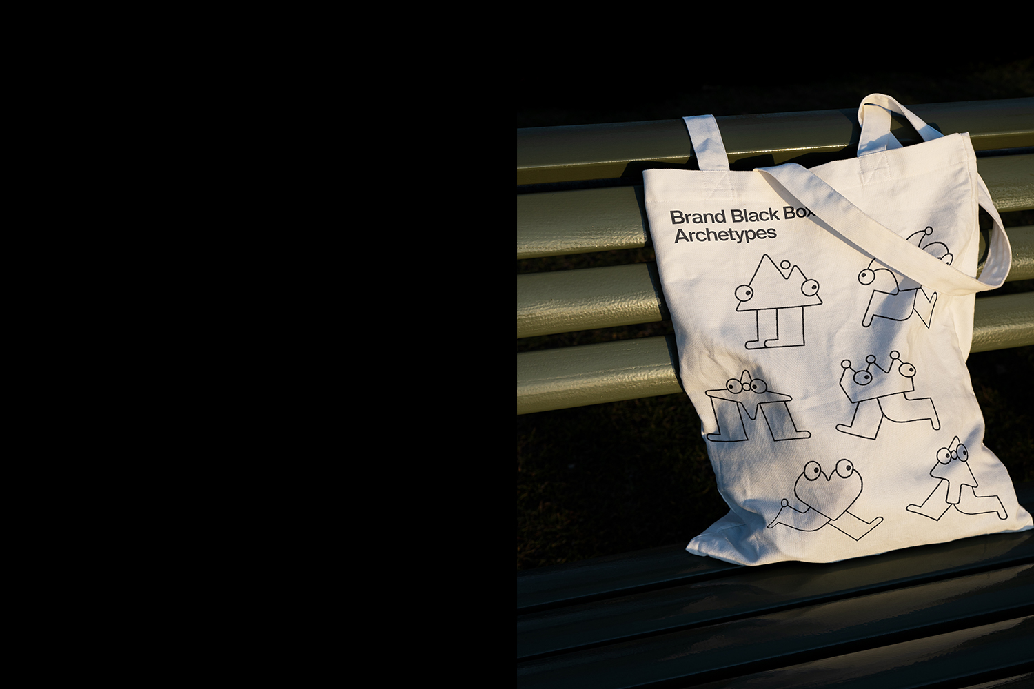
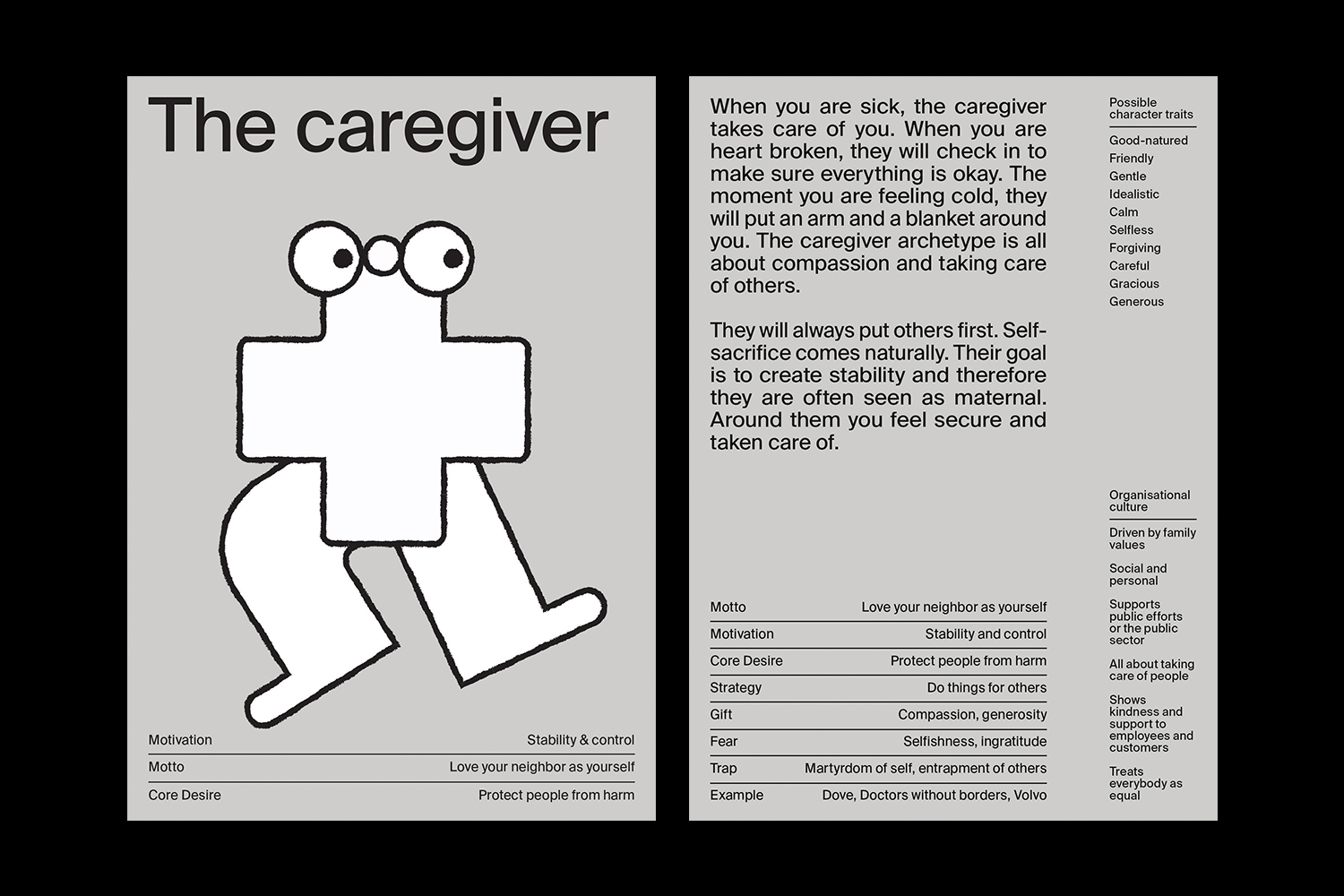
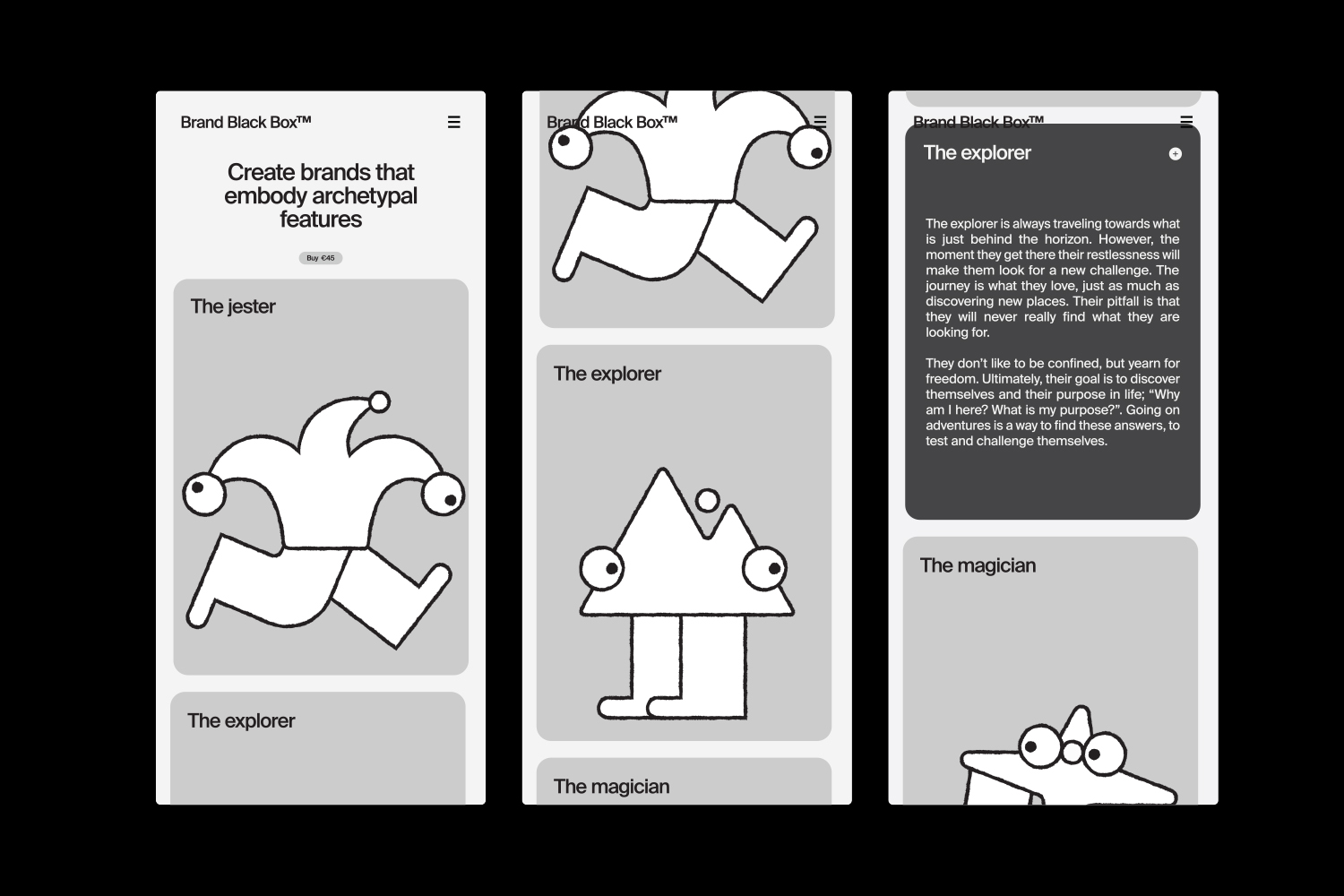
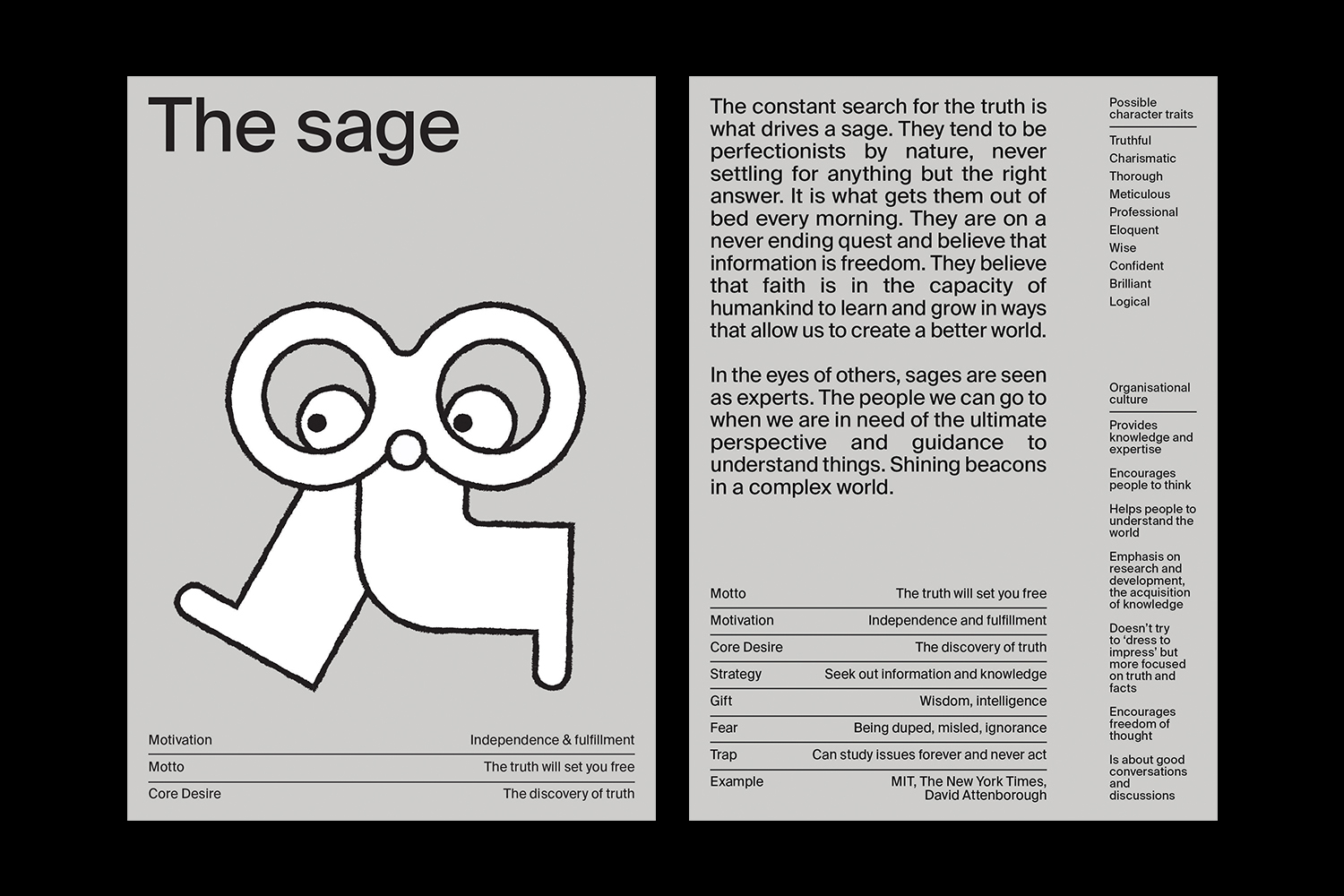
BRAND ARCHETYPES
Visual identity, Editorial
2023
Want to make your brand connect to people? Brand archetypes are a way to find focus and clarity in your brand positioning. It is based upon the theory that there are universal archetypical patterns underlying all human communication.
Carl Jung translated the theory into 12 archetypes. In 2001 Carol S. Pearson (in her book The Hero and the Outlaw) used these archetypes and turned them into brand archetypes. Based on this theory, I developed this body of work for Morrow.
Carl Jung translated the theory into 12 archetypes. In 2001 Carol S. Pearson (in her book The Hero and the Outlaw) used these archetypes and turned them into brand archetypes. Based on this theory, I developed this body of work for Morrow.
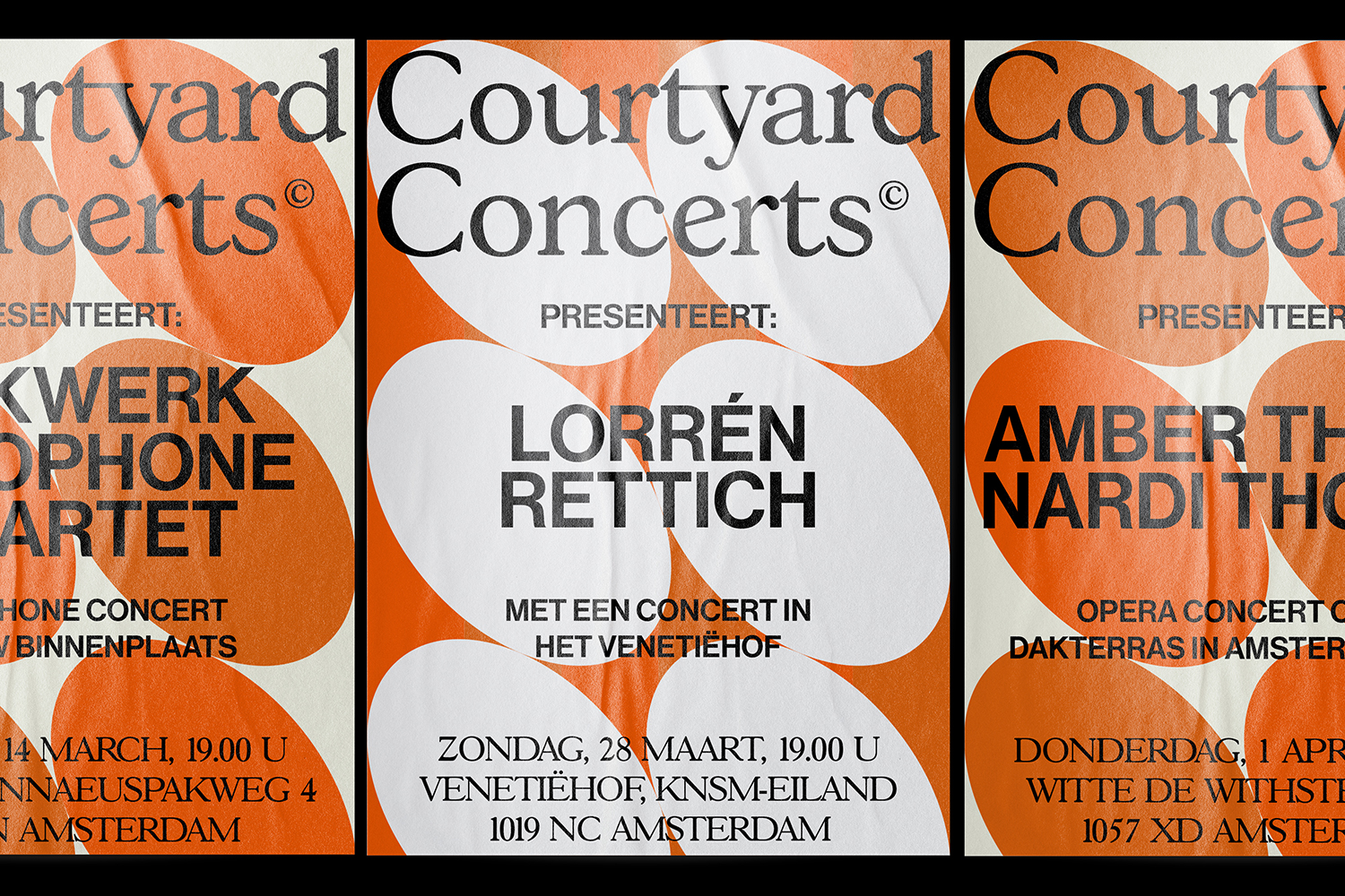
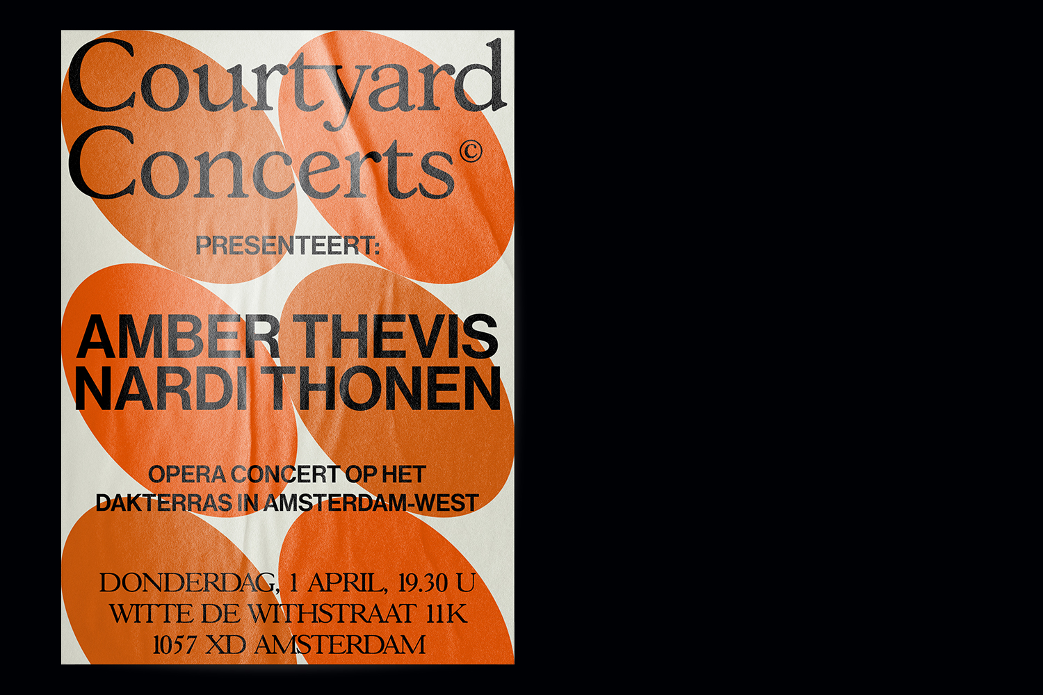
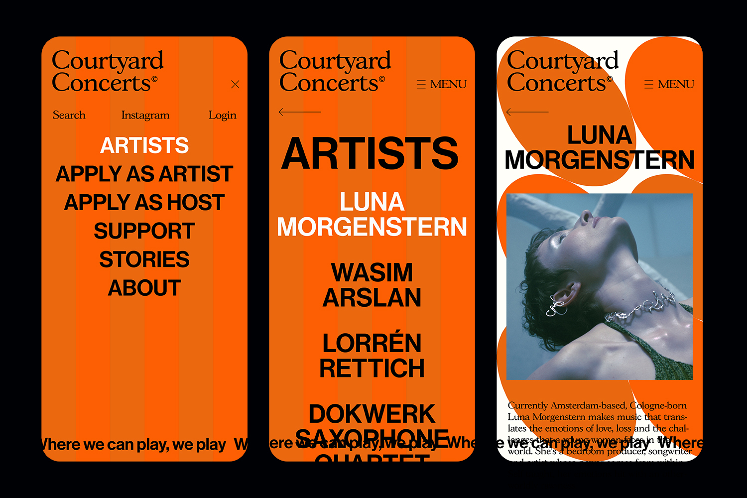
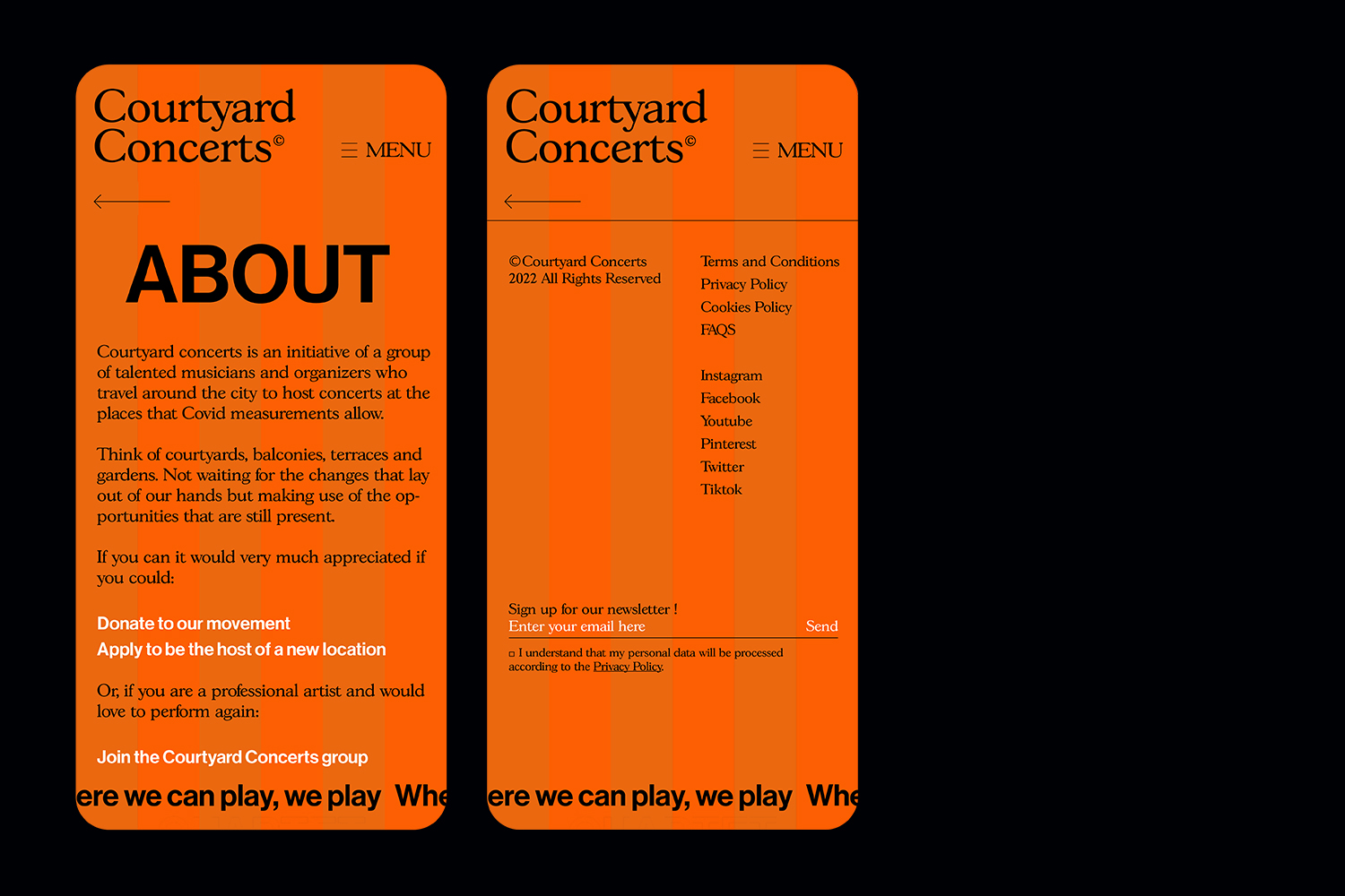
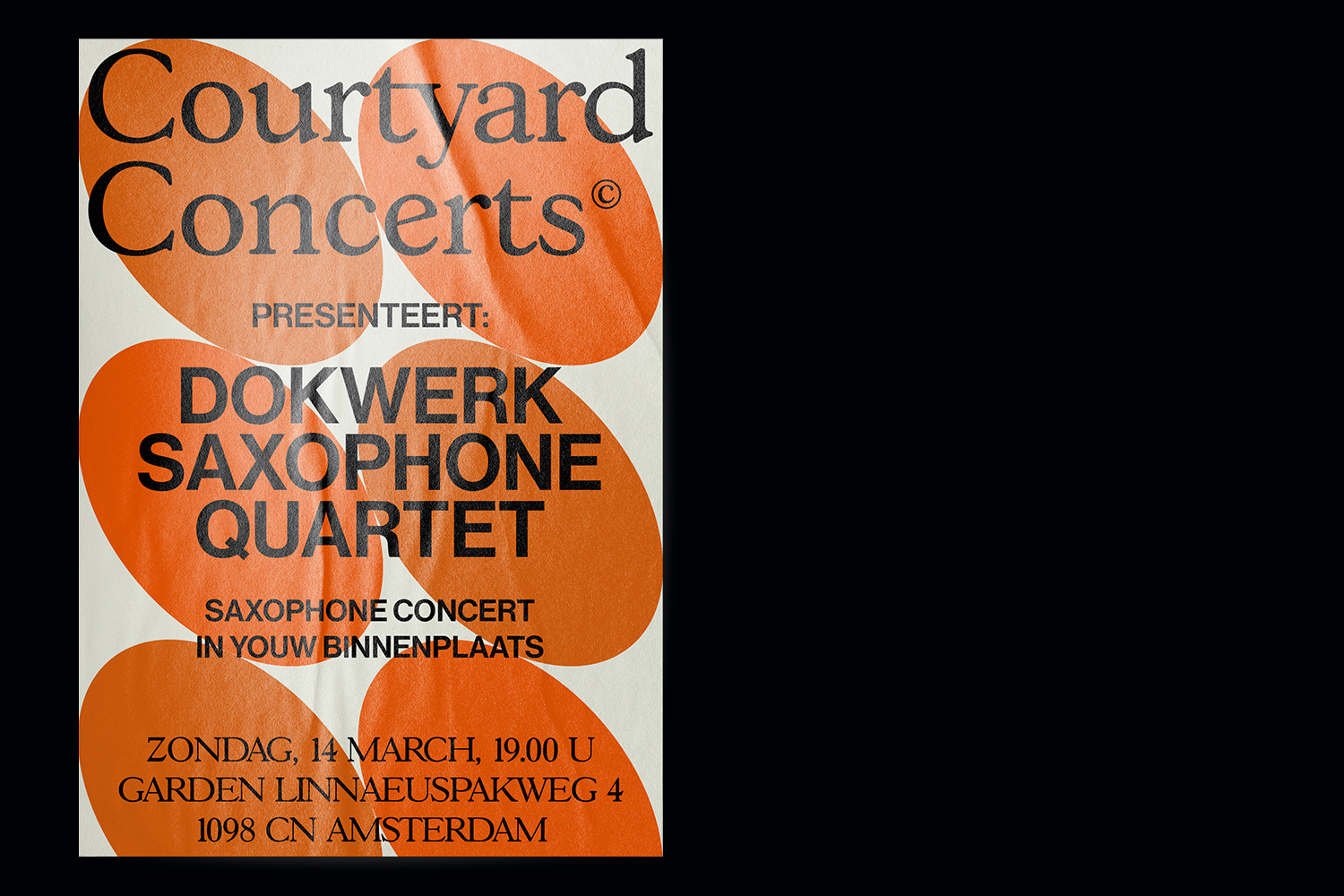
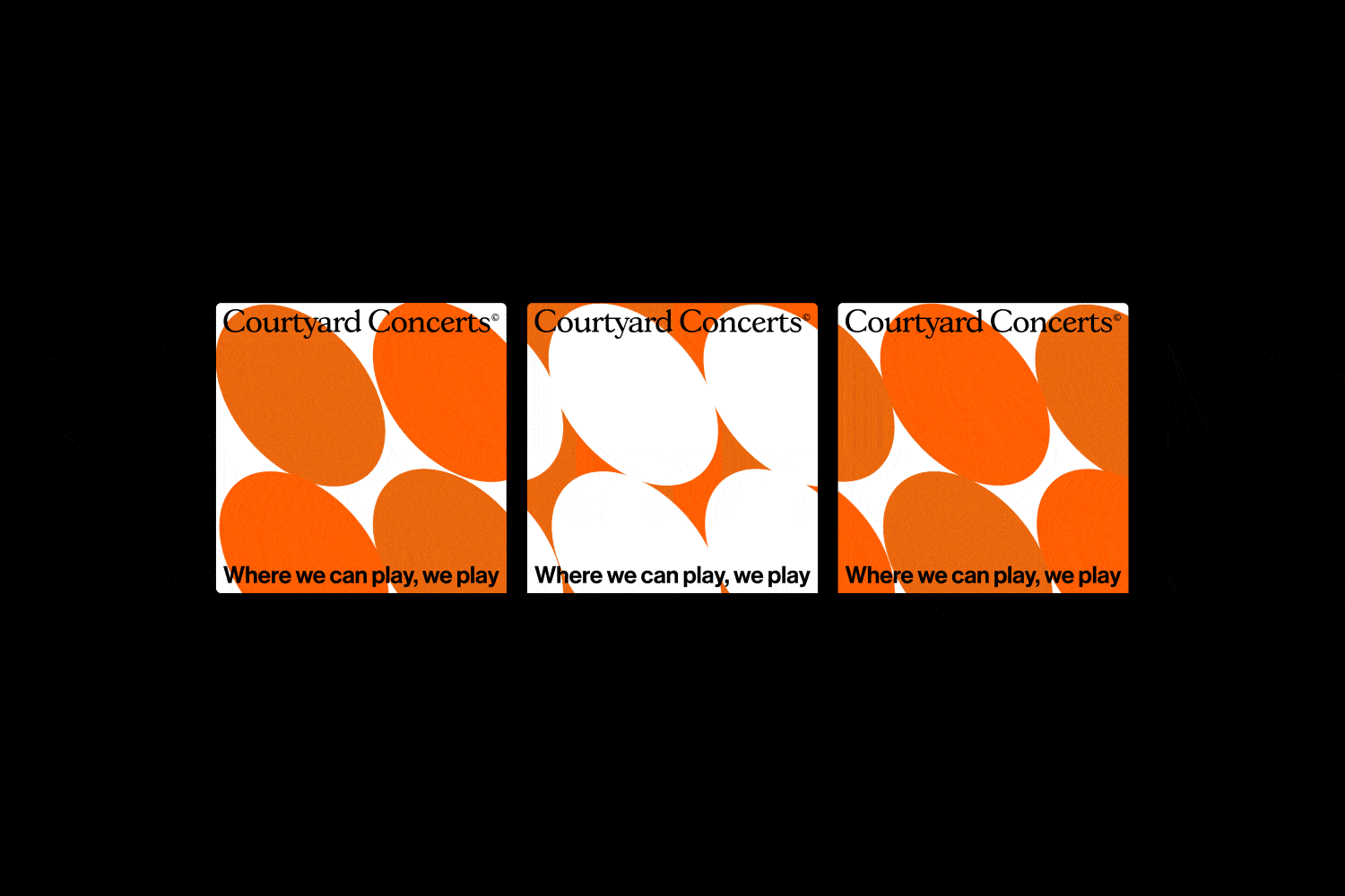
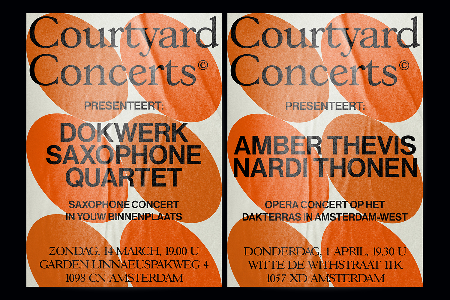
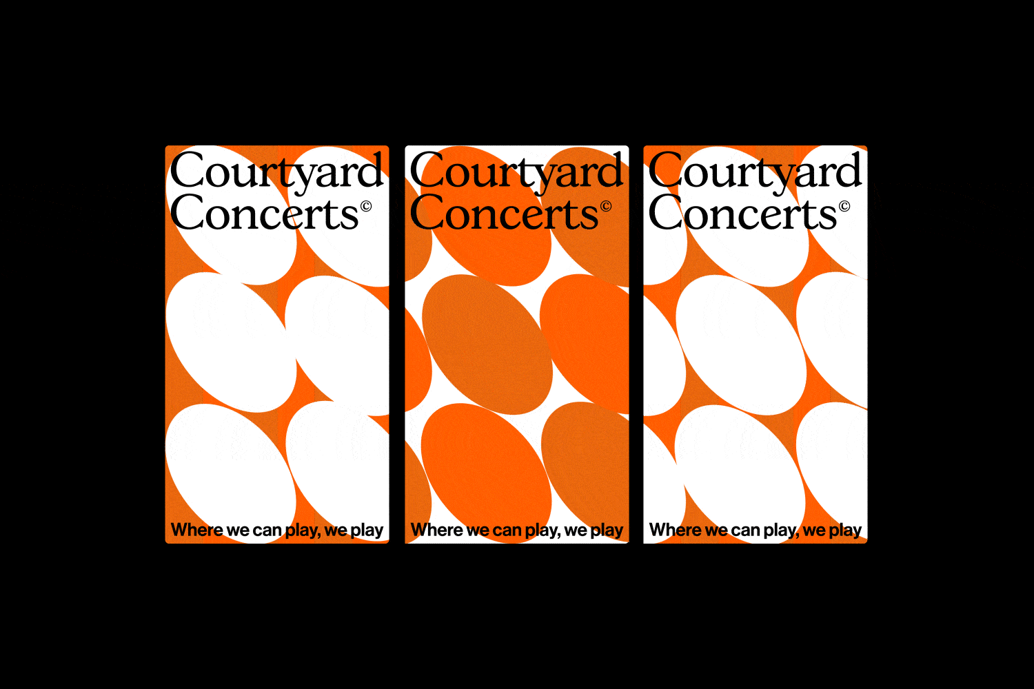
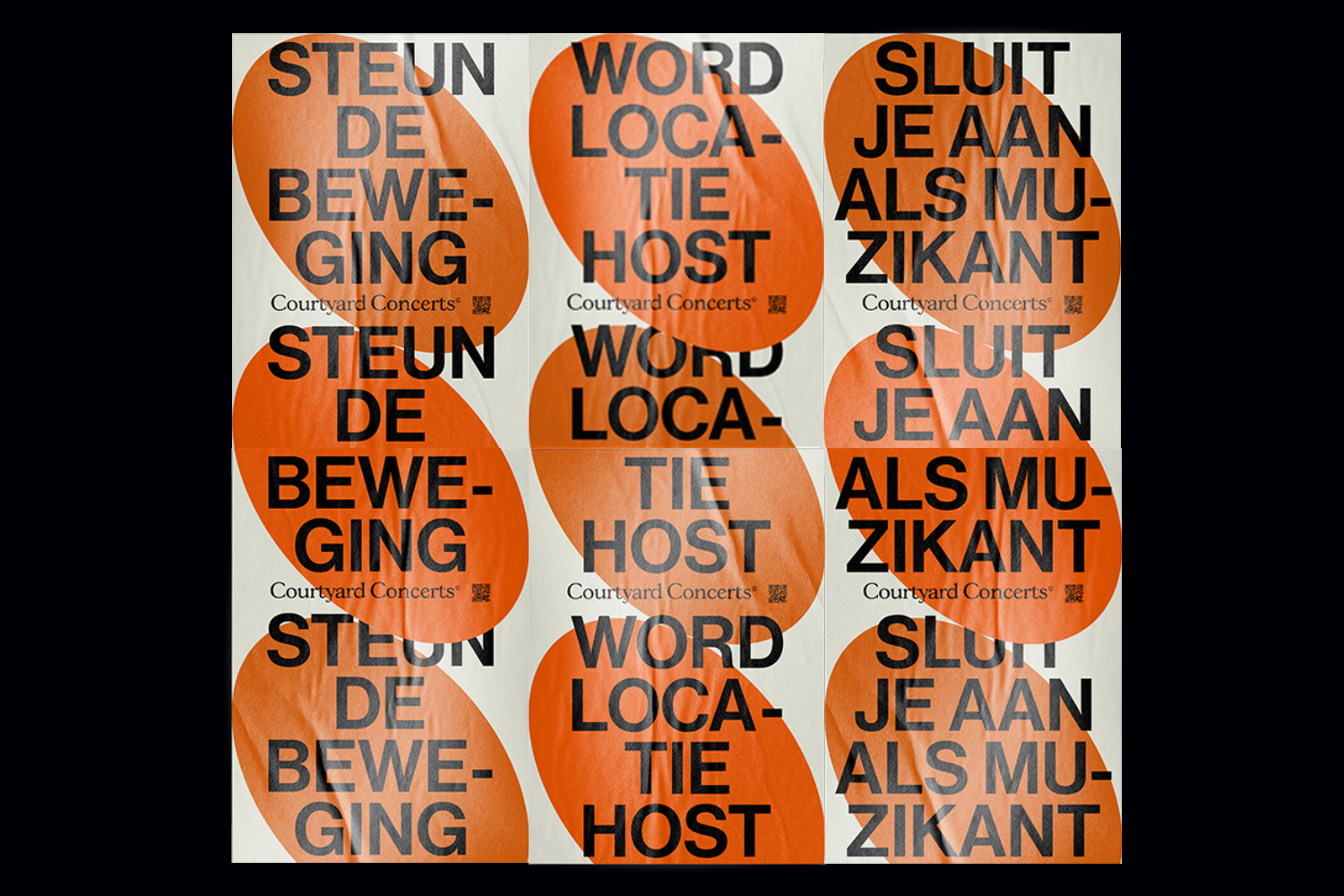
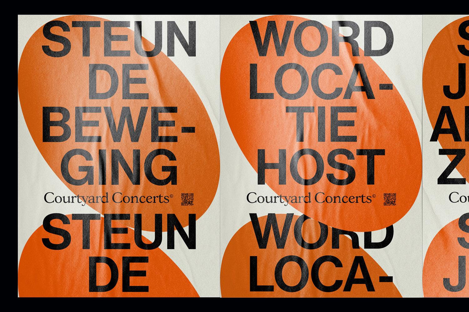
COURTYARD CONCERTS
Visual identity, Website
2021
2021
Courtyard Concerts was an initiative created by a group of talented musicians during the pandemic, where they would travel around the city and host concerts in public courtyards, terraces or gardens, as an alternative way of gathering during the Covid pandemic. The chosen typography as well as the lay-out of the poster are inspired by traditional concert posters, which you can find anywhere in the city. Despite its traditional layout, by using a bold pattern and a vibrant colour, the aim was to grab the attention of passers-by. The oval’s uneven shape symbolises the idea of people getting together in an unconventional way such as a courtyard. The colour orange was chosen for being the dominant colour in the characteristic brick
walls around the city of Amsterdam.
walls around the city of Amsterdam.
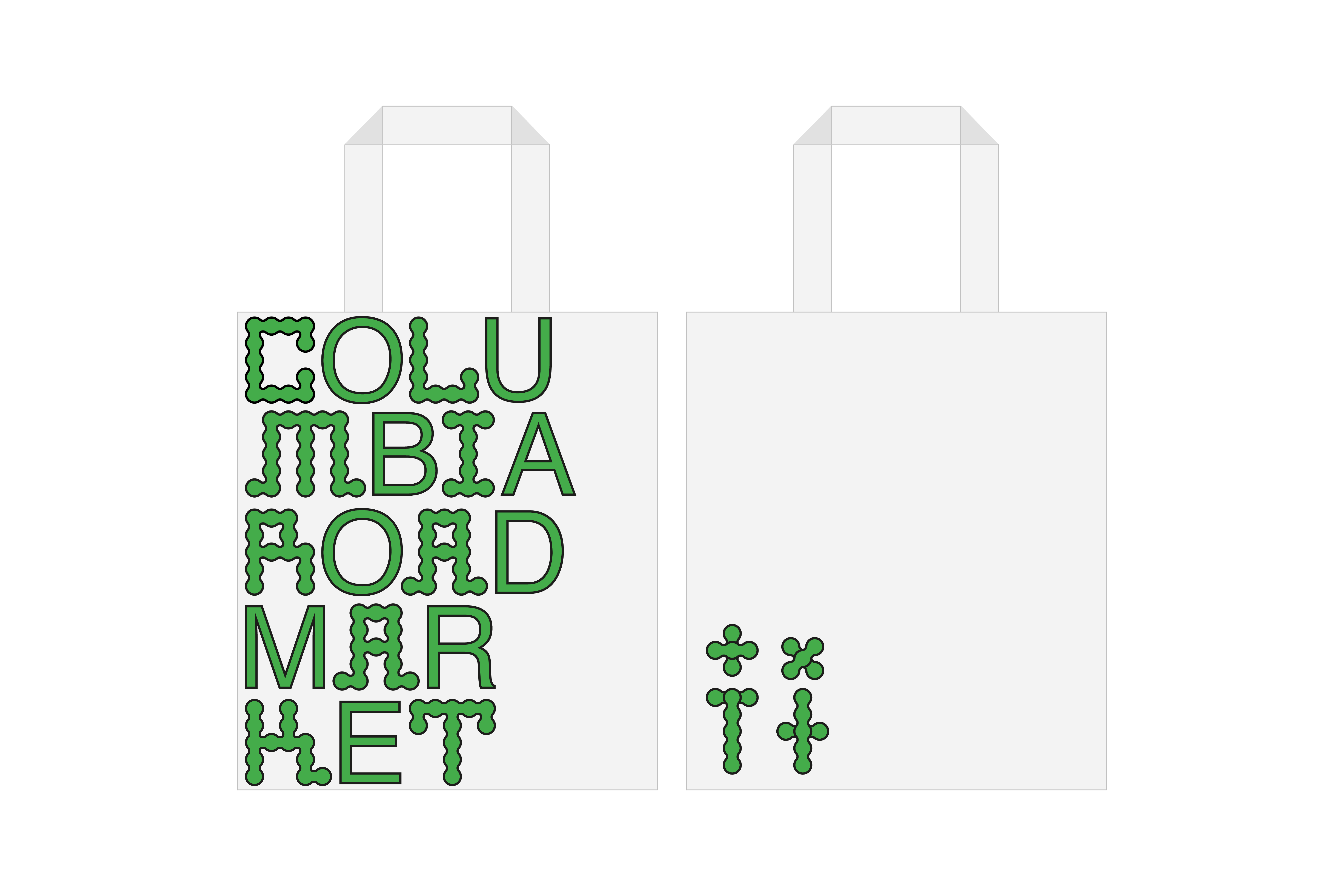
COLUMBIA ROAD MARKET
Visual Identity
2018
2018
Created the corporate identity for Columbia Road Market - a market composed of sixty independent shops, galleries, and its famous flower market on Sundays. The identity was based around the circular shape created by insects when eating leaves. This playful approach became the defining characteristic of the identity, which was translated into a customised typography and brand elements. The colour palette was chosen with the idea of reinforcing human beings’ connection with nature. The clean features of the identity serve to provide a moment of calm - a welcome escape from hectic urban life.


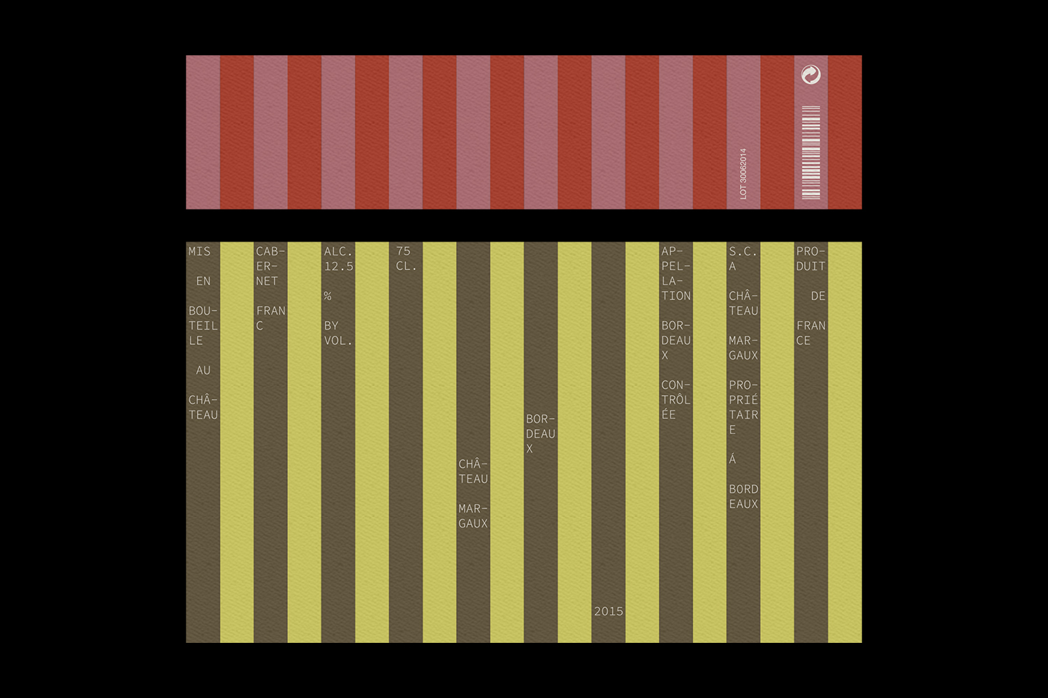
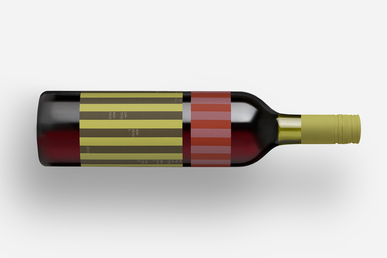
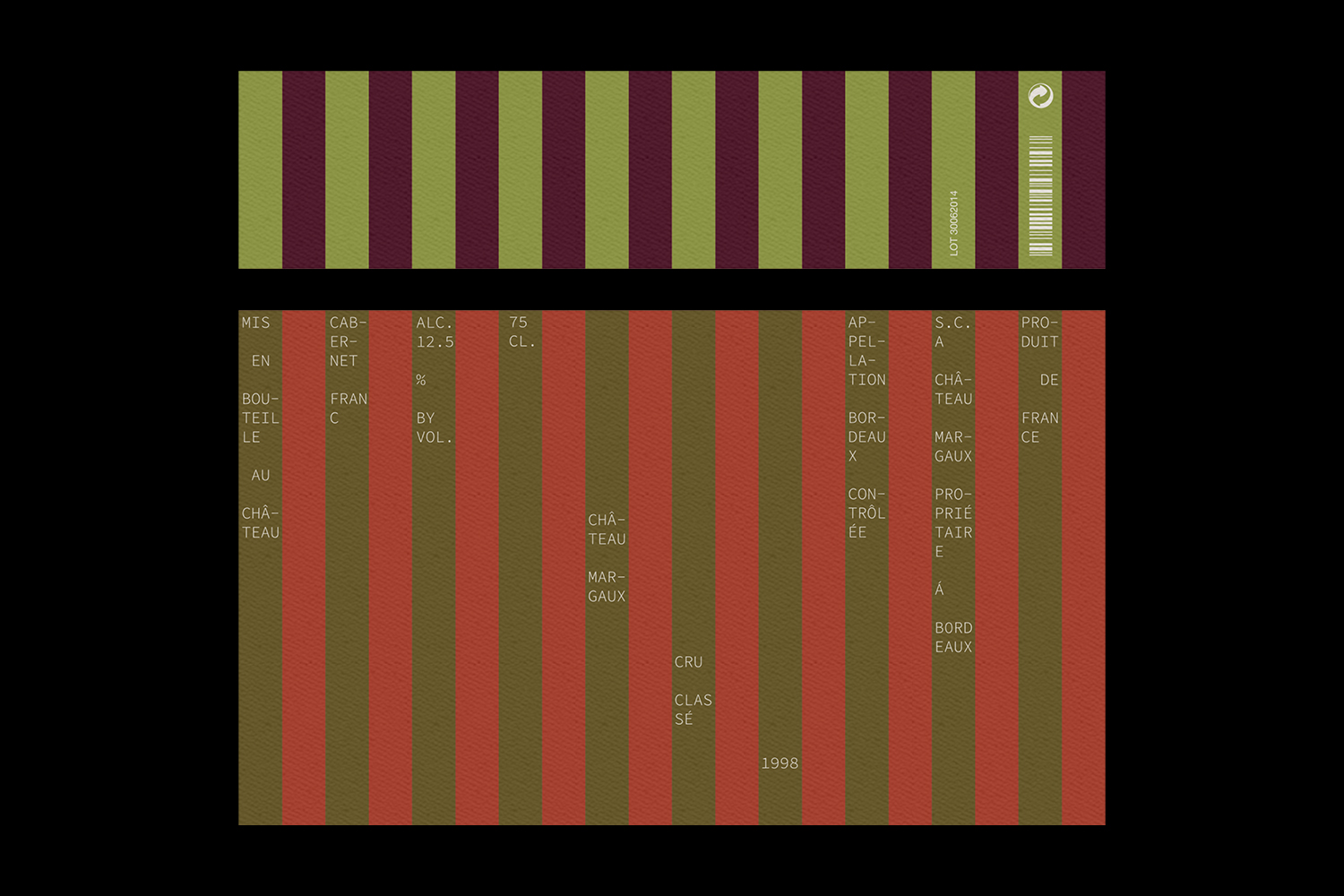
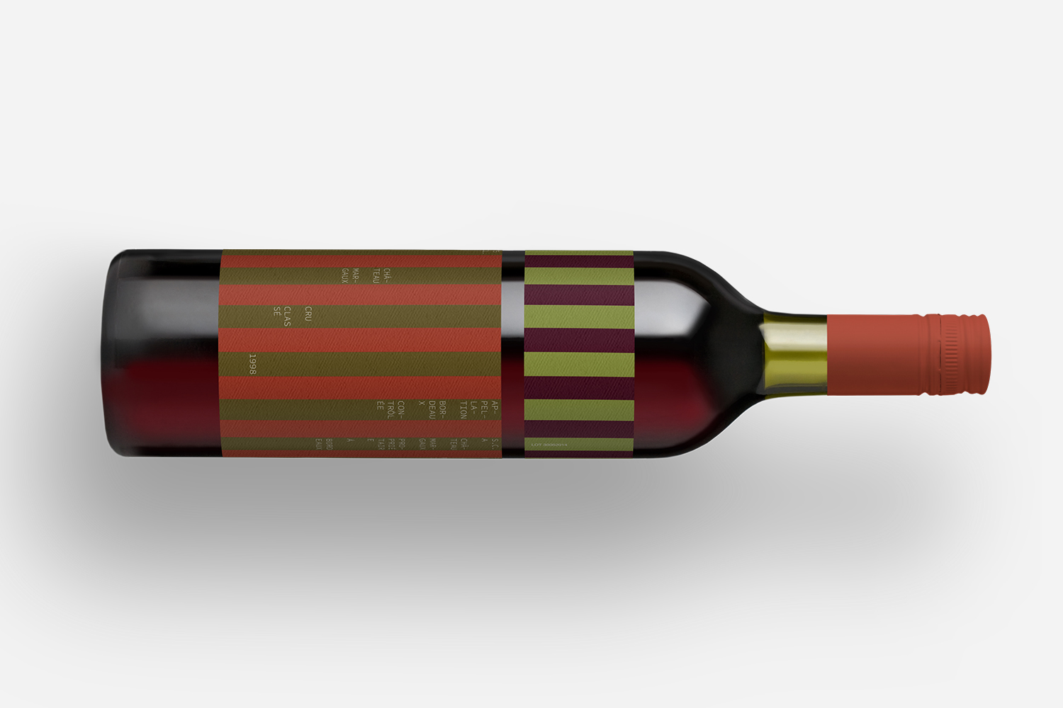
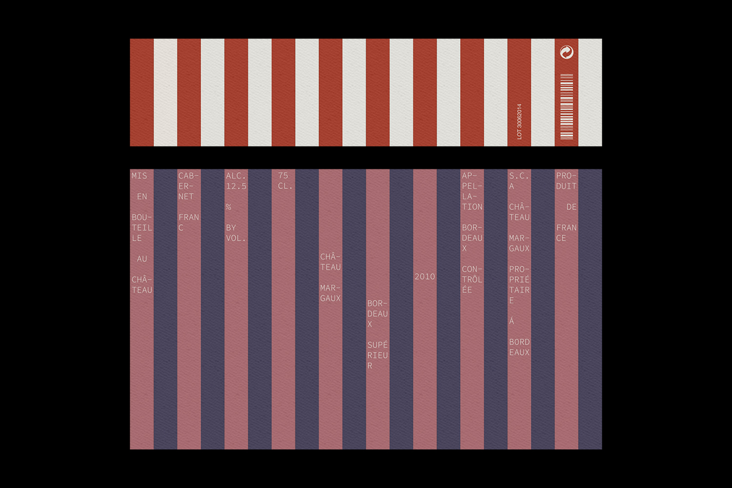
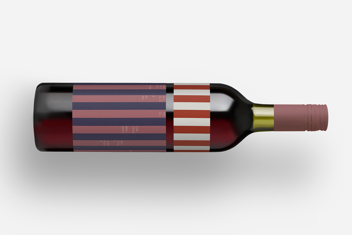
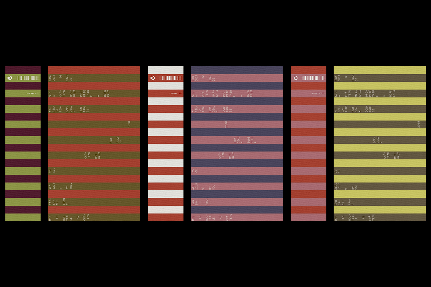
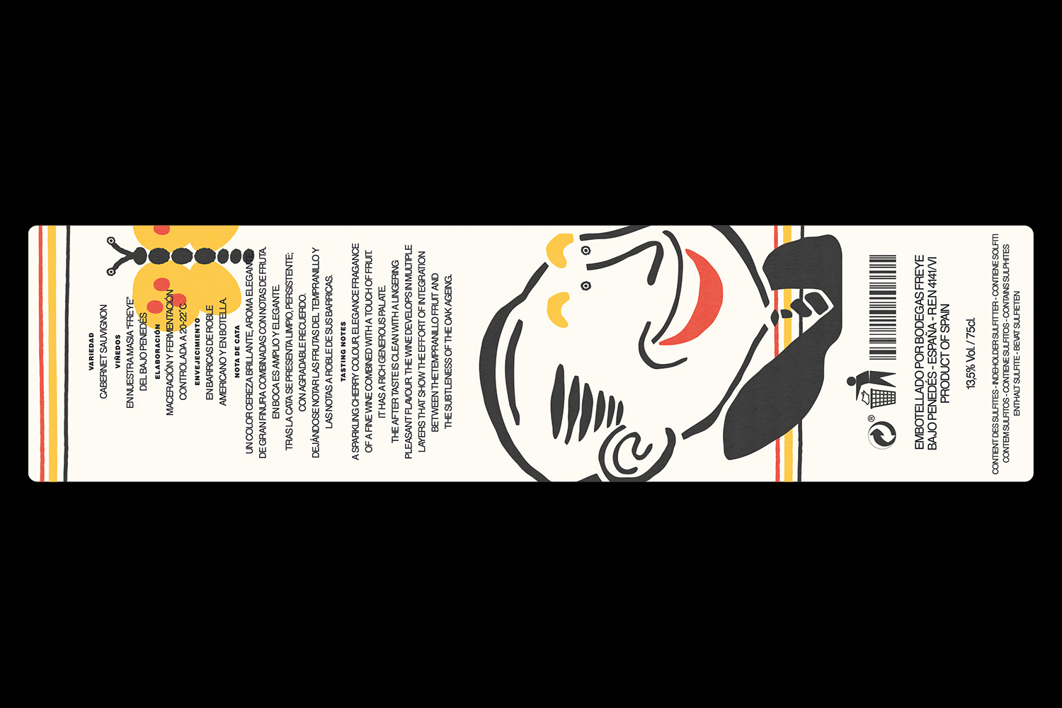
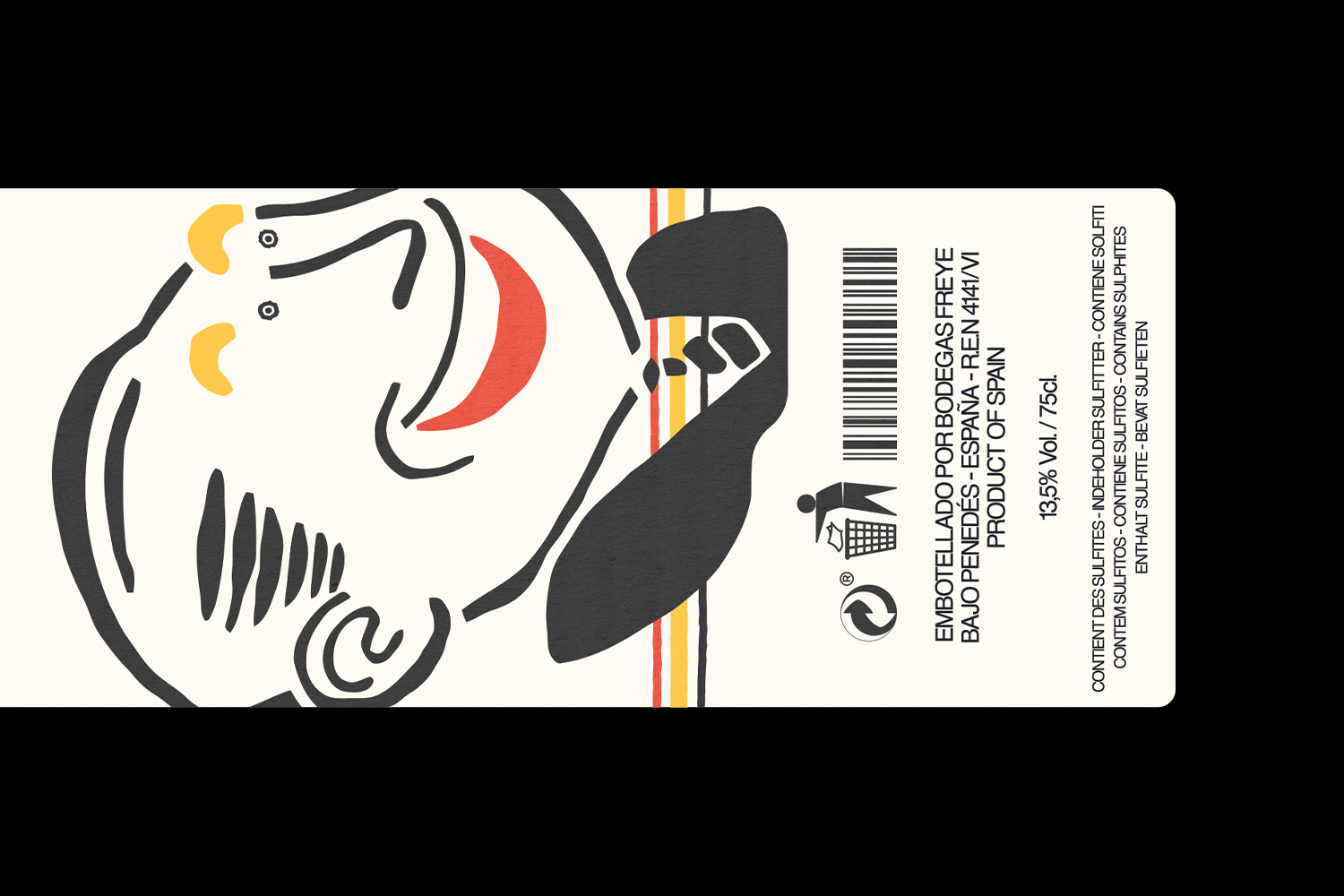
CHÂTEAU MARGAUX
Visual identity, Packaging
2020
2020
Château Margaux is family-run vineyard in the Bordeaux region of France, whose wines are known for their fruity flavours. The identity was inspired by the work of French artist Daniel Buren, consisting of regular, contrasting-coloured stripes. A custom coding system was developed where different colours correspond to a different appellation level for each wine. As a way to grab the consumer’s attention, the text on the label is intentionally small, prioritising the coloured stripes, inviting individuals to get a closer look and stand out amongst other wines.